
Recomendados
Más contenido relacionado
La actualidad más candente
La actualidad más candente (20)
Destacado
Destacado (18)
Similar a Five
Similar a Five (20)
Five
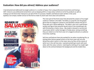
- 1. Evaluation: How did you attract/ Address your audience? I had attracted and addressed my target audience in a number of ways, from using professional conventions and having a USP. I chose to use professional conventions such as keeping within a 3 way colour scheme on all of my products as well as making sure the fonts that I had put to use were fit for it’s purpose. Headers and features were written in the same typeface, but simply a bolder version of the font to make my work look more clean and authentic. The main part of the front cover that attracted the viewers of my target audience I believe is the bible. The bible as a prop fits into the gospel genre that my magazine is based on and therefore catches the eye of those who see it while walking by. The bible is also such a well known symbol and figure that everyone would notice it has something to do with Christianity or God or Jesus. My model is dressed in normal and casual wear which is what teenagers of today wear, seeing something they can relate to on the front cover of a magazine attracts an audience more than anything. Sell lines and features have also worked for me when considering this, as putting other famous gospel artists on the front cover will not only attract fans who’s name is in the cover story, but fans of the names of which are in the sell lines also. I wanted everything to work with each other, with the colour scheme matching the clothing of my model right down to the contrast between the background and the models face.