
Recomendados
Más contenido relacionado
Destacado
Destacado (18)
Último
Último (20)
Good or bad design
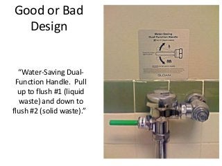
- 1. Good or Bad Design “Water-Saving Dual- Function Handle. Pull up to flush #1 (liquid waste) and down to flush #2 (solid waste).”
- 2. • Here the colors on the buttons do not enhance the experience. They might even make you dizzy. Good or Bad Design Not only are these colors horrible, but this interface has too many tabs!
- 3. • What's the difference between these five commands? Good or Bad Design • Busy, busy, busy. This computer will self-destruct in 3 minutes, 11 seconds. Unless you want to do it NOW. Resistance is futile. The "Restart Later" option has been disabled, but is still visible, just to taunt you.
- 4. • Background images don't always enhance a web page. Sometimes it makes them hard to read. Good or Bad Design
- 5. • You say "YES", I say "OK" ??? Good or Bad Design Winter is coming so I bought this hot water dispenser the other day. The capacity volume is 4.0L. But the gauge only shows 1.0/2.0/3.0. So where is the missing 1 liter?
- 6. I think it really attracts me by its creative interactive design, which allows me not only exercising but also enjoy game playing. Doing sports never lacks in flavour or interest Good or Bad Design
- 7. • http://carolcgt512.files.wordpress.com/2012/10/qqe688aae5 9bbe20121014225504.png Good or Bad Design
- 8. I think the website http://candccoffee.com/ is good for it creative dynamic navigation, but fails to meet some principle in user interface design. Representing its navigation in an animation way can solve the dull and boring experience of browsing internet.However bring another risk that is user might miss up some detailed information because they are hidden under the main folder if you forget to click them. Good or Bad Design
- 9. • A bad design of 3D interface Good or Bad Design
- 10. Video Good or Bad Design StreetPong.flv Paper for IPAD.flv