
Recommended
More Related Content
What's hot
What's hot (19)
Viewers also liked
Viewers also liked (20)
Similar to Evaluation q2
Similar to Evaluation q2 (20)
Recently uploaded
Recently uploaded (20)
Evaluation q2
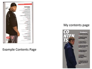
- 1. Example Contents Page My contents page
- 2. Differences The costumes are much different as in the example magazine, they are wearing mainly black, grey and red also they are wearing a bandana. Bandanas are associated with hip hop quite a lot because in the 90s and early 2000s mainly black rapper wore them. For my image he is wearing much different type of clothing which does not look as intimidating as the other image from the example magazine. Also in the example contents page the for the image you can see more of the person in the image, this makes them stand out much more compared to mine you can’t see as much as the person as they are cut off a the waist.
- 3. Similarities There are a lot more similarities to my image and the example image compared to the differences there are. A similarity for the images that both of the people are stood the same way. They are both stood side on with both of them facing towards the camera giving the image direct address. Another similarity to both of the images is the gesture on their faces, they are both showing very blank looks on their faces, which suits hip hop magazines very well. Usually you would never see a rapper smile on a magazine or show any type of expression on their faces. Also both of the images share the same shot type which is a mid shot, so this shows more of their upper body which is a much better and effective way to show off the person who is in the image.
- 4. How does my media product represent particular social groups? I think that my media product is aimed more towards males more than females, also it represents younger adults which are aged around 16-21. For example on my double page spread more males can relate to the story that I have written rather than females. Females would relate to a more upbeat and happier story as they can probably relate more to it. Another reason why my magazine represents males rather to females shows on my double page spread, the primary colours that I used are black and grey and these two colours go well together and make each other stand out, this represents males more as they are very dark and dull colours and they would prefer this to very bright colours, because I have used much darker colours it doesn’t represent females as they would prefer it have much brighter colours like, pink, white and other bright colours.