Color Systems and Spaces
•
6 recomendaciones•3,411 vistas

A look at color spaces in digital and print environments, as well as examples of color use in everyday life.

Recomendados
Más contenido relacionado
La actualidad más candente
La actualidad más candente (20)
Destacado
Destacado (20)
Similar a Color Systems and Spaces
Similar a Color Systems and Spaces (20)
Más de Jennifer Janviere
Último
Último (20)
Color Systems and Spaces
- 2. Color Design Color Use in Organizational Systems Image Source: www.bottomlinedesignawards.com/target.html Research shows that colors play a large part in human memory. In the world around us there are many examples of the use of color-coding to organize information and make it memorable to users.
- 3. Color Design Color Use in Organizational Systems Image Source: http://www.transitchicago.com/ Research shows that colors play a large part in human memory. In the world around us there are many examples of the use of color-coding to organize information and make it memorable to users.
- 4. Color Design RGB Colorspace The main purpose of the RGB color model is for the display of images in electronic systems, such as televisions and computers. Before the electronic age, the RGB color model already had a solid theory behind it, based in human perception of color and light. RGB is an additive color model in which the primaries red, green and blue light are added together to produce a wide array of colors. The combination of all three primaries creates white light.
- 5. Color Design CMYK Colorspace Also referred to as process color, CMYK is a subtractive color model. CMYK is used to produce all colors that appear in print, and refers to the four inks that, when combined in various percentages, comprise every possible color that can be reproduced in print (Cyan, Magenta, Yellow, Black). This color model is considered subtractive because the inks subtract brightness from a (usually white) background. When combined together, all fours colors produce black.
- 6. Color Design Gamut Gamut refers to the range of colors available in a color space. Different color spaces have different gamuts as do different devices. When a color falls outside of a color space's range, it can't be reproduced by the device and is called out of gamut.
- 7. Color Design CMYK Colorspace Image Source: http://bit.ly/cqAGtL RGB color space has a wider gamut, or range of available colors, than CMYK color space. Just because a color is visible on a computer monitor doesn t necessarily mean it can be reproduced in print. It is important to be aware of the color limitations when creating files that will later be printed.
- 8. Color Design Spot Colors Spot colors are pre-mixed inks applied on the printing press. Spot colors can be produced in a wider and more vibrant range of colors than traditional four color printing, and can have special characteristics which aren't available in process inks, such as metallic or fluorescents. Because they only use one ink plate, spot colors can reduce the cost of printing if ink choices are limited to one or two spot colors. Spot colors are not a good choice when printing a full-color piece, however, because adding a spot color means that a fifth plate must be added to the printing process, which will increase the cost of printing.
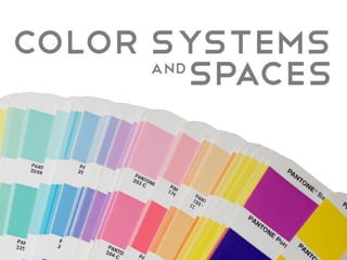
- 9. Color Design Pantone Management System Pantone Matching System, or PMS, is the most widely use spot color system. Designers can select from a swatch book and specify the chosen color to a printing service, who then follows a specific formula to create the desired color. The advantage of this system is that there is no guessing about how a color will appear in print since it is always mixed from a set formula. Most companies have designated Pantone colors that for their logos to maintain a consistent appearance.
- 10. Color Design Pantone Vs. CMYK Pantone colors have a wider gamut than CMYK colors and can produce a wider, richer range of colors. A Pantone color cannot be accurately reproduced in CMYK. A common problem occurs when a designer tries to achieve the look of a PMS color while printing four color process. The four color process uses CMYK inks and is not capable of exactly matching a PMS color which is composed of PMS base inks. One compromise is to use Pantone's Process Color System, which simulates the spot colors using CMYK.
- 11. Color Design Tips for Experimenting with Color Use a restricted palette; impose your own limits on the range of colors. Try using colors you dislike to see if you can make a pleasing arrangement. Use only your favorite colors. Deliberately aim for concord or discord. Choose pairs of contrasting colors. Subordinate you choice of colors and work only with the client s preferences. Design by choosing a mood for the piece first. Always echo your colors to create harmony and unity. Look to the masters of fine arts, such as your favorite painter, and utilize their palettes. Excerpt from The Color Design Workbook, by Adams Morioka and Terry Stone