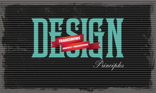
Design Principles for 3D Presentation
•
2 recomendaciones•1,466 vistas

The world of design can be quite daunting for #tradeshow marketers out there. The different ways that you can design your space that highlights your brand is varied and quite fascinating The challenge is how do you tell your story that is real and approachable. You might want to download the book at http://exhibits.skybay.com/design-ideas-for-trade-shows-and-3d-presentations

Recomendados
Recomendados
Más contenido relacionado
Destacado
Destacado (15)
Más de Sarmistha Tarafder
Más de Sarmistha Tarafder (8)
Último
Último (20)
Design Principles for 3D Presentation
- 2. Clutter and confusion are failures of design Good design is a renaissance attitude that combines technology, cognitive science, human need, and beauty to produce something that the world didn’t know it was missing.– Paola Antonelli
- 3. The principles of design are the building blocks to attain certain goals. primarily it gets people to do what you want.
- 4. white space Stand out from the crowd and give your eye the needed space to focus on. CRAP Contrast is a dynamite design principle that creates powerful visual spread. Repeated use of shape, color, or other elements lends regularity and rythmic poetry. Within the depths of alignment, lives the integrity of design. It lends wholeness, nothing lacking, nothing broken. Proximity is all about projecting wholeness. It is the easiest way to achieve unity. Techniques that guide your audience with directional cues. directing attention
- 5. Nothing exists without its opposite The yin and yang of stark contrasts create a notion of a fine balance
- 6. Contrast Our eyes crave for contrast. The essence of any element is defined by its value, properties, or quality relative to something else. And, that is where contrast comes in play. Use contrast to attain advantageous results in your designs and presentations. http://www.anthropologie.com/
- 7. includes orientation Contrast Diagonal versus Straight http://www.skyline.com/
- 8. includes shape, Contrast Geometric versus Organic http://www.blueverticalstudio.com/burkhardt-leitner-exhibition-stand-by-burkhardt-leitner/
- 9. includes topography Contrast Smooth versus Bevel http://www.studioandrewhoward.com/portfolio/exhibitions/gateways-exhibition/
- 10. includes color, Contrast Dark versus Light http://www.louisvuitton.com
- 13. You have to be aware of all the latent possibilities that give a work its special character – its atmosphere, its moods, its contrasts – Alfred Brendel http://www.behance.net/gallery/BsAs/1872179
- 14. Each repetition has a new meaning There is nothing more difficult to master than repetition. When it’s well done, it’s like a little echo, like waves, poetry itself
- 15. Repetition Repetition calls for visual excitement by enriching the object of interest. Acting as a connevtive tissue, it lends unity in design. Create visual echo by repeating elements that highlights degrees of variation. http://www.behance.net/dart-design
- 16. radial Repetition creates charm and symmetry http://www.folkartmuseum.org
- 20. gradual Repetition Creates Interrelatedness http://www.coroflot.com/GoExhibitions/SELECTED-PHOTOS
- 21. Repetition of shapes creates awed admiration http://www.folkartmuseum.org
- 22. but does not want to be bored. It likes familiarity, The eye loves repetition, but needs surprises. –Edith Bergstrom Jali, Humayun’s Tomb, Delhi
- 23. Alignment begins with a constituency of one Elements sharing a common axis supports an unified space
- 24. Alignment In the complex visual world, alignment is the unseen filament that creates a visual connection with the elements of design. Alignment creates order out of chaos. It communicates a purpose in the placement of products. www.pinterest.com
- 25. center Alignment Creates a Focal point www.louisvuitton.com/
- 27. converging Alignment of expanded Space Creates the Illusion http://wildinkpress.com/blog/2011/05/23/
- 29. vertical Alignment of space awareness Creates Heightened Sense www.exhibitoronline.com
- 30. message work in concert your brand and your Alignment is that optiamal state where to propel profit and goodwill. http://imaginethese.blogspot.com/2011/06/trade-fair-stand-design-hanover-fair.html
- 31. It is all about proximity Putting things together visually that belong together reduces clutter, and establishes visual hierarchy
- 32. Proximity Proximity is derived from the Gestalt theory of visual perception. We are always seeking a gestalt or unified whole. Our mind wants to simplify and organize information. It does this by grouping elements together to create new wholes. Understanding how the mind groups elements (by proximity, similarity, continuation and alignment) helps us understand how unity can be achieved. http://www.pinterest.com
- 34. creates an unified composition Proximity www.nike.com
- 37. An old surrealist trick was to take images that had no business being together and plopping them into the same image. Your mind wants to make associations. Design does that all the time. –Art Chantry http://www.behance.net/gallery/BsAs/1872179
- 38. Space, the wonderful something in nothing The ideal space must contain elements of magic, serenity, sorcery and mystery
- 39. White Space White space is not empty space. It is the foundation of good design. Strategic and effective use of white space through out your design is a proven way to demonstrate clear cohesion. http://www.chrismaclean.co.uk/QAGOMA
- 40. active White Space to the elements in the design Draws Attention http://momadesignstudio.org/Exquisite-Corpses
- 41. passive White Space encourages enticement Launches Curiosity Photo: Global Experience Specialists, 2011 ABC Kids Expo in Louisville
- 42. provides respite White Space Enables Modulation www.pinterest.com
- 44. White Space commands attention Enables Legibiity http://www.archdaily.com momadesignstudio.org
- 45. steeers the flow in design White Space Enables Fusion http://www.atelier522.com/en#/view/16/
- 46. The ideal space must contain elements of magic, serenity, sorcery and mystery. –Luis Barragan http://www.behance.net/gallery/Live-with-less-poster-contest/5170389
- 47. Attention is a main asset in marketing Marketing is all about directing attention
- 48. Directing attention Seizing attention and directing it towards a desired outcome is the ultimate goal of your design. http://www.behance.net/gallery/Port-Typeface/6747553
- 49. Directing attention ignore everything else and pay attention to me! Arrows http://www.pinterest.com
- 50. Directing attention converging lines convey lightning dynamism Pathways http://www.coroflot.com/GoExhibitions/SELECTED-PHOTOS
- 55. Directing attention Surprise Interruption breaks the monotony of the space http://www.pinterest.com
- 56. Directing attention capture light for a phenomenal outome Contrast http://www.fubiz.net/usersstuff/cone-of-light-audi-ags-visionary-exhibition-stand-concept-at-the-consumer-electronics-show-2013-ces-las-vegas-january-2013/
- 57. Directing attention Visual Cues “The whole is greater than the sum of its parts.” –Aristotle http://www.atelier522.com/de/
- 58. Directing attention what do you feel? C olo r http://www.ansorg.com
- 59. The first problem of communication is getting people’s attention. Break a pattern The most basic way to get someone’s attention is this: . –Chip Heath http://www.behance.net/gallery/Motion-Theater/10484077
- 60. CRAP directing attention white space a reflection of balance, harmony, logic and abstract beauty http://www.designboom.com/design/bao-bao-issey-miyake-shinjuku/
- 61. TO create a memorable design ing. you need to start with a thought that’s worth remember — Thomas Manss
- 62. If you like what you see, download the http://exhibits.skybay.com/design-principles-for-tradeshows-and-presentations 62 page visual guide at what is your story? Every great design begins with an even better story. — Lorinda Mamo Share it with us. Sarmistha Tarafder [starafder@skybay.com] @sarmisthataraf [510-490-9900]