
Recomendados
Más contenido relacionado
La actualidad más candente
La actualidad más candente (20)
Destacado
Similar a Music magazine
Similar a Music magazine (20)
Más de VahesanSlide
Más de VahesanSlide (16)
Último
Último (20)
Music magazine
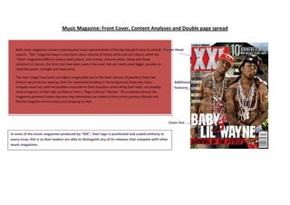
- 1. Music Magazine: Front Cover, Content Analyses and Double page spread Both music magazines convey a stereotypical visual representation of the Hip Hop genre and its cultural Master Head aspects. “XXL” magazine keeps a consistent colour scheme of mainly white and red colours, whilst the “Vibes” magazines differs in various bold colours, such as blue, red and yellow. Along with these variations of colours, the fonts that have been used in the cover title are clearly sized bigger, possibly to resemble power, strength and masculinity. The main image/ focal point are highly recognisable due to the sheer amount of jewellery these two famous rap artists are wearing. With the ramshackle building in the background, these two males Additional uniquely stand out, with the jewellery mounted on their shoulders whilst tilting their head, can possibly Features show arrogance or their high confidence from a “Rags to Riches” lifestyle. This evidently attracts the magazines potential readers because they themselves can relate to these artists previous lifestyle and find the magazine more curious and intriguing to read. Cover line In most of the music magazines produced by “XXL”, their logo is positioned and scaled similarly in every issue; this is so that readers are able to distinguish any of its releases that compete with other music magazines.
- 2. The colours used on the front cover contrast to each other, therefore making the front cover very eye- catching and vibrant. The colour scheme even runs into the clothing of the male artist, “Kanye West”, who is wearing a blue and grey baseball jacket. The posture and facial expression of this male artist conveys an arrogant yet confidence look, meaning he is a determined character- thus relating to the audience of the magazine. What makes this magazine less generic is that the colours that are used will apply towards a more feminine audience, as VIBE is a Hip-Hop/ R&B type magazine it’s rare that light blue and purple is used on a magazine that shows high levels of masculinity. In addition, the main image is placed in front of all other elements, in front of texts and masthead, purposely to highlight their importance, when comparing to other magazines such as XXL, texts and lettering are overlapped.
- 3. VIBE uses fewer colours across its front cover, but it’s highly visible due to the intense bold colours that contrast against each other to make it stand out. A great example of this happens on the title of the magazine, “VIBE”, plain, simple, bold and not filled with any colours, which makes it stand out against the dark background. The typography of the font are mostly in capitals, clear to read which can portray a firm and strong definition.
- 4. The Content page of this music magazine uses limited writing, due to the main image taking up three quarters of the entire page. The font that has been used is the same as the font used on the front cover, which means that there is a consistent house style. Headings are coloured differently to make them appear more visible (PINK), bold (BLACK) fonts have been used to highlight sub heading; the normal text remains consistent throughout. Overall this content page seems to give out a unique and different portrayal, the retro style of images and text makes this content page seem as if it is purposely targeted to a niche audience.
- 5. What is unique about this content page is that the images are cut out into square shapes, in a tiled pattern with a drop shadow makes it look more 3dimensional and as if they are album covers. The other interesting point, the front cover is also included in the top corner of the page , but rescaled to a smaller size which gives a stronger relation between the content page and front cover. Also the page numbers are customised in yellow and black, which is similarly coloured as the content title, which follows on all around the page (Consistent colour scheme). However this content page has more information and therefore more text.
- 6. The content page of this magazine is easily readable. The layout of the images and text are prearranged with content listings on one side and three quarters taken up by large images. The title “Drummer” is clearly visible due the capital lettering, bold and large font. Again the colour schemes applied throughout the page. From visual images used on the page, you are able to predict the type of genre this magazine will endorse; “Rock”
- 7. This NME magazine double page spread uses a wide range of innovative designs to attract their audience. The Title “Teenagers” flows between both pages creating a visual bridge between the pages, which means the main text is Stereotypical – Teenagers; untidy room, posters, unique connected to the main image. fashion choices and stylish hairstyles. The colour scheme is followed on throughout the page, blue, white and black. This text box is customised to look like a page ripped from a book, the use of the stylish text box makes the double page vv The text are aligned to the left are split into columns for much spread even more interesting and appealing towards easier reading. In addition the last column contains smaller teenagers. images to aid with the information provided in that section.
- 8. The pull quote that’s been used on this double page spread is highly visible due to the typography and the black background that has been applied. It shows diversity in style which can relate to what is being actually said in the text. All the information and text are on one side of the page, the main image (just the one) has been placed on one side of the double page spread. Black, white and red are the main colours used in the writing and is the main colours on the shirt of the female person, which shows a relation and consistency colour scheme.
- 9. Even though the main colours of this NME magazine are blue, black and white, there are other colours involved in the main image which makes this double spread more colourful. Other additional images have a white stroke which surrounds its borders, making it look like photographs on the double page spread. The texts are aligned left and are in columns to make it much easier to read. The text also flows around the additional image, a creative way of placing the image without disrupting the text.