
Recomendados
Más contenido relacionado
La actualidad más candente
La actualidad más candente (16)
Destacado
Destacado (18)
Similar a Finished front cover essay
Similar a Finished front cover essay (20)
Más de jessicagilani
Más de jessicagilani (20)
Último
Último (20)
Finished front cover essay
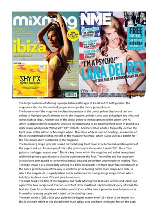
- 1. The target audience of Mixmag is people between the ages of 16-30 and of both genders. The magazine caters for the needs of people who enjoy the dance genre of music. The house style of the magazine involves frequent use of the colour yellow. Sections of text are yellow to highlight specific themes within the magazine; yellow is also used to highlight key titles and words such as ‘Ibiza’. Another use of the colour yellow is the background of the album ‘SHY FX’ which is attached to the magazine, and also the background to an advertisement which in placed in a circle shape which reads ‘WIN A VIP TRIP TO IBIZA’. Another colour which is frequently used on the front cover of this edition of Mixmag is white. The colour white is used on headings; an example of this is the masthead which is the title of the magazine ‘Mixmag’, which is also used as a border for the free album which is attached to the magazine. The Gutenberg design principle is used on the Mixmag front cover in order to make certain points of the page stand out. An example of this is the primary optical area which reads ‘2011 Ibiza. Your guide to the biggest season ever!’ This is a key theme within the magazine and so has been placed within the primary optical area so that the audience see this first. The smaller and less important articles have been placed in the terminal optical area and are written underneath the heading ‘Plus’. The main image is of a young lady dancing in a bikini on a beach. The front cover has connotations of the dance genre because of the way in which the girl is dancing on the main image. Also Ibiza, in which the image is set, is a party island and is well known for having a large range of clubs which hold host to dance music DJ’s and play dance music. The mast head is the title of the magazine and reads ‘Mixmag’ the text used is white and stands out against the blue background. The sans serif font of the masthead is bold and looks very informal, the text also looks fun and modern which has connotations of the dance genre because dance music is listened to by young people and is used on the clubbing scene. The main article is ‘2011 Ibiza your guide to the biggest season ever!’, it is clear to the reader that this is the main article as it is placed in the main optical area and have the largest font on the page.
- 2. The word Ibiza is as large as the Masthead and therefore draws the reader’s attention to the article, the word is also in yellow which is a bright colour and so attracts the reader. The target audience of the NME is people between the ages of 25-35 and mainly males. The magazine caters for the needs of people who enjoy the Rock and Indie genre of music. The house style of the front cover uses the colours black, white and pale blue. Pale blue and black are used on large sections of the text, whereas the colour white is used on the Masthead and as a background to sections of the text. The main article in the issue of NME is about the performer Lana Del Rey, a pale blue font is used for her name as this is an attractive colour and therefore draws the reader’s attention to this article. The black text used above and below the main article stands out against the white background, as they are contrasting colours, and therefore the text is clear and easy to read, an example of this black text is the quote, ‘I’m a psycho’. The Gutenberg design principle is used on the front cover of NME in order to draw the reader’s attention to certain articles. The main optical area on this front cover is an image of Lana Del Rey and pieces of text which are places to the left of the picture. The picture of Lana Del Rey promotes the article about her inside NME, whereas the pieces of text at the side of the image, for example ‘Noel Gallagher ‘I am a genius, just like God’ promote smaller articles from different artists which are also inside the magazine. The main image of the performer Lana Del Rey is effective as her white dress has connotations of innocence, whereas her pose and also her red lipstick have the opposite connotations. The colour red is often linked with love and passion, and also danger which are themes which link in with the rock genre of music. Lana Del Rey is sticking her tongue out which is a very stereotypical pose for a rock star and also is a pose which is linked with the popular rock band ‘ the rolling stones’. In the image the artist is stood in front of an American flag, because of her nationality, text on the front cover also reads ‘The true face of a modern American Idol’ and therefore this links in with the American flag. The Masthead is a sans serif font and is large and bold which makes it stand out so that the reader is clear when they first see the magazine, what the name of the magazine is. The text is white and therefore stands out against the dark blue section of the American flag in the background, the text looks very dominant and loud within the page and this has connotations of the rock and indie genre of the magazine. In comparison, the two magazines have very different front covers due to the different genre of music in which they base the content of the magazine on. Mixmag caters for the needs of people who enjoy the dance genre of music and therefore the front cover uses fun looking and informal text and images to represent this genre, whereas NME caters for the needs of people who enjoy the rock and indie genre of music. Therefore the images and text used are more dominant and formal looking and therefore the front cover looks attractive to people who favour these genres. A similarity of the two magazine front covers is the use of bright colours which are used in order for the front covers to look attractive and eye catching to the reader. Another similarity between the magazine covers is the use of the heading ‘plus’ in the terminal area to advertise smaller articles and stories withing the magazine.