Descargar como PDF, PPTX


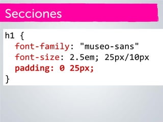


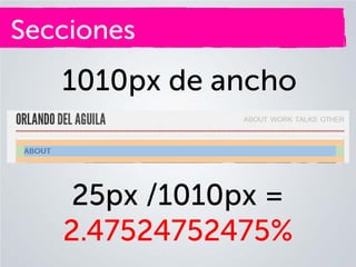


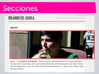


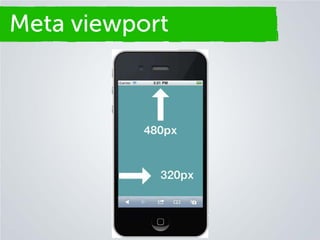


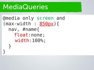


Este documento presenta una introducción al diseño web responsivo. Explica conceptos como diseños fijos y fluidos usando píxeles, porcentajes y ems. También cubre temas como diseño adaptativo, puntos de ruptura y consultas de medios para crear diseños que se adapten a diferentes dispositivos. El objetivo final es diseñar para la web en lugar de solo para dispositivos específicos.


![3 - Metodologias para el diseño de las aplicaciones web [2025].pdf](https://cdn.slidesharecdn.com/ss_thumbnails/3-metodologiasparaeldiseodelasaplicacionesweb2025-251125201128-13ae4d34-thumbnail.jpg?width=640&height=640&fit=bounds)


