Descargado 59 veces
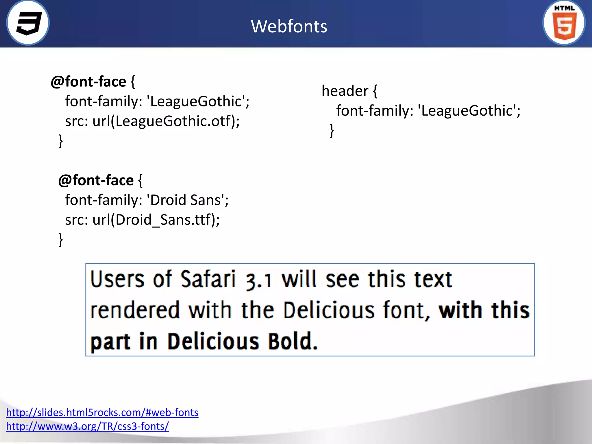
![Selectores
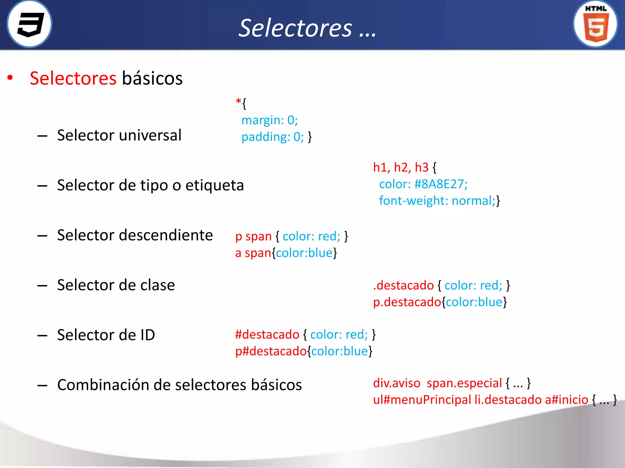
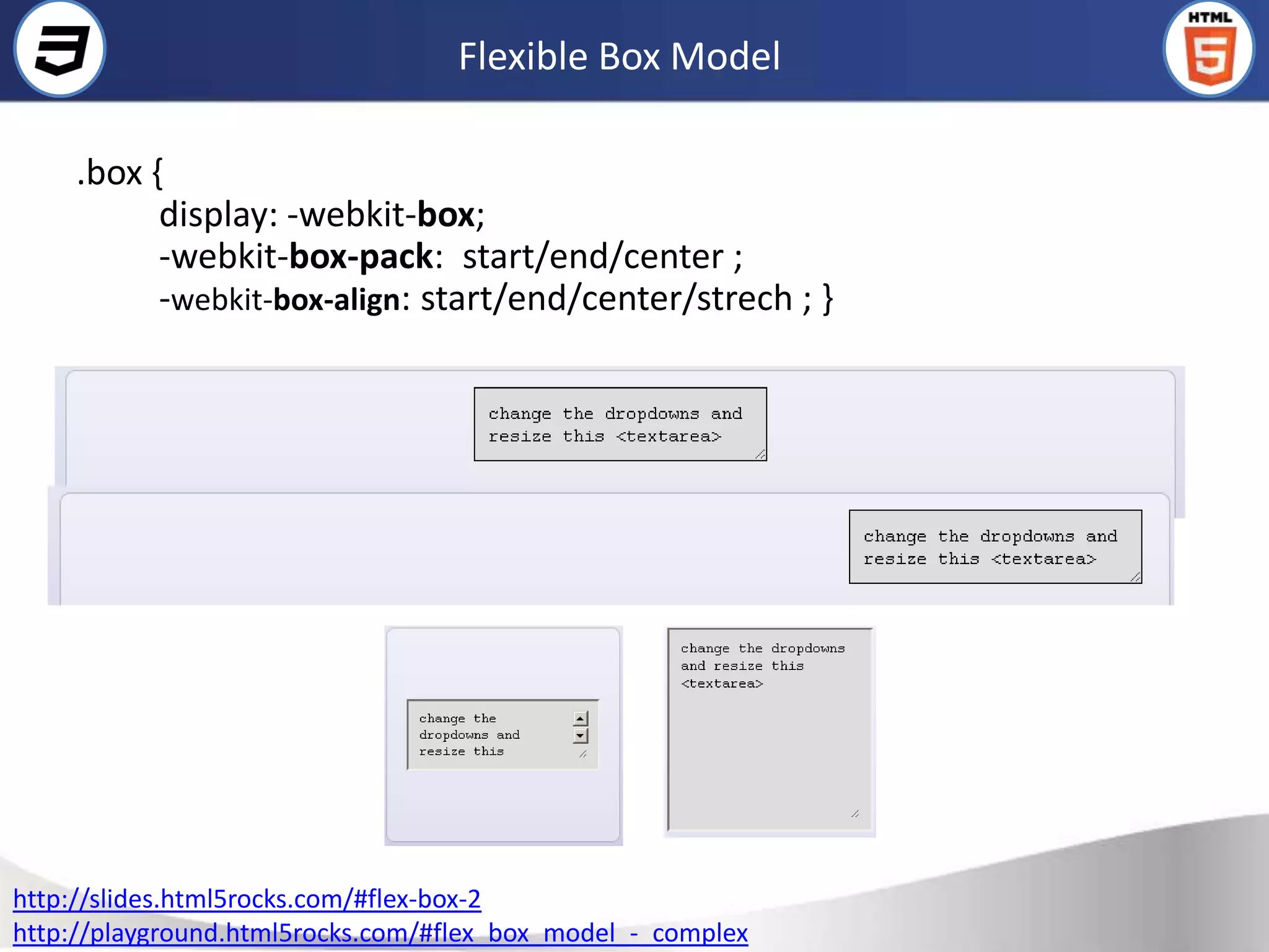
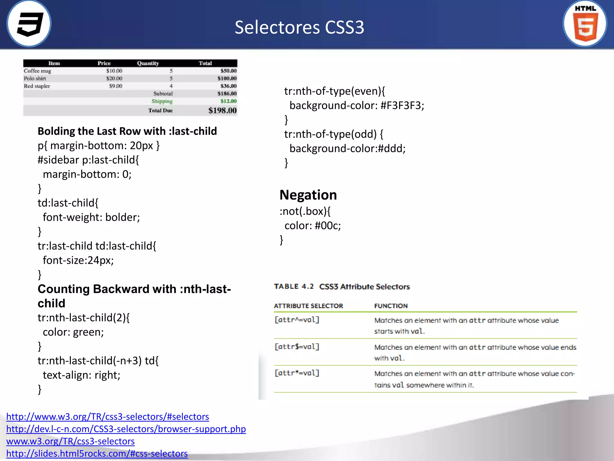
• Selectores avanzados
– Selector de hijo <p><span>Texto1</span></p> (CUMPLE)
<p><a href="#"><span>Texto2</span></a></p> (NO CUMPLE)
p > span{ margin: 0; padding: 0; }
– Selector adyacente
<body>
H1 + h2 { color: red;} <h1>Titulo1</h1> (APLICA)
Deben cumplir dos condiciones: <h2>Subtítulo</h2> (APLICA)
elemento1 y elemento2 deben ser hermanos, por lo <h2>Otro subtítulo</h2> (NO APLICA h1 +h2)
que su elemento padre debe ser el mismo. </body>
elemento2 debe aparecer inmediatamente después de
elemento1 en el código HTML de la página.
– Selector de atributos
/ * Se muestran de color azul todos los enlaces que tengan un atributo "class", independientemente de su valor */
a[class] { color: blue; }
/* Se muestran de color azul todos los enlaces que tengan un atributo "class" con el valor "externo" */
a[class="externo"] { color: blue; }
/* Se muestran de color azul todos los enlaces que apunten al sitio "http://www.ejemplo.com" */
a[href="http://www.ejemplo.com"] { color: blue; }
/* Se muestran de color azul todos los enlaces que tengan un atributo "class" en el que al menos uno de sus valores
sea "externo" */
a[class~="externo"] { color: blue; }](https://image.slidesharecdn.com/html5css3-120213061854-phpapp02/75/CSS3-6-2048.jpg)
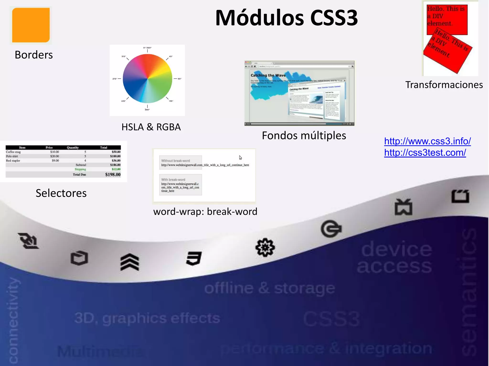
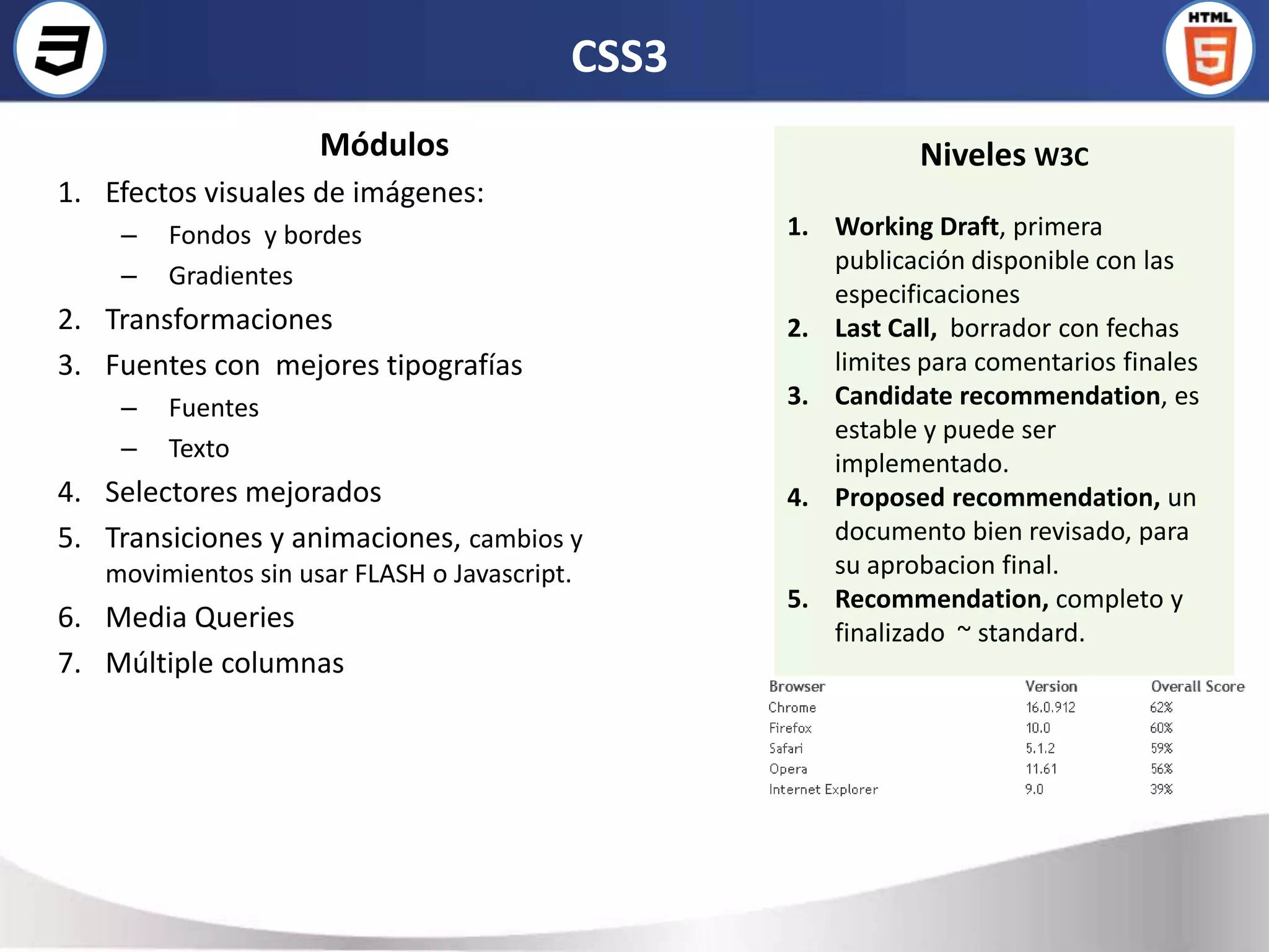
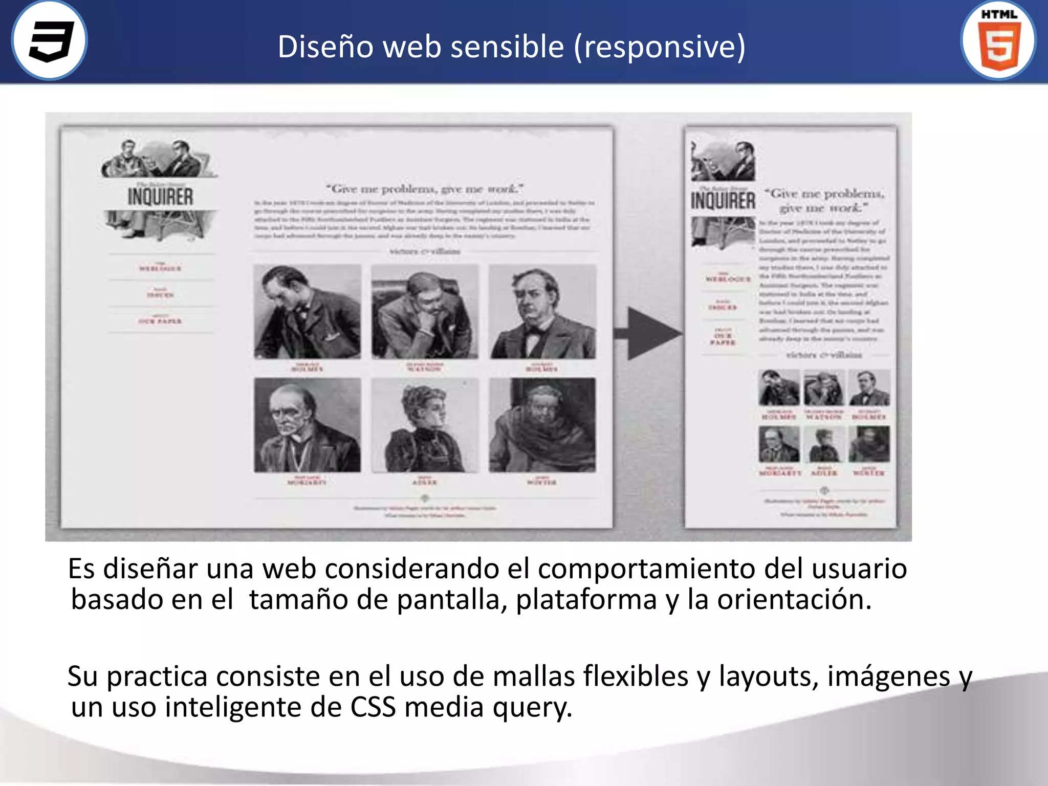
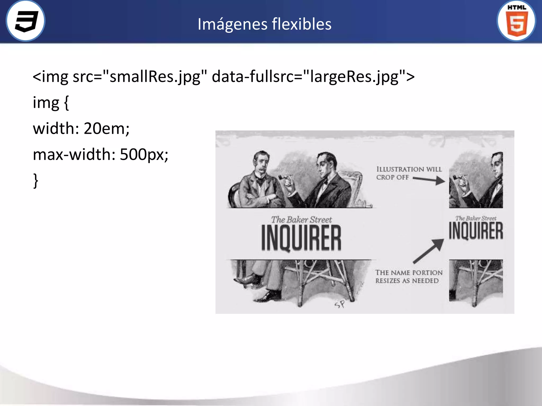
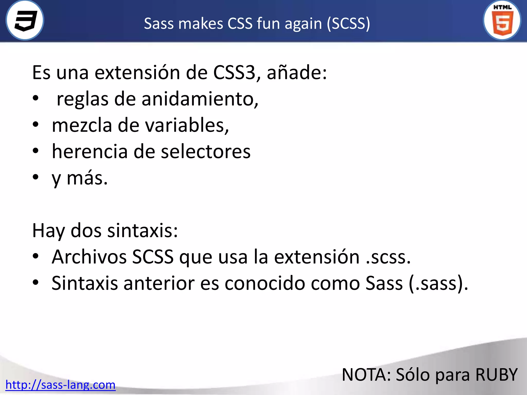
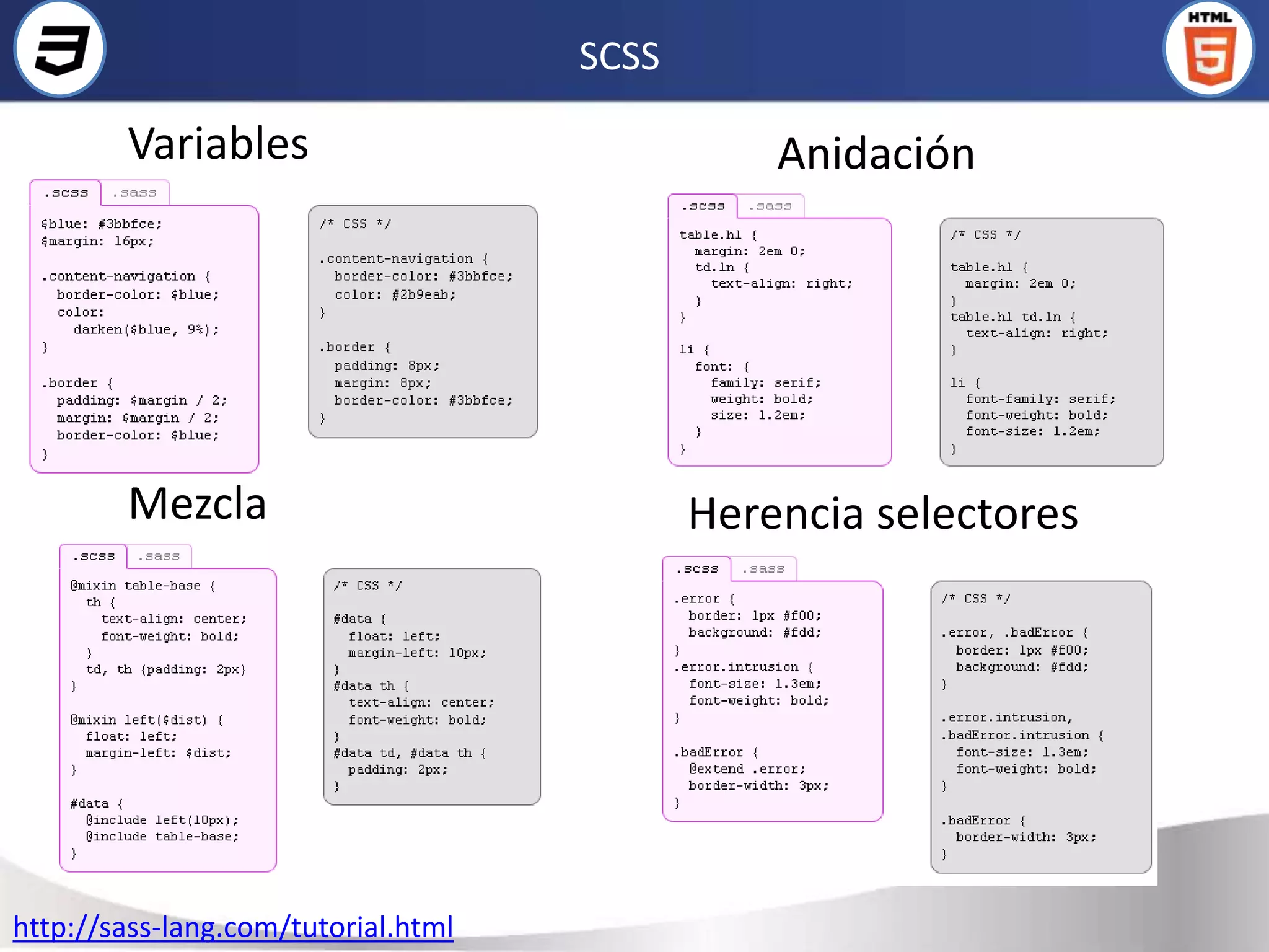
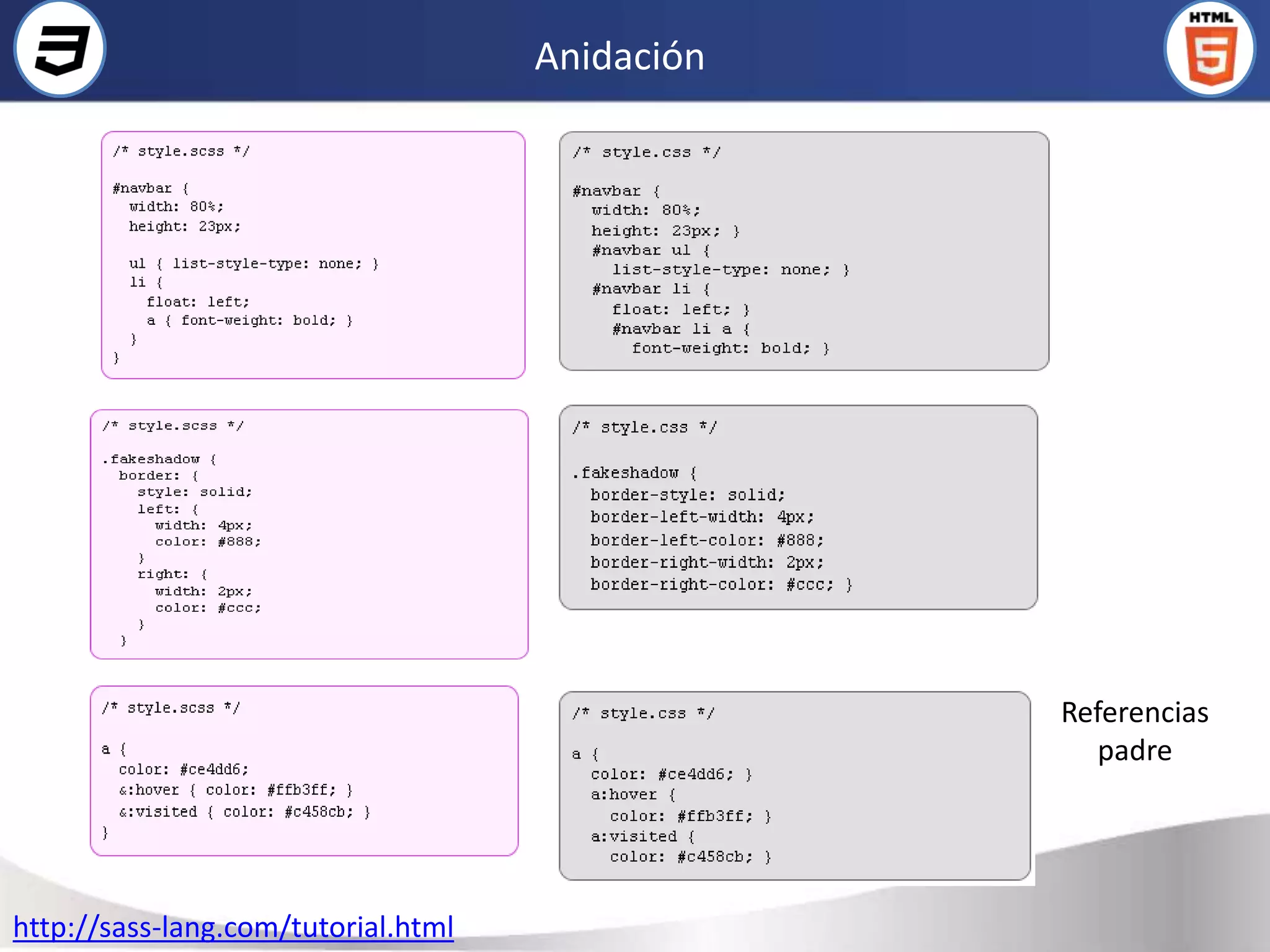
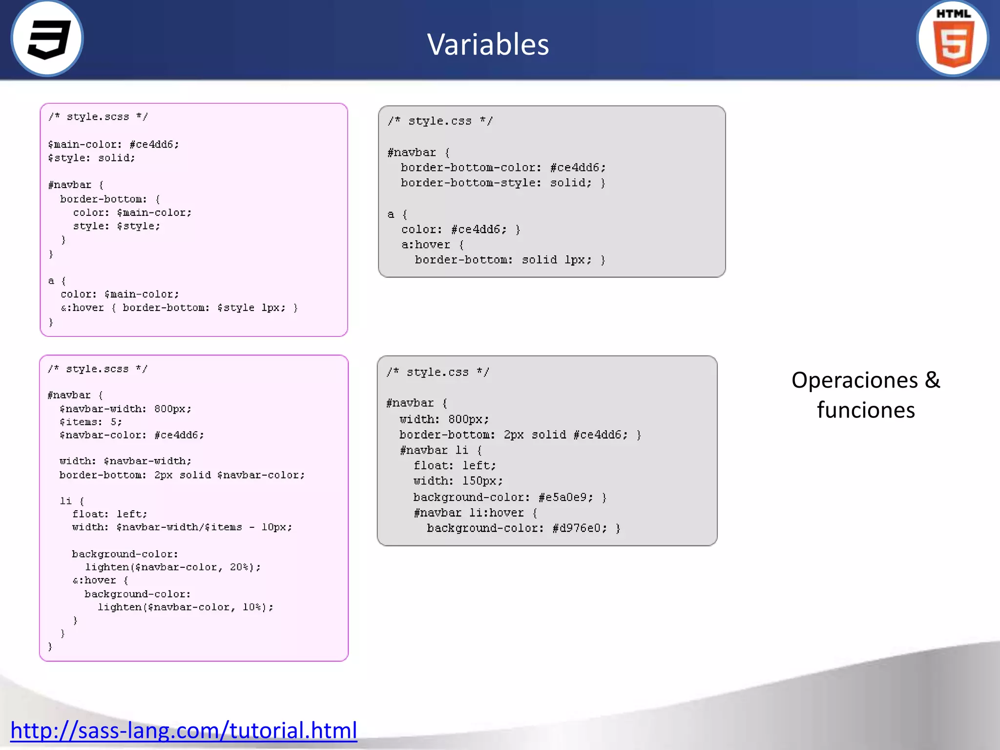
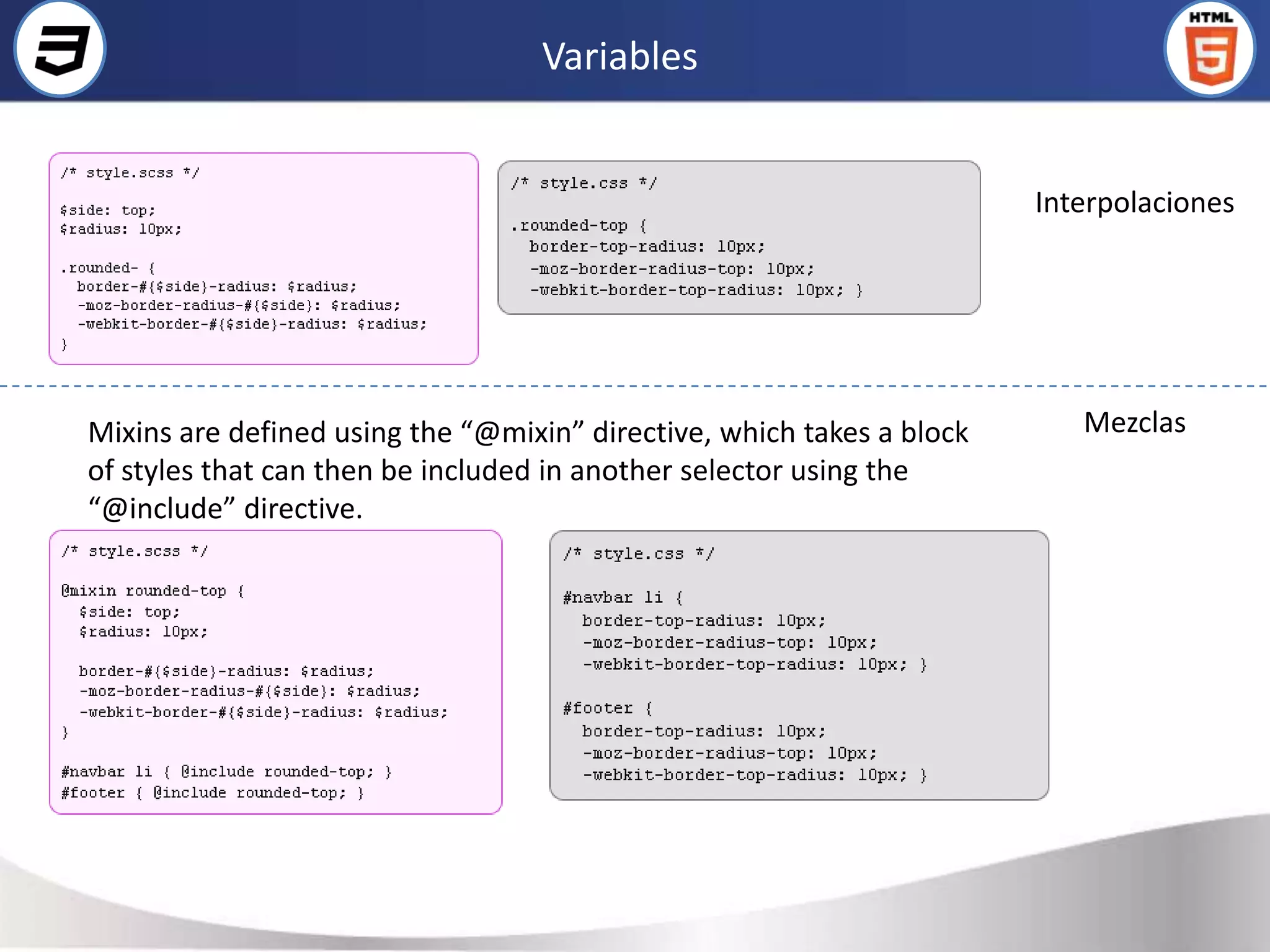

Este documento resume conceptos clave de CSS como CSS3, diseño web responsive, SASS, LESS y CSS orientado a objetos. Brevemente describe las características principales de CSS3 como bordes, transformaciones, fondos múltiples y gradientes. También cubre selectores avanzados de CSS3, animaciones, transiciones y media queries. Finalmente, introduce conceptos como diseño web responsive, preprocesadores como SASS y LESS, y el enfoque de CSS orientado a objetos.