SlideShare una empresa de Scribd logo
1 de 52
Descargar para leer sin conexión
LA REVISTA CULTURAL. Nº9
LisaLyon,1982copyright©RobertMapplethorpeFoundation.Reproducedwithpermission
Acceso gratuito al centro y a las exposiciones
Plaza de Weyler, 3 · Tel. 971 178 500 · www.laCaixa.es/ObraSocial
Hasta el 10 de mayo
M A R Ç 2 0 0 9 									 C U L T U R A M A L L O R C A 3
CM - Cultura Mallorca
Fotografía:
Tom Solo (portada), Patrick Parenteau, Brigitte
Lucke, Victor Castells Avinyó
Traducción: Judith Glueck
Supervisión:
Santiago Fabré de Balanzo, Christiane Nolte
Colaboración: Aina Riera, Marga Melià, Josef
Kiffmeyer, Teresa Ruiz de Apodaca, Michael Mittau,
Santiago Stonelli
Reservados todos los derechos, prohibida la
reproducción total o parcial de los artículos,
fotografías, ilustraciones y demas contenidos,
sin permiso previo del editor.
CM no se hace responsable de las opiniones de
sus colaboradores ni se identifica con las mismas.
Impressum:
Dr. Brigitte Lucke – Editor
Arquitecte Benassar 67
07004 Palma de Mallorca
Tel. +34 971 20 60 47 • +637 516 492
info@culturamallorca.com
www.culturamallorca.com
Marketing Mallorca: Aina Riera 610 643463
Marketing Barcelona: Marga Melià Rigo 606091629
Webdesign:
Michael Mittau
Tel. +49 211 1588310
www.tech-nomades.de
Diseño y maquetación:
Anibal Guirado / Ramón Giner
Tel. + 34 971 711559 / + 34 971 723172
ramon@gdos.net
Impresión:
BIG. Bahía Indústria Gràfica
Deposito Legal: PM-2696-2006
METAPAISAJES
Texto: Pau Waelder. Fotos: Fundación Pilar i Joan Miró a Mallorca
BOTERO: UNA MIRADA DIFERENTE
MARIO ELEFANTHELIADIS: EL PECADO SALVA
BERNAT SANSÓ: OBRAS 1997-2007-09-11
Texto y fotos: Solleric
ART AL CARRER: MANOLO VALDÈS A PALMA
Texto: CAIXA-FORUM. Fotos: Patrick Parenteau
…Y AL FINAL FUE MERZ
Texto: Pilar Ribal / Foto: Patrick Parenteau
DESPUÉS DE ERROR
ENTREVISTA CON AMPARO SARD
Texto: Aina Riera. Fotos: red.
NACHO FRISUELOS: DE LA PINTURA COMO PAISAJE INFINITO
Texto: Pilar Ribal. Fotos: Tom Solo
LA DESCONSTRUCCIÓN DE LO COTIDIANO
Texto: Marga Melia
AGENDA LOCAL
ARTISTA INVITADO: NACHO FRISUELOS / Foto: Tom Solo
CUANDO LAS OBRAS SALEN DEL ESTUDIO SIENTO SU PERDIDA
BIEL AMER EN CONVERSACIÓN CON PEP LLAMBIAS
Fotos: red.
SIN PIE DE PAGINA
PINTORA Y GALERISA: MIQUELA NICOLAU
Texto: red. Fotos: Victor Castells Avinyó
CA N’ALLUNY: LA CASA DE ROBERT GRAVES
Texto: Ca n’Alluny. Fotos: Patrick Parenteau
STRUKTUR VISIONEN 07
SCHÜNO
Texto: Red. Foto: Schüno
AGENDA NACIONAL
AGENDA INTERNACIONAL
UN VERANO EN EL CINE
Texto y fotos: Marga Melia
EL ARTESANO DE LA NUEVA GASTRONOMÍA
VICENTE FORTEA
Texto: Teresa Ruiz de Apodaca
RUTES SENDERISTES A MALLORCA: REFUGIS DE LA MUNTANYA
Text i fotos: Jona Ramon Bosch Cerd
LA ÚLTIMA PÁGINA:
FOTOGRAFO INVITADO: PATRICK PARENTEAU (Vancouver)
6
10
12
14
16
18
21
22
24
26
28
30
32
35
36
38
40
42
44
47
MANEU
BAHIA
M A R Ç 2 0 0 9 									 C U L T U R A M A L L O R C A 5
CM , una revista independiente y trilingüe, se presenta desde hace más de tres años
en España y Alemania, Suiza, Inglaterra, Irlanda, Estados Unidos, Canadá, Nueva Ze-
landa y Hong Kong como un referente en la divulgación de la cultura contemporánea,
con el objetivo de conectar con las vibraciones culturales más emergentes e intere-
santes como de crear un vinculo entre los procesos creativos de múltiples artistas
con nuestros lectores. En una amplia distribución en galerías, museos, fundaciones y
ferias internacionales de arte contemporáneo, CM trabaja desde la aparente sencillez
del blanco y negro para hacerte llegar las últimas reflexiones del panorama cultural.
Con nombres como Mapplethorpe, Miroslav Tichy o Takashi Murakami os presenta-
mos en este nuevo número las últimas exposiciones con críticas de arte, reflexiones y
artículos que estamos seguros de que serán de vuestro interés. Así como los artistas
invitados en esta nueva edición son los mallorquines Rafel Morey y Mónica Fuster.
CM quisiera tener un feedback positivo con todos vosotros, para ir creciendo en base a
vuestras críticas constructivas, por ese motivo, CM cuenta con un forum especializado
en cultura accesible a través de nuestra pagina web: www.culturamallorca.com
Quisiéramos aprovechar la ocasión para comentar nuestra grata sorpresa al en-
terarnos de que CM tiene grandes seguidores que coleccionan los números an-
teriores, que, o ya tienen la colección entera de la revista o nos van pidiendo
algunos números para irla completando.
Por último quisiéramos agradecer a todos nuestros lectores que desde un principio han
compartido este nuevo reto editorial, el seguimiento que han hecho de la revista como
las demostraciones de apoyo. Gracias por creer en la única revista especializada en arte
contemporáneo de Baleares, que poco a poco irá rompiendo más y más barreras.
Brigitte Lucke
CM - Cultura Mallorca
La revista cultural para Mallorca
6 C U L T U R A M A L L O R C A 									 M A R Ç 2 0 0 9
Cristina Ros Salvà
All works copyright © Robert Mapplethorpe Foundation.
Qüestió de distànciesA question of distances
M A R Ç 2 0 0 9 									 C U L T U R A M A L L O R C A 7
A Robert Mapplethorpe el miram amb els ulls de
l’actualitat. Observar avui cadascuna de les seves
fotografies, tot i conèixer la trajectòria vital i artística de
qui ha restat com a mite de la revolució homosexual
dels anys setanta i vuitanta als Estats Units, tot i que
el sapiguem transgressor, provocador, amb un interès
manifest per la celebritat, visionari pel que fa a l’art però
també al mercat i, fins i tot, encara que el reconeguem
en l’afirmació, realitzada per ell mateix, que era part
de la cultura americana que li va ser contemporània,
amb tot i això, les seves fotografies s’observen avui
des de la distància que imposa el present.
Els artistes i les obres són importants pel que
significaren a la seva època, però també, tant o més,
per la seva capacitat de suportar el pas de l’època,
de les dècades, i fins i tot el pas de l’artista i de les
seves revolucions. Les fotografies de Mapplethorpe,
quan es compleixen dues dècades de la mort de
l’artista, aguanten amb la mateixa força l’observació
de l’actualitat. La distància que marca la caducitat
dels calendaris no les ha engroguides. Més encara,
una vegada que ha quedat enrere l’enrenou que
produïren, quan ja no és possible interpretar-les
com a crides d’atenció o com a camins marginals i
escandalosos que havien de redundar en notorietat
per a l’artista, els nus masculins, les escenes de sexe,
els retrats o les llargues sèries de flors es defensen
amb excel·lència per si mateixos.
Salvada la distància entre l’actualitat i l’ahir de les
obres, Mapplethorpe mateix en va marcar moltes
altres, de distàncies, algunes més notòries que no
d’altres. Millor dit, algunes han quedat escrites a la
seva biografia i d’altres es poden llegir amb força
claredat a les seves fotografies. No és el propòsit
d’aquest article breu aprofundir en la biografia de
l’artista, ni tan sols fer-ne una crònica de passada, tot
i que fos per esmentar la distància establerta entre
el camí emprès i l’educació tradicional i catòlica
rebuda o, fins i tot, la distància, i més que distància,
el trencament amb tants de prejudicis que respecte
del sexe, la raça, el gènere o la religió mateixa hi havia
tan sols fa trenta o quaranta anys. Cal destacar, això sí, la tasca de qui fou un
esteta, un artista amb una enorme preocupació estètica, un home amb l’objectiu
ferm d’anar a la recerca de la bellesa que emana o que es pot descobrir en els
cossos animats i inanimats.
Així que la distància és obligada si es persegueix la perfecció, per molt que l’artista
s’apropàs als models, convisqués amb bona part d’ells o hi tengués relacions
íntimes. El control de la imatge fins a l’obsessió per la perfecció tècnica i/o la
de qualsevol dels elements i detalls que intervenen a l’obra l’obliga a allunyar-se
de l’objecte, sia aquest un tros de pa, sia un gerro amb una flor, sia un penis,
un tors, un home o una dona. No es tracta d’una distància física, sinó d’una
distància psicològica, una manera de mirar des de fora, per poder analitzar,
calcular i controlar. Robert Mapplethorpe ho deia i ho repetia, que ell no deixava
res a l’atzar. El fotògraf, eminentment fotògraf d’estudi, semblava trobar-se bé
sobretot a l’espai i amb les persones i els objectes que ell podia dominar des
del principi a la fi. També amb els processos, tot i la investigació. Controlava al
mil·límetre les composicions, les proporcions, els equilibris, els enfocaments,
el blanc i negre, les ombres i la llum, les postures dels cossos, les actituds, les
textures de les pells, el color quan el va fer servir, tot allò que havia d’entrar en
We view Robert Mapplethorpe through the eyes of the present. Even though one is aware
of the biography and art of a mythical figure in the gay revolution of the 1970s and 80s in
the US, even though one knows him to have been transgressive, provocative, markedly
interested in celebrity, a visionary with respect to art but also with respect to the market,
and even though one recognises him in the statement he made about himself - that he
was a part of his own contemporary American culture – still, his photographs are viewed
today from the distance imposed by the present.
Artists and works are important for what they mean in their day, but also, as much or more
so, by their capacity to bear the passing of that day, of decades and even of the artist and
his revolutions. Two decades after Mapplethorpe’s death, his photographs can still bear
today’s gaze with the same forcefulness. The distance that marks the lapsing of calen-
dars has not aged them. What’s more, the noise they produced has all been left behind,
now that it is no longer possible to interpret his works as attention-seeking or marginal
and scandalous pathways intended to make the artist notorious; the male nudes, the sex
scenes, the portraits or long series of flowers are defences in themselves par excellence.
Aside from the distance between the yesterday and today of his works, Mapplethorpe him-
self marked many other distances, some more famous than others. Some have remained
8 C U L T U R A M A L L O R C A 									 M A R Ç 2 0 0 9
la fotografia i tot el que hi havia de quedar a fora. Perseguia la perfecció fins a
l’eliminació dels defectes. I tot aquest control és fruit d’una distància que l’artista
s’havia d’imposar respecte de la pròpia obra.
Més enllà del sexe, de la raça i del gènere, el cos humà es torna, d’aquesta
manera, pura forma, una forma eminentment bella quan passa per l’ull de
Mapplethorpe, que a més tenia ull per triar cossos extraordinaris. El mateix passa
amb les orquídies, els lliris xinesos o les tulipes, que es retorcen, es tanquen
o s’obren insinuants, com si fossin cossos, formes belles i, per tant, igualment
desbordants d’erotisme. Figures animades que es converteixen en figures
inanimades del tot sotmeses a l’artista. Es converteixen en escultures, molt més
suggerents per la forma que no perquè l’artista intenti extreure el foc de cap
ànima que hi pogués habitar a dintre. Contràriament, quan fotografia estàtues,
en una reconeguda sèrie, sembla perseguir-ne l’expressió, com si volgués animar
aquelles figures clàssiques de marbre o bronze i convertir-les en éssers dotats de
a part of his written biography and others
can be very clearly read in his photographs.
This brief article does not intend to delve
into the artist’s biography, not even to suc-
cinctly chronicle it, although it must men-
tion the distance between the path he took
and the traditional, Catholic education he
received and even the distance - or rupture
rather than distance - from the many preju-
dices about sex, race, gender and religion
itself that existed only thirty or forty years
ago. Yet, it does indeed propose to highlight
the work of a man who was an aesthete, an
artist with an enormous aesthetic sense, a
man with an unyielding goal: to seek the
beauty that emanates or can be discovered
in animate and inanimate bodies.
So distance is obligatory when one pur-
sues perfection and this is true no mat-
ter how close the artist gets to his mod-
els, no matter whether he lives with or
maintains intimate relations with a good
many of them. Controlling an image to
the point of obsessing over technical per-
fection and/or any element or detail that
intervenes in a work forces an artist to
distance himself from the object, be it a
chunk of bread, a vase with a flower, a
penis, a torso, a man or a woman. This
is not a physical, but rather a psycho-
logical distance, a way of looking at the
object from the outside so as to be able
to analyse, calculate and control it. Rob-
ert Mapplethorpe said it on many occa-
sions: he left nothing to chance. An emi-
nently studio photographer, he seemed
to be comfortable in a space and with
people and objects he could dominate
from start to finish; beyond the research
he conducted, the same thing was true
of his processes. He controlled down to
the millimetre his compositions, propor-
tions, balances, approaches, blacks and
whites, lights and shadows, positions of
bodies, focuses, skin textures, colour
when he used it - everything that was al-
lowed to come into the photograph and
everything that remained outside. He pursued perfection until all flaws were removed.
And all this control was the fruit of a distance from the work itself that the artist was
forced to impose upon himself.
After passing through Mapplethorpe’s eye, which was also adept at choosing extraor-
dinary bodies, the human body thus became pure, an eminently beautiful shape
beyond sex, race or gender. The same thing can be said about the orchids, Chinese
lilies and tulips that twist, close or open insinuatingly, as if they were bodies, beautiful
shapes that are therefore equally overflowing with eroticism. Animated figures that
become inanimate and absolutely submissive to the artist’s will. They become sculp-
tures, much more suggestive because of their shapes than because of the artist’s
attempts to extract the fire of a soul that may dwell within. To the contrary, when he
was photographing statues in an acclaimed series, Mapplethorpe seemed to pursue
their expression, as if he wanted to animate those classic marble and bronze figures
M A R Ç 2 0 0 9 									 C U L T U R A M A L L O R C A 9
vida i sentiments, tots aquells sentiments que, moltes vegades, no trobam a les
fotografies realitzades als seus amics, amigues i amants.
Fotògraf de temes clàssics i a la recerca de la perfecció, revolucionari en el context
sociopolític que li va tocar viure, Mapplethorpe, per la seva manera de mirar i
d’interpretar les formes i, entre altres aspectes, també per fer a través del conjunt de
la seva obra una mena de diari de les pròpies vivències i reivindicacions, és un dels
grans precursors de la fotografia artística que domina la proposta contemporània.
Vist des de la distància que ofereix el pas de dues dècades després de la seva mort,
el 9 de març de 1989, l’obra de Robert Mapplethorpe esdevé encara més forta.
and turn them living, feeling beings, endowed with all the feelings that are lacking on
many occasions in the photographs taken of his friends and lovers.
Photographer of classic themes in search of perfection, revolutionary within the socio-
political context of his day, Mapplethorpe’s way of viewing and interpreting shapes and
making a kind of diary of his own experiences and demands through his oeuvre made him
one of the great precursors of the contemporary art photography scene. Viewed from the
distance offered by the passing of two decades after his death on March 9, 1989, Robert
Mapplethorpe’s work is now even stronger.
10 C U L T U R A M A L L O R C A 									 M A R Ç 2 0 0 9
An exhibition with works by Anselm Kiefer always poses a very special challenge to
the observer, the curator and naturally, the collector as well. The artist’s works display
such a wide variety in terms of the interpretation of the world and the depiction of
the inconceivable, of the paradox, replete with illustrative metaphors and allegorical
worldly landscapes, that approaching and contemplating them must be understood as
a provocation to knowledge itself and one’s own capacity for perception - all this within
a context with an impressive dimension and an aesthetic indelibly stamped on the ob-
server’s view through a symbiosis between materiality and painting. Thus, Kiefer’s work
is an on-going challenge to the senses and the spirit. Yes, we recognise everything we
see, yet does that mean we have already grasped it?
When collector Hans Grothe became familiar with Anselm Kiefer’s works in the mid-
1980s, he could not resist them and began to devote himself to them with the cor-
responding consequences. He has compiled a considerable collection of twenty-five
works from the score of years that stretch from 1989 to today. At first, the collector
Una exposició amb obres d’Anselm Kiefer sempre és un desafiament molt especial, per
a l’observador, el curador i naturalment també per al col·leccionista. Les obres de l’artista
presenten tanta varietat quant a la interpretació del món i la plasmació de l’inconcebible,
de la paradoxa, ple de metàfores il·lustratives i paisatges al·legòrics del món, que s’ha de
comprendre l’aproximació i contemplació de l’obra com a provocació del propi saber i de
la pròpia capacitat de percepció. Tot això dins el context d’una dimensió impressionant i
una estètica, que es grava de forma inoblidable dins la visió de l’observador, mitjançant
una simbiosi entre materialitat i pintura. L’obra de Kiefer és d’aquesta manera el continu
desafiament dels sentits i de l’esperit. Sí que reconeixem tot allò que veiem, però vol dir
que per això ja ho comprenem?
 El col·leccionista Hans Grothe no s’hi va poder resistir, quan a mitjans dels anys 80
va conèixer les obres d’Anselm Kiefer i va començar a dedicar-se a elles, amb les
conseqüències corresponents. Es va reunir una col·lecció considerable d’unes 25 obres
dels vint anys que van de 1989 a avui. El col·leccionista al primer intent no va comprendre
Anselm Kiefer
	 Walter Smerling. President de la Fundació per a l’Art i la Cultura
	 Fotos: Es Baluard
M A R Ç 2 0 0 9 									 C U L T U R A M A L L O R C A 11
did not understand the early paintings, the origin of the Grothe collection, Lilith and
The Big Freight. Yet, his fascination was so great that he wished to comprehend them
and finally acquired them. This phenomenon has accompanied Grothe until today: “I
identify what I see, although I do not understand it, and interpret it in a direction dif-
ferent from the one Kiefer insinuates.” This, together with his fascination for Kiefer’s
painting, as opposed to Keifer’s oeuvre as a whole, has captivated Grothe and is the
only explanation behind the collector’s motives for separating himself from a large
part of his complete and considerable collection of German contemporary art, with
exception of Anselm Kiefer’s work, in mid-2005.
Unlike the widely-held opinion that Kiefer is first a German painter who devotes himself
primarily to German history, the Grothe Collection provides a different view. Grothe
began to collect Kiefer when the latter was taking his leave of Germany, significantly
through the work Census in the Magiciens de les terres exhibition. Sixty million peas,
strung up and incrusted in lead strips and placed in an ordinary, everyday container oc-
cupied by the monster Leviathan, which symbolised an entire nation’s political stance
- paradoxical, disquieting and alarming all at the same time. This confrontation would
be decisive in the German collector from Duisburg’s subsequent actions.
Upon observing the selection in Es Baluard, it can be seen that overcoming Germany’s
past, although exhibited in a particular form, does not represent the centre of Kiefer’s
attention. Le voyage au bout de la nuit, Schwarze Flocken [Black Flakes], Die Grosse
Fracht [The Big Freight], Shevirat HaKelim [The Breaking of the Vessels] and the stel-
lar paintings For Robert Fludd: the Secret Life of Plants are testimonies to the poetic
and philosophical culture of the work by this German artist who has settled in France.
The twenty works on display at Es Baluard were largely produced outside of Germany,
concretely in the southern French town of Barjac and in Paris. Perhaps that is why the
works convey a new view of the complexity of artistic thought and action.
Moreover, the pathos in Kiefer’s work, described on numerous occasions, appears
strangely truncated, withdrawn and neutralised. The collection makes an impression
without overpowering the spectators and invites them to an analytical reflection. To a
large degree, Kiefer’s work reflects that which is extraordinarily important to the artistic
and intellectual debate in Europe and many other parts of the world.
els primers quadres, l’origen de la col·lecció Grothe, Lilith i Gran carregament. Això no
obstant, va quedar tan fascinat que els volia comprendre i finalment els va comprar. Es
tracta d’un fenomen que acompanya el col·leccionista fins avui: “Identific allò que veig,
encara que no ho comprenc i que ho interpret en una altra direcció que la insinuada
per Kiefer.” Aquest fet, juntament amb la fascinació per la pintura de Kiefer, captiven
Grothe de cara a la obra global de Kiefer. És l’única explicació de perquè el col·leccionista
a mitjans de l’any 2005 es va separar de gran part de la seva col·lecció completa i
considerable d’art contemporani alemany, a excepció de les obres d’Anselm Kiefer.
A diferència de l’opinió habitual de què Kiefer sigui en primer lloc un pintor alemany
que es dedica principalment a la història alemanya, la col·lecció Grothe proporciona una
visió diferent. Grothe va començar la col·lecció Kiefer, quan aquest s’estava acomiadant
d’Alemanya, de forma significativa mitjançant l’obra Cens nacional a l’exposició
Magieciens de les terres. 60 milions de pèsols, enfilats i incrustats dins tires de plom,
ficades dins un contenidor normal i corrent, ocupat pel monstre Leviatan, simbolitzant
la postura política de tota una nació. Va ser paradoxal, inquietant i alarmant a la vegada.
Per al col·leccionista alemany de Duisburg, aquesta confrontació seria decisiva per a la
seva actuació posterior.
A l’hora d’observar la seva selecció a Es Baluard, es pot contemplar que per a Kiefer la
superació del passat alemany, encara que exposat de forma característica, no representa
el centre de la seva atenció. Dominen més bé els temes del cristianisme jueu, temes
mitològics i polítics. Le voyage au bout de la nuit,  Flocs negres, Gran carregament, She
berat Hakelim i els quadres estel·lars Secret life of plants for Robert Fludd, són testimonis
de la cultura poètica i filosòfica dins l’obra de l’artista alemany establert a França. Les 20
obres mostrades a Es Baluard són en gran part produïdes fora d’Alemanya, concretament
al poble del sud de França Barjac i a París. Tal vegada per aquest motiu les obres
transmeten una nova visió de la complexitat de l’acció i el pensament artístic.
A més, el pathos dins les obres de Kiefer, descrit en nombroses ocasions, apareix
estranyament trencat, replegat i neutralitzat. La col·lecció impressiona sense apoderar-se
de l’observador i convida a una reflexió analítica. Les obres de Kiefer reflecteixen en gran
mesura allò que per a la discussió artística i intel·lectual, a Europa i a moltes altres parts
del món, té una importància extraordinària
12 C U L T U R A M A L L O R C A 									 M A R Ç 2 0 0 9
Las palabras de un rebelde e inconformista quien ha sido confrontado con una
fama repentina a la edad de 79 años, cuando su trabajo fue exhibido por primera
vez en “Kusthaus Zürich” en el 2005 y celebrado en el Centro Jorge Pompidou en
una gran retrospectiva en el 2008; una fama que nunca buscó y que no le importa
para nada.
La biografía de Miroslaw Tichy esta en la línea de la carrera de muchos artistas
en países pertenecientes al Pacto de Varsovia. Nacido en Checoslovaquia en
1926, cuando era niño demostró un inmenso interés por el dibujo y se convirtió
en estudiante de la Academia de las Artes en Praga. Pasó años en prisión y en
hospitales mentales y durante décadas vivió retraído y aislado en su pueblo natal
de Kyiov.
Allí encontró su nicho, viviendo como un paria, como alguien que no pertenece
a ningún lugar, permitiéndole una cierta libertad y una vida autodeterminada. Él
observó el mundo que le rodeaba a través de las lentes de sus cámaras caseras; un
mundo, que él cree ser sólo una idea, que sólo existe tan allá como lo percibimos.
Durante cuatro décadas caminaba por las mismas calles y alrededor de los mismos
lugares, equipado con su cámara, que casi siempre escondía bajo su jersey. Tomó
cientos de fotos cada día, revelándolas más tarde en su humilde estudio y colgando
los negativos a secar en su patio trasero.
La mayoría de sus fotos son imágenes de mujeres un tanto fuera de foco. Son
muy atractivas y a primera vista parecen ser del siglo 19; no del siglo 20. Y es este
sentido atemporal y esta falta de perfección que hacen que las imágenes parezcan
poéticas y bastante místicas. Son como el largo diario de una persona que siempre
se mantuvo al borde de la escena; sin nunca interactuar. A veces podemos ver una
mirada, o una sonrisa o hasta un adiós con la mano; la mayoría de sus imágenes
son tomadas desde una posición de observación, desde un lugar escondido.
La característica esencial de su obra no es la perfección o documentación, sino su
respeto y profundo amor por las mujeres como seres humanos preciosos; aunque
él mismo lo rechazaría.
Tal vez, dentro de esta actitud de escepticismo convencido, este impulso lo
mantuvo vivo.
The words of a rebel and non-conformist who has been confronted with sudden
fame at the age of 79 when his work was shown for the first time in “Kusthaus
Zürich” in 2005 and celebrated at the George Pompidou Centre in a large retro-
spective in 2008; a fame he was never looking for and doesn’t care about at all.
Miroslaw Tichy’s biography reads like many artists’ careers in countries belong-
ing to the former Warsaw Pact. Born in Czechoslovakia in 1926 he showed an
immense interest in drawing as a child and became a student at the Academy
of Arts, in Prague. He spent years in prison and mental hospitals and lived for
decades withdrawn and isolated in his hometown of Kyiov.
There he found his niche living as an outcast, as someone who belongs to no-
where, allowing him a certain kind of freedom and a self-determined life. He
observed the world that surrounded him through the lenses of his homemade
cameras; a world, that he believes to be only an idea, that only exists so far as
we perceive it.
For four decades he was walking the same streets and around the same places,
equipped with his camera, which he mostly hid under his jersey. He took hun-
dreds of photos each day, developed them later at his modest studio and hung
the negatives in his backyard to dry.
Most of his photos are slightly out of focus images of women. They are very ap-
pealing and at first glance look to be from the 19th; not the 20th century. And it
is this timelessness and lack of perfection that makes the images appear poetic
and rather mystical. They read like the long diary of a person who always kept on
the border of the scene; without ever interacting. Sometimes we can see an eye
contact, a smile or even a wave; most of his images are taken out of an observing
position, from a hidden place.
The essential characteristic of his work is not in perfection or documentation,
but his respect and deep love of women as beautiful human beings; even if he
himself would reject this.
Maybe, within this attitude of convinced scepticism, this impulse kept him alive.
Miroslav Tichy
“Si quieres ser famoso, tienes que ser el peor en algo
que nadie más en el mundo”
Miroslav Tichy
“If you want to be famous, you have to be worse at
something than everyone else in the world”
Miroslav Tichy
	 ???????????????????
	 Cortesia: Roman Buxbaum 2006, Mirislav Tichy , Tazan Retired. Film by Roman Buxbaum
M A R Ç 2 0 0 9 									 C U L T U R A M A L L O R C A 13
14 C U L T U R A M A L L O R C A 									 M A R Ç 2 0 0 9
“Soy un abservador. “
“I am an observer.”
“Todo cuanto existe
es el mundo!
Y cuando una parte
de ella se volvió reco-
nocible lo imprimí.”
“Everything that exists
is the world!
And if some of it be-
came recognizable, I
printed it.”
“Reconocemos
únicamente aquello
que podemos, y
queremos reconocer.”
“We recognize only
which we can and
want to recognize.”
“De todas formas, el mundo no es más que una aparencia, una illusion.”
“The world is anyway nothing but an appearance, an illusion.”
“Todo lo decide la tierra, que
está girando.”
“Everything is decided by the
earth which is turning.”
“Las imperfecciónes forman parte de ella. Esa es la poesía.”
“The flaws arte part of it.That’s the poetry.”
“La fotografía es
percepción. Los ojos
– aquello que ves. Y
ocurre tan de prisa.
!I que a lo major no
ves absolutamente
nada!”
“Photography is
perception. The
eyes, you see with.
And it happens so
fast that you may not
see anything at all.”
M A R Ç 2 0 0 9 									 C U L T U R A M A L L O R C A 15
“La fotografía significa pintar con la luz.”
“Photography means painting with light.”
“Nunca he hecho más
que dejar que el tiempo
pase.
Voy al pueblo y debo
hacer algo más que
solo dar un paseo. Así
simplemente apretaba
el botón.”
“I have never done
anything beyond letting
time pass by.
I go to town and must do
something, rather than
just talk a walk.
So I was simply pressing
the release.”
“La fotografía es una cosa concreta.”
“Photography is something concrete.”
Yo no seleccioné nada.
Examiné el material bajo la ampliadora. Y todo lo que
me parecía en algo al mundo, lo imprimí.”
“I did not select anything.
I looked at the stuff under the enlarger, and whatever
seem to bear resemblance of the word, I printed.”
16 C U L T U R A M A L L O R C A 									 M A R Ç 2 0 0 9
SOLLERIC
M A R Ç 2 0 0 9 									 C U L T U R A M A L L O R C A 17
Cadàver exquisit (Exquisite corpse) is a display proposal that integrates artists from
different generations and very different styles. Exquisite corpse is a technique that
allows a group of words or images to be put together as a group; the result is known
as an exquisite corpse or cadavre exquis in French. Used by the surrealists around
1925, its inspiration comes from an old table game called “consequences”, in which
the players wrote on a sheet of paper in turns, folded it to hide the writing and then
they passed it on to the next player, for another collaboration. The name derives from
a phrase that came up the first time it was played in French: Le cadavre / exquis /
boira / le nouveau / vin (The corpse / exquisite / will drink / the new / wine).
The theorists and promoters of this creative strategy (initially Robert Desnos, Paul
Eluard, André Bretón and Tristan Tzara) postulated that creation, especially poetic or
expressive creation, should be anonymous and collaborative, intuitive, spontaneous,
recreational and, if possible, automatic.
Eighty years later, cadavre exquis still preserves all its creative potential. For this
reason, a creation of a new exquisite cadaver is proposed, with the collaboration of
the following artists: Steve Afif, Josep Maria Alaminos, Amador, Rafael Amengual,
Mateu Bauzà, Erwin Bechtold, Joan Bennàssar, Pere Bennàssar, Rafel Bestard, Jim
Bird, Maria Carbonero, Maria Catalán, Pep Coll, Astrid Colomar, Joan Costa, Cristina
Escape, Ñaco Fabré, Marian Femenías Moratinos, Paca Florit, Pep Guerrero, Gilbert
Herreyns, Enric Irueste, Ellis Jacobson, Mercedes Laguens, Alícia Llabrés, Antoni
Llabrés, Pep Llambías, Eugenio López, Joan March, Teresa Matas, Mariano Mayol,
J.M. Menéndez Rojas, Maria Antònia Mir, Pepe Nebot, Ángel Pascual Rodrigo, Ra-
fel Perelló, Cris Pink, Alceu Ribeiro, Enric Riera, Dolores Sampol, Lourdes Sampol,
Àngel San Martín, Bernat Sansó, Horacio Sapere, Amparo Sard, Tòfol Sastre, Juan
Segura, Joan Soler Rebassa, Andreu Terrades, Vicenç Torres, Rafel Tur Costa, Tomeu
Ventayol and Amable Villarroel.
The Cadàver exquisit exhibition – that has been in Ses Voltes from January 8 to Fe-
bruary 8– is a coproduction that is part of the Projecte Llevant, thanks to which it has
been possible for exhibitions of great quality to be carried out, and be presented in
different exhibition halls in Majorca, Menorca and Ibiza. All the productions in this
project have also been presented in Barcelona, and some of them in Bremen and
Lüberg (Germany), in Moscow (Russia) and in Saragossa, amongst others. The Go-
vernment of the Balearic Islands, the Consell de Mallorca, the Ajuntament de Palma
and “Sa Nostra” Caixa de Balears have contributed to the now travelling exhibit.
53 artists for an
“exquisite corpse”
??????????????????
Cadàver exquisit (Exquisite corpse) is a display proposal that integrates artists from diffe-
rent generations and very different styles. Exquisite corpse is a technique that allows a
group of words or images to be put together as a group; the result is known as an exquisite
corpse or cadavre exquis in French. Used by the surrealists around 1925, its inspiration
comes from an old table game called “consequences”, in which the players wrote on a
sheet of paper in turns, folded it to hide the writing and then they passed it on to the next
player, for another collaboration. The name derives from a phrase that came up the first
time it was played in French: Le cadavre / exquis / boira / le nouveau / vin (The corpse /
exquisite / will drink / the new / wine).
The theorists and promoters of this creative strategy (initially Robert Desnos, Paul Eluard,
André Bretón and Tristan Tzara) postulated that creation, especially poetic or expressi-
ve creation, should be anonymous and collaborative, intuitive, spontaneous, recreational
and, if possible, automatic.
Eighty years later, cadavre exquis still preserves all its creative potential. For this reason,
a creation of a new exquisite cadaver is proposed, with the collaboration of the following
artists: Steve Afif, Josep Maria Alaminos, Amador, Rafael Amengual, Mateu Bauzà, Erwin
Bechtold, Joan Bennàssar, Pere Bennàssar, Rafel Bestard, Jim Bird, Maria Carbonero,
Maria Catalán, Pep Coll, Astrid Colomar, Joan Costa, Cristina Escape, Ñaco Fabré, Marian
Femenías Moratinos, Paca Florit, Pep Guerrero, Gilbert Herreyns, Enric Irueste, Ellis Ja-
cobson, Mercedes Laguens, Alícia Llabrés, Antoni Llabrés, Pep Llambías, Eugenio López,
Joan March, Teresa Matas, Mariano Mayol, J.M. Menéndez Rojas, Maria Antònia Mir,
Pepe Nebot, Ángel Pascual Rodrigo, Rafel Perelló, Cris Pink, Alceu Ribeiro, Enric Rie-
ra, Dolores Sampol, Lourdes Sampol, Àngel San Martín, Bernat Sansó, Horacio Sapere,
Amparo Sard, Tòfol Sastre, Juan Segura, Joan Soler Rebassa, Andreu Terrades, Vicenç
Torres, Rafel Tur Costa, Tomeu Ventayol and Amable Villarroel.
The Cadàver exquisit exhibition – that has been in Ses Voltes from January 8 to February
8– is a coproduction that is part of the Projecte Llevant, thanks to which it has been possi-
ble for exhibitions of great quality to be carried out, and be presented in different exhibition
halls in Majorca, Menorca and Ibiza. All the productions in this project have also been
presented in Barcelona, and some of them in Bremen and Lüberg (Germany), in Moscow
(Russia) and in Saragossa, amongst others. The Government of the Balearic Islands, the
Consell de Mallorca, the Ajuntament de Palma and “Sa Nostra” Caixa de Balears have
contributed to the now travelling exhibit.
Part of the exhibition “Exquisite corpse”,
with works by Astrid Colomar, Cris Pink,
Alícia LLabrés, Joan March, Joan Ben-
nàssar, Cristina Escape, Pep Guerrero and
Amparo Sard. >>>>> (See photo second
series corpse.jpg)
18 C U L T U R A M A L L O R C A 									 M A R Ç 2 0 0 9
La present exposició, amb caràcter retrospectiu i que romandrà en exhibició en
la Planta Noble del Casal Solleric fins a finals de març, proposa una exhaustiva
aproximació al treball de qui és considerant un dels noms essencials dins l’àmbit de
l’escultura contemporània a les Illes Balears, i s’articula a partir de quatre nuclis te-
màtics que inclouen obres de la seva etapa inicial, així com de les sèries Ferro-testes,
Animals en acció i Homenatge a l’arquitectura, que en el seu conjunt permeten
conèixer la seva evolució estilística.
De formació autodidacta, Antoni Ferragut (Cartagena, Múrcia, 1946, i resident a
Mallorca des del 1948) col·laborà en els seus inicis amb el Centre d’Investigacions
i Activitats Artístiques de Xavier Corberó a Esplugues (Barcelona). Bona part de la
seva producció pot ubicar-se dins l’àmbit de l’abstracció, encara que sovint s’hi de-
tecten referències figuratives, algunes de caràcter zoomòrfic.
El ferro s’ha configurat com un dels seus materials predilectes, i ha treballat també
l’acer, el metacrilat, la fusta, el marbre i el bronze, entre d’altres. Són característiques
les seves formes estilitzades i contundents, plenes de dinamisme, amb les quals
aconsegueix acotar de manera sensual l’espai i el buit, presents sempre en el rere-
fons conceptual de tota la seva obra.
Ha realitzat obres en col·laboració amb importants arquitectes, alhora que cal des-
tacar també la presència de les seves escultures monumentals a diferents indrets
públics i privats de l’illa.
El Casal Solleric revisa
l’obra d’Antoni Ferragut
??????????????????
The present exhibition, with a retrospective character, that will be on display in
the Planta Noble of the Casal Solleric until the end of March, proposes a thorough
approximation to the work of who is considered one of the principal names in the
field of contemporary sculpture in the Balearic Islands, and it focuses around four
main themes, that include works from the first stages, as well as from the series
Ferro-testes, Animals en acció i Homenatge a l’arquitectura, that as a whole show
the evolution in his style.
As a self-taught person, Antoni Ferragut (Cartagena, Murcia, 1946, and a re-
sident in Mallorca since 1948) collaborated, in his first stages, with the Centre
d’Investigacions i Activitats Artístiques de Xavier Corberó in Esplugues (Barcelona).
Most of his work can be categorized under the area of abstraction, though often,
figurative references can be detected, some of a zoomorphic character.
Iron has become one of his favourite materials, and he has also worked with steel,
methacrylate, wood, marble and bronze, amongst others. His stylized and blunt
shapes, full of dynamism, through which he manages to delimit space and empti-
ness, always present in the conceptual background of his work are typical.
He has worked alongside important architects, and we must also point out the
presence of his monumental sculptures in different public and private places on
the island.
Antoni Ferragut. Llevant, 1984
Ferro
50 x 45 x 35 cm
(Fotografia Joan-Miquel Ferrà)
M A R Ç 2 0 0 9 									 C U L T U R A M A L L O R C A 19
Germán Gómez (Gijón, 1972),
guardonat amb el Premi Revela-
ció PhotoEspaña’08 –dotat amb
10.000 euros i que reconeix el tre-
ball d’un fotògraf espanyol, menor
de 35 anys–, presenta fins el pròxim
5 d’abril la instal·lació titulada Con-
denados a l’Espai Quatre del Casal
Solleric. La crítica ha coincidit a
destacar el treball de Germán Gó-
mez com el d’un artista que extreu
de la memòria individual les refe-
rències que li permeten interpretar
les seves incerteses, enyorances
i contradiccions. La sèrie d’obres
que sota el títol de Condenados
presenta ara a Palma resumeix el
marcat caràcter autobiogràfic de
la seva obra. La seva trajectòria ha
consolidat l’obra d’un creador obs-
tinat a comunicar quelcom distint
cada vegada sense deixar de ser
recognoscible sempre.
En conjunt, el projecte que ara pre-
senta l’Espai Quatre del Casal So-
lleric, Condenados, neix de l’estada
del seu autor a la capital d’Itàlia,
becat per l’Acadèmia d’Espanya a
Roma, on es va proposar traslladar
al discurs contemporani els personatges de l’Infern de la Capella Sixtina. De fet, l’ar-
tista de Gijón va partir de la figura de Miquel Àngel per elaborar una paràbola entorn
de determinades “ferides històriques” derivades de la identitat i les seves contradic-
cions. Per a això “va aïllar” algunes de les figures dels frescs de la Capella Sixtina i
posteriorment va fotografiar, amb les mateixes poses, persones que sofreixen en vida
el rebuig social per ser “diferents”: ja sigui per la seva raça, orientació sexual, pensa-
ment, malaltia, minusvalidesa... En paraules de Germán Gómez, aquesta mostra “vol
ser un humil homenatge a tots els que neixen condemnats”.
Des d’aquesta perspectiva, l’autor assumeix que la seva obra fotogràfica es nodreix
de contradiccions i mitjançant aquesta sèrie –i altres com Fichados-Tatuados, Gale-
ria Fernando Pradilla, Madrid, 2008– construeix un gran al·legat artístic, una aguda
reflexió entorn del “rebuig” al llarg de la història, al mateix temps que continua amb
el relat del seu treball, en gran mesura autobiogràfic, exhibint-lo en una sala sota
terra –l’Espai Quatre–, la qual cosa converteix el muntatge en un nou i metafòric
descens als inferns, on es posen de manifest postures inquietants en aquests rostres
i figures que s’entrecreuen lluitant, debatent-se entre el cel i la terra, formant un gran
bloc mai perfecte i sempre ferit, marcat, compost, dibuixat...
La comissària de l’Espai Quatre, Neus Cortés, ha avançat els noms dels artistes
que realitzaran instal·lacions en el petit soterrani del Casal Solleric aquest any,
entre els cuals destaca el nom de Esther Ferrer, guardonada amb el Premi Nacio-
nal d’Arts Plàstiques 2008. José Maldonado, José Ramón Amondarain i Sáncherz
Castillo són els altres artistes seleccionats per a intervenir en el Espai Quatre al llarg
d’aquest any.
Germán Gómez, guardonat amb el Premi
Revelació PhotoEspaña’08, exposa a l’Espai
Quatre del Casal Solleric
??????????????????
Germán Gómez (Gijón, 1972),
awarded the Revelation Prize in
PhotoEspaña’08 - a prize of 10,000
euros and recognizing the work of
a Spanish photographer less than
35 years of age - presents until
next April 5th at Casal Solleric’s
Espacio Cuatro an installation titled
Condenados (Condemned). Critics
have coincided in praising Germán
Gómez’s work as that of an artist
who can extract from an individual
memory, the references that allow
him to interpret his uncertainties,
yearnings, and contradictions. The
series of works presented now in
Palma under the title, Condenados,
summarizes the marked, autobio-
graphical character of his work. His
trajectory has consolidated the work
of a creator tenaciously attempting
to communicate something differ-
ent each time while always remain-
ing recognizable.
As a collection, the project he now
presents at Casal Solleric’s Espacio
Cuatro, Condenados, is born out
of the author’s stay in the capital
of Italy, sponsored by the Spanish
Academy in Rome, where he proposed translating the contemporary discourse of hell’s
characters in the Sistine Chapel. In fact, the artist from Gijón stems from Michael An-
gelo’s figure to elaborate a parable around certain “historical wounds” derived from
the identity and its contradictions. For this he “isolated” some of the figures from the
frescos in the Sistine Chapel and later photographed, with the same poses, people who
suffer in their lives from social rejection for being “different”: be it for their race, sexual
orientation, thoughts, illness, handicap… In the words of Germán Gómez, this show
“wants to be a humble homage to all those who are born condemned”.
From this perspective, the author assumes that his photographic work is nurtured by
contradictions and through this series - and others like Fichados-Tatuados (Caught-Tat-
tooed), Fernando Pradilla Gallery, Madrid, 2008 - he constructs a great artistic allegory,
an acute reflection as to “rejection” throughout history, at the same time continuing his
work’s story, in large part autobiographical, exhibiting it in an underground hall - Espa-
cio Cuatro -, which turns his work into a new montage and a metaphorical descent into
hell, where worrying postures in these faces and figures that are interlaced fighting are
manifested, debating themselves between heaven and earth, forming a great block,
never perfect and always wounded, marked, complex, drawn…
Espacio Cuatro’s commissioner, Neus Cortés, has advanced some of the names of
the artists that will be presenting their installations in the small basement of the
Casal Solleric this year, of which the name of Esther Ferrer, awarded the National
Visual Arts Prize 2008, stands out. José Maldonado, José Ramón Amondarain and
Sáncherz Castillo are some of the other artists selected to take part in Espacio Cuatro
throughout this year.
Germán Gómez. CONDENADO RETRATO IX, 2008.
Fotografia de color i fil, 100 x 100 cm, peça única.
20 C U L T U R A M A L L O R C A 									 M A R Ç 2 0 0 9
John Ulbricht, one of the most gifted painters in acquired culture in the world to-
day, shows the head almost human in his portraits, but only the head, as the only
home for homogeneousness, in order to evidence the Face of Time embodied and
already personified.
For Ulbricht, the technique of imagining Time in a significant manner, as a step
and character of the Face, consists of identifying white Space’s material, barely
clayey, with the material almost golden, desolate, from the characteristics that
make up the mysterious biology of character. More specifically: a zone within
the Space has concentrated and accumulated enough cosmic energy so that,
from the comprehension and internalization of the material, the Face’s definitive
John Ulbricht, uno de los pintores más dotados de cultura adquirida, que hoy
existen en el mundo, en los retratos presenta la cabeza llegada a humana, pero
sólo la cabeza, como único hogar de la hominización, para hacer evidente el
Rostro del Tiempo encarnado y ya personal.
La técnica para dar una significativa figuración del Tiempo, como paso y carácter
del Rostro, consiste para Ulbricht en identificar la materia del Espacio blanco, ar-
cilloso con lejanía, con la materia casi dorada, asolada, de los rasgos que arman
el misterio biológico del carácter. Más concretamente: una zona del Espacio ha
concentrado y acumulado suficiente energía cósmica para que, de la compren-
sión e interiorización de la materia, naciera el Instante definitivo del Rostro, que
JOHN ULBRICHT
	 Extract from a Blai Bonet text
M A R Ç 2 0 0 9 									 C U L T U R A M A L L O R C A 21
Instant could arise, reflecting and mirroring the warm colour of the lands of the
Earth. The popular expression “the face of the earth” deeply defines the being in
Ulbricht’s unrepeatable portraits. In some of those “facies” of Space, Picasso’s
for example, they not only portray the head’s roundness and warmness, but the
painting expresses the agitated biology and biography of temporality’s Face and
life’s moons instilled in Picasso.
In the continuation of that act of drawing cracks in the universe’s skin, which is
the portrait of total Space and of personal Time, Ulbricht, in the last portraits and
paintings of 1973, has found new elements to achieve the birthing of the Face of
Space: in the portrait of the American author, friend to the poet Dylan Thomas,
Ruthven Todd, the presentation of the biography and the character’s biography
is carried out by two proper elements of individuality’s intra history portrayed, but
that the author, in his eagerness to turn each frame into a unique work, makes
present in the form of expressions external to the Face of Time: the darkening of
the existential material of the individuality is thrown at Space’s whiteness, which
is left greenish, blackened, earthy and muddied hominy. And the face was left
this way, translucent, oxygen coloured, the hair portrayed in its reality of flaps of
smoke with fog… And, instead of the Look, the glasses’ objectivity presented as
dead nature, an optical still life about the Face which says “always tomorrow, and
never do we morrow.”
The portrait of an intellectual girl with our time’s fury at the ready, is the investitu-
re of an arrested whirlwind, dark, greenish with brown areas, very visible stirring
lines from the brush’s bristles, where the Space and the concentration of its
matter in the head’s Time are a proper dark green fiery treatment. The darkened
tongue and groove, not dark, of Space and of Time are here a compactness and
almost union, only broken deliberately by the hanging threads, employed as a
plastic part of the canvas, which threatened with bad weather, with storm… As
in Ruthven Todd’s portrait, the strong accent was, is, in the still life of the glasses
over the still living nature within the pale eyes, the deep portrait the girl is in the
supreme find, delicate, tragic, of the pale, cyclamen coloured lips, which, within
a few centimetres of high paint, synthesize and portray the small splendour, or
minimized, of Time’s spring spectacles.
Ulbricht’s incredible capacity to portray, to attract the visual reality of beings is,
nevertheless, in the spacious painting, which is the musical theme’s Portrait, a
great rectangular canvas, probing the whitest Space, one of the highest level
whites I’ve seen in paint, being crossed by a counter position of intensities of
cyclamen and amaranth coloured blooms, and of different situations of green in
the leaves and of its different situations of green in the leaves and of its reverbe-
rations, fugitives, like splinters over the whiteness, that express only pictorially
what, in the musical theme, is the impressionist vibration of the concrete sound
of each note.
The impressive find, also impressionist in the mental sense of Manet, Mallar-
mé, Debussy, is in that the Portrait of the musical theme has the Space in two
versions, the Space over the space; the strict white, which vibrates above and
below the monumental canvas, and the space of different times, attentions, me-
lodies, twilights, of green, which, in regards to the cyclamen coloured densities
of the musical theme, are the spatial orchestration, the orquestral colour, and
the Colour that specializes in each instrument. The multiple collections of green,
the vicinity of the situations of the sun’s greenishness, don’t retain any natural
perspective in regards to the spectator. It is the perspective of the visual sounds
of green, orquestrated over the base of the original whiteness. And this pictorial
reason of which, neither on the whitened surfaces of the cloth’s superior and
inferior parts, nor in the movement of green’s escapes and densities, is there any
reverberation of the musical theme’s amaranth colour, which is Time’s portrait;
the mentally whitened whiteness and the orquestration of the green are the Space
of the perennial leaf and that always remains, like the sky and the earth. Like the
unrepeatable Art Ulbricht man within the human species.
refleja y espejea el cálido color de las tierras de la Tierra. La expresión popular “la
faz de la tierra” define con hondura el ser de los retratos irrepetibles de Ulbricht.
En alguna de esas “facies” del Espacio, la de Picasso, por ejemplo, además de
retratar la rotundidad y el templaderal de la cabeza, el cuadro expresa la biología
y la biografía agitadas del Rostro de la temporalidad y de las lunas de la vida
instalada en Picasso.
En la continuación de ese acto de hacer calas en la piel del universo, que es el
retrato del Espacio total y del Tiempo personal, Ulbricht, en los últimos retratos
y pintados en 1973, ha encontrado nuevos elementos para lograr la parición del
Rostro del Espacio: en el retrato del escritor americano, amigo del poeta Dhylan
Thomas, Ruthven Todd, la presentación de la biografía y de la biografía del per-
sonaje está realizada por dos elementos propios de la intrahistoria de la indivi-
dualidad retratada, pero que el pintor, en su ahínco de convertir cada cuadro en
una obra única, hace presentes en forma de expresionaduras externas al Rostro
del Tiempo: el oscurecimiento de la materia existencial de la individualidad es
echada al blancor del Espacio, que queda verduzco, ennegrecido, terroso y limos
de homonía. Y el rostro quedó así, traslúcido, de color de oxígeno, la cabellera
retratada en su realidad de colgajos de humo con niebla… Y, en vez de la Mirada,
la objetividad de las gafas presentadas como una naturaleza muerta, un bodegón
de óptica sobre el Rostro que dice “siempre mañana, y nunca mañanamos”.
El retrato de una muchacha intelectual con el furor en ristre de nuestra época, es
la embestida de un torbellino arrestado, pardo, verduzco con amarronamientos,
muy visibles los surcos en revolera de las cerdas de la brocha, donde el Espacio
y la concentración de su materia en el Tiempo de la cabeza son una misma lum-
brada de tramado verdinegro. El machihembrado oscurecido, no oscuro, del Es-
pacio y del Tiempo son aquí una compacidad y una casi unicidad, sólo quebrada
por las hilachas deliberadamente, empleadas como factor plástico del lienzo, que
amenaza con mal Tiempo, con temporal… Como en el retrato de Ruthven Todd
el acento fuerte estaba, está, en el bodegón de las gafas sobre la naturaleza viva
aún de los ojos mortecinos, el ahondado retrato la muchacha está en el hallazgo
supremo, delicado, trágico, de los pálidos labios de color ciclámen, que, en unos
pocos centímetros de pintura alta, sintetizan y retratan el esplendor pequeño, o
empequeñecido, de los espectáculos primaverales del Tiempo.
La increíble capacidad de Ulbricht para retratar, atraer la visualidad real de los
seres está, sin embargo, en la espaciosa pintura, que es el Retrato del tema
musical, un gran lienzo rectangular, sonde el Espacio blanquísimo, unos de los
blancolores más altos que he visto en la pintura, está siendo cruzado por una
contraposición de intensidades de floraciones de color ciclamen, amaranto, y
de diferentes situaciones del verdor en las hojas y de sus diferentes situaciones
del verdor en las hojas y de sus reverberaciones, fugitivas, como esquirlas sobre
la blancura, que expresan solo pictóricamente lo que, en el tema musical, es la
vibración impresionista del sonido concreto de cada nota.
El hallazgo impresionante, también impresionista en el sentido mental de Manet,
Mallarmé, Debussy, está en que el Retraro del tema musical tiene el Espacio en dos
versiones, el Espacio sobre el espacio; el blanco estricto, que vibra arriba y abajo del
lienzo monumental, y el espacio de diferentes tiempos, vigilias, mediodías, crepús-
culos, del verde, que , respecto al tema musical de las densidades de color ciclamen,
son la orquestación espacial, el colorido orquestal y el Color que se especializa en
cada instrumento. Los múltiples conjuntos de verde, la vecindad de los grupos de si-
tuaciones del verdor del sol, no guardan ninguna perspectiva natural con respecto al
espectador. Es la perspectiva de los sonidos visuales del verde, orquestado sobre la
base del blancor originario. Y esta razón pictórica de que, ni en las superficies enlu-
cidas de la parte superior e inferior de la tela, ni en el movimiento de las densidades
y fugas del verde, haya ninguna reverberación del color amaranto del tema musical,
que es el retrato del Tiempo; el blancor mentalemente enlucido y la orquestación del
verde son el Espacio de hoja perenne y que siempre queda, como el cielo y la tierra.
Como el irrepetible hombre del Arte Ulbricht entre las especies humanas…
22 C U L T U R A M A L L O R C A 									 M A R Ç 2 0 0 9
In an event-filled World that makes us perceive all variations of grey through
to the darkest shade of black, the breath of fresh air that opening a window
represents is something to be grateful for, even if it does not occur at the most
opportune of times.
Leaving insipid shades of grey behind and revelling in the brightness of colour is
synonymous with one name: Pep Coll.
Despite manuals’ dogmatic theories, providing that it represents an escape from every
day routine, Coll seems to have an innate gift for combining innumerable colours when
unites all the colours that a palette full of experiences and memories can offer.
His daring cannot be denied. The most glaringly bright, often disturbing of co-
lours are combined with gentle, relaxing shades, moving from the brush to the
canvas or paper with skill and harmony.
Half-moon-shaped elements, shapes that take us back to childhood playgrounds
or the wall of a convent, primitive-shaped little houses, tangled up worms, zigzags
that erotically scribble out a triangle, squares with climbing criss-crossing lines,
En un mundo lleno de incidencias, que nos obligan a percibir el gris en todas sus
tonalidades, hasta el negro más oscuro, se agradece el aire fresco que comporta
abrir una ventana aún siendo a destiempo.
El dejar atrás el gris insípido para saborear la vivacidad del color, en el arte con-
temporáneo isleño, tiene nombre y apellido: Pep Coll.
La combinación de innumerables colores parece innata, a pesar de las teorías de
los manuales, cuando Coll abraza todos los colores que le pueda ofrecer una paleta
llena de vivencias y recuerdos, siempre que comporte huir de nuestro día a día.
Su atrevimiento es incuestionable. Los colores más llamativos y a menudo inquie-
tantes conviven con colores suaves y relajantes, pasando del pincel a la tela o al
papel con acierto y armonía.
Elementos como la media luna, formas que nos transportan a los patios de nues-
tra infancia o a la pared de algún convento, casas que atienden a formas pri-
mitivas, gusanos retorcidos, zigzags que desdibujan eróticamente el triángulo,
cuadrados sometidos por líneas cruzadas, círculos, flechas que siempre te guían
Abreme una ventana…
	 Biel Font. Fotos: Brigitte Lucke
M A R Ç 2 0 0 9 									 C U L T U R A M A L L O R C A 23
circles, and arrows that always point upwards create a balance, always governed
by colour, seeking relief so as to leave no room for oppressive anguish.
For some time, this world has found its limbo in a round format evocative of a portho-
le, because the Pep Coll, who is most prone to fantasizing has perhaps exchanged
having both feet on the ground for a long sea voyage in order to maintain his freedom
of expression, because the world that emerges from his imagination is free.
hacia arriba…entonan el equilibrio, siempre regidos por el color, buscando dis-
persarse sin dejar sitio para la angustia opresora.
Desde hace un tiempo este universo ha encontrado su limbo en el formato circu-
lar, evocando el ojo de buey…porqué quizás el Pep Coll más fantasioso ha cam-
biado los pies en tierra firme por un periplo por mar para conservar su libertad
expresiva; porque libre es el universo que surge de su creatividad.
24 C U L T U R A M A L L O R C A 									 M A R Ç 2 0 0 9
Everything has a reason, everything is everything that happens, whatever happens,
everything that happens has a reason. (Gilles Deleuze)
Mercedes Laguens rescues these words from Deleuze, which are themselves a fold
or loop, for the exhibit inaugurating on the 30th at the Aba Art Gallery in Palma.
Since Skin of Paint, the exhibit she did at Casal Solleric in 2004, one could not have
been able to see one of her individual exhibits in Palma. Those that follow her work
were able to see her exhibit, Lies grow like Pinocchio’s nose, at Son Tugores, Alaró
in 2006.
This time, she presents us with a group of pieces whose conducting thread is the
concept of the fold, a paradoxical proposal since the entire exhibit is the spread of a
single work.
The paintings on large and small canvas, the drawings on paper, and the ceramic
objects, of which we were able to see an example at Palma City and at Son Tugores,
will allow us to intuit and deduct the trails left by the author, about the reflexion in
regards to the fold and to the passing of time.
The painter, who also writes, leaves us clues to decipher what’s presented. The fold
is the painting and also the experience. The painting itself doesn’t exist because, as
it is artificial, it’s pure experience and folds with it.
Todo tiene una razón, todo es todo lo que suceda, suceda lo que suceda, todo lo que
sucede tiene una razón. (Gilles Deleuze)
Mercedes Laguens rescata estas palabras de Deleuze, que son en sí mismas un
pliegue o un bucle, para la exposición que el día 30 inaugurará en la galería Aba Art
de Palma. Desde Piel de Pintura, la exposición que hizo en el Casal Solleric en el
2004, no se había podido ver en Palma una muestra individual suya, los que la si-
guen pudieron ver en Son Tugores, Alaró, en el 2006 su exposición Crecen mentiras
como nariz de Pinocho.
Esta vez nos presenta un conjunto de obras cuyo hilo conductor es el concepto de
pliegue, propuesta paradójica ya que toda exposición es el despliegue de un traba-
jo.
Las pinturas sobre tela de gran y pequeño formato, los dibujos sobre papel y los ob-
jetos cerámicos, de los cuales ya pudimos ver algún ejemplo en un Ciutat de Palma
y en Son Tugores, nos permitirán intuir, deducir los rastros que la reflexión en torno
al pliegue y al paso del tiempo deja la autora.
La pintora, que también escribe, nos deja pistas para descifrar lo presentado. El
pliegue es la pintura y también la vivencia. La pintura por sí sola no existe porque,
siendo artificio, es pura experiencia y se pliega con ella.
PLIEGUE: TIEMPO VESTIDO
	 ?????????????????????????
M A R Ç 2 0 0 9 									 C U L T U R A M A L L O R C A 25
Mercedes Laguens talks to us about painting, her history, the folds and drapes, the
white ruffs over black background in baroque portraits, the “origami-headscarf” on
the head of Young Woman with a Water Pitcher by Vermeer, an artist that is ever
present for M. Laguens for his luminous space, for the colour. She also reminds us
that the painting is time and space that evokes continued creation and, of course,
also evokes the fold.
And it folds her name in its initial, the M, and by doing so it paints itself in the folded
plain. And spreading it challenges us: what we see isn’t an image; it’s a look; since it’s
the look that gives it the tone, the criteria with which it is looked at.
And like all folds, what begins returns to the end. Therefore, another quote, this time
by the painter herself: Wrapping, packaging, opening, spreading, unfolding; time is
an elastic mass of cooked folds of shortcrust pastry.
Mercedes Laguens nos habla de la pintura, de su historia, de los pliegues y drapea-
dos, de la gorguera blanca sobre fondo negro de los retratos barrocos, del “pañuelo-
origami” en la cabeza de La mujer joven con jarro de agua de Vermeer, artista que
siempre tiene presente M. Laguens por su espacio luminoso, por el color. También
nos recuerda que la pintura es tiempo y espacio que evoca el hacer continuado y,
cómo no, también evoca el pliegue.
Y pliega su nombre en su inicial, la eme, y al hacerlo se pinta en plano plegado. Y
desplegando nos lanza un reto: lo que vemos no es imagen, es mirada; ya que es la
mirada lo que da el tono, el criterio con el que se mira.
Y como todo pliegue, lo que empieza vuelve en el final. Por tanto otra cita, esta vez
de la propia pintora: Envolver, empaquetar, abrir, desplegar, desdoblar; el tiempo es
una masa elástica de pliegues cocidos de pasta brisa.
Mònica Fuster
“Among Them”, 2007
Dibujo mural (tríptico), 2 x 4 m
Lápiz, carbón y bolígrafo sobre papel
28 C U L T U R A M A L L O R C A 									 M A R Ç 2 0 0 9
Cause : Consequence
Body : Shadow
Memory : Desire
Desire : End-of-desire
Conception : Execution
Rehearsal : Performance
Myth: Insight	
Archetype : Prototype
Past : Present
Dream : Remembrance
Call : Answer
Echo : Echo
Answer : Question
Future : Present
Desire : Pain
Pain: Hope
Hope : Action
Action : Regret
Non-action : Regret
Life : Regret
Life : Death
Life : Art
(A) Cause : Consequence
“One fine morning, I awoke to discover that, during the night, I had learned to
understand the language of birds. I have listened to them ever since. They say: ‘Look at
me!’ or: ‘Get out of here!’ or: ‘Let’s fuck!’ or: ‘Help!’ or: ‘Hurrah!’ or: ‘I found a worm!’
and that’s all they say. And that, when you boil it down, is about all we say.
(B) (Which of those things am I saying now?)”
M A R Ç 2 0 0 9 									 C U L T U R A M A L L O R C A 29
(A)-Fragmentos del texto “From cause to consequence (and back again)”, 2008
por George Stolz, texto escrito para el Catàlogo Fábula fabulae, de Mònica Fuster.
(B)-Cita: Hollis Frampton, “Pentagrama para conjurar la narrativa”
Causa : Consecuencia
Cuerpo : Sombra
Memoria : Deseo
Deseo : Fin de deseo
Concepción : Ejecución
Ensayo : Actuación
Mito : Perspicacia
Arquetipo : Prototipo
Pasado : Presente
Sueño : Recordación
Llamada : Respuesta
Eco : Eco
Respuesta : Pregunta
Futuro : Presente
Deseo : Dolor
Dolor : Esperanza
Esperanza : Acción
Acción : Arrepentimiento
No-acción : Arrepentimiento
Vida : Arrepentimiento
Vida : Muerte
Vida : Arte
(A) Causa : Consecuencia
“Una hermosa mañana desperté para descubrir que, durante la noche, había aprendido a
entender el lenguaje de los pájaros. Desde entonces siempre les he escuchado. Dicen:
“¡Mírame!”, o “¡Fuera de aquí”, o: “¡ A follar!”, o “¡Socorro!”, o “¡Hurra!” o “¡He
encontrado un gusano!”, y eso es todo lo que dicen. Nosotros si lo pensamos no decimos
mucho más.
(B) (¿Cuál de esas cosas estaré diciendo yo ahora?)”
30 C U L T U R A M A L L O R C A 									 M A R Ç 2 0 0 9
Fotografo invitado: Rafal Morey
Millers Ten
M A R Ç 2 0 0 9 									 C U L T U R A M A L L O R C A 31
32 C U L T U R A M A L L O R C A 									 M A R Ç 2 0 0 9
According to scientific studies, if the network of neurons that makes up our brain
were to be stretched out, the extended distance they would occupy would be equiva-
lent to fourteen kilometres, of which apparently we use but a little over a centimetre.
In that miniscule portion we develop our cognitive capacities, our perception and
comprehension of that which exists. From that reduced potential, we experience our
physical and mental condition. It’s a limitation that the newest technological discover-
ies are expanding to limits that were unthinkable until now.
The synergy between scientific discovery and artistic interests explains that long, spec-
ulative tradition which goes from the optical investigations of Dutch paintings and im-
pressionism, to experimental photography, to kinetic painting or environmental art. And
despite the fact that all artists have wanted to capture that which belongs to their own
time, some have been especially fortunate in their desire to follow that magical thread
that science places over that thing we call reality. New discoveries, new technological
advances, and all that we know or thought we knew could end up altered.
Según algunos estudios científicos la extensión que ocuparían las redes neurona-
les de nuestro cerebro si fueran desplegadas sería el equivalente a unos catorce
kilómetros, de los que al parecer sólo utilizamos algo más de un centímetro. En esa
porción minúscula se desarrollan nuestras capacidades cognitivas, la percepción y
comprensión de lo existente. Desde esa potencialidad reducida, experimentamos
nuestra condición física y mental. Una limitación que los nuevos descubrimientos
tecnológicos se ocupan de ampliar hasta límites por ahora impensables.
La armonización de las búsquedas científicas con el interés artístico explica esa larga
tradición especulativa en la caben desde las investigaciones ópticas de la pintura
holandesa y el impresionismo, hasta la fotografía experimental, la pintura cinética o
el arte ambiental. Y a pesar de que todos los artistas han querido plasmar lo que es
propio de su tiempo, algunos han resultado especialmente afortunados en su deseo
de seguir ese hilo mágico que la ciencia tiende sobre eso que llamamos realidad.
Nuevos descubrimientos, nuevos avances técnicos y todo aquello que sabemos o
creíamos saber puede quedar trastocado.
ANN VERONICA JANSSENS
“CUANDO EL PENSAMIENTO Y LA EXPERIENCIA SE HACEN POESÍA”
Espai d’Art Contemporani de Castelló y Galería Toni Tàpies de Barcelona
	 Pilar Ribal
M A R Ç 2 0 0 9 									 C U L T U R A M A L L O R C A 33
This meant, for example, that until Marey froze their image in the air, painters er-
roneously represented the horses’ gallop, and it wasn’t until the introduction of the
railroad that a painter named Turner was able to paint those vaporous atmospheres
resulting from the combination of rain, wind and speed. Photography, the filmmaker,
the digital image… the arch that encompasses the sensory, visual and intellectual
continues to be treated to an infinity presently impossible to calculate.
To take human perception to a limit and manipulate our physical and mental ex-
periences to the point of confusing and altering them is the challenge undertaken
by the work of Ann Veronica Janssens, an artist with an extensive and recognized
trajectory that has, for more than thirty
years, turned the time-space-form-light
equation into a consistent process of
plastic investigation.
Breaking the Kantian premise that only
that which exists in time and space can
be perceived, Janssens realized lumi-
nous installations that break convention
and certainty, blurring the boundaries of
that which is tangible and intangible and
making us perceive phenomena as invis-
ible as the movement of a planet or the
explosion of light radiating off a light bulb.
Her sculptural proposals are as consistent
as they are ethereal, able to constitute the
luminous materialization of colour or cap-
turing the volume of air with a transparent
gel. Time’s elasticity, one of the philosophi-
cal topics best depicted in her work, is one
of the aspects questioned in some of her
best-known installations, like the pavilion
she realized for her exhibit at the Berlin National Gallery. A replica of that installation
currently occupies the public space in front of Castellon’s Espai d’Art Contemporani
in order to expose the visitor to the perturbing experience of finding oneself lost in the
middle of a thick, coloured mist.
This exhibit, titled by Janssens, Are you experienced?, and commissioned by Joël
Benzakin and Michèle Lachowsky, is the first she’s institutionally produced in
Spain and is without a doubt one of the most interesting proposals in the national
circuit. Four specific projects: the editing of an artist’s book with all the visual ar-
chives of the artist, a sound installation (a terrifying roar of unknown origin), sev-
eral luminous projections where we find ourselves in the dominion of immaterial
painting, and the previously mentioned pavilion, integrate this ambitious initiative
which lets us discover the most subtle registers of a work with such conceptual
and plastic potency.
Coinciding with this institutional presentation, Janssens individual exhibit is at the
Toni Tàpies Gallery in Barcelona, at which we find such beautiful pieces as Cocktail
Sculpture or Tropical Moonlight. These sculptural works, metaphorically and literally
exploring the reflection of light and the optical illusion of a moving space, are com-
plemented by a series of recent audiovisual installations: registers of the workings of
lunar and solar observatories and light metering exercises.
Thought through scientifically, designed to the millimetre, plastically impeccable…
it’s easy to be taken by the suggestive capacity of Ann Veronica Janssens’ pieces.
Her formal universe is like a complex network of constellations whose philosophical
breath and sensorial qualities take us to that neighbouring sphere where thought and
experience become poetry.
Así, por ejemplo, hasta que Marey no congeló su imagen en el aire, los pintores
representaban erróneamente el trote de los caballos, y no fue hasta la introducción
del ferrocarril que un pintor llamado Turner supo pintar esas atmósferas vaporosas
resultado de la combinación de la lluvia, el viento y la velocidad. La fotografía, el
cinematógrafo, la imagen digital... el arco de lo visual, intelectual y sensorial sigue
tensándose hasta un infinito por ahora imposible de calcular.
Llevar la percepción humana a un límite y manipular nuestras experiencias físicas
y mentales hasta confundirlas y alterarlas es el reto que asume el trabajo de Ann
Veronica Janssens, una artista de extensa y reconocida trayectoria que lleva más
de treinta años haciendo de la ecuación
tiempo-espacio-forma-luz un consistente
proceso de investigación plástica.
Rompiendo la premisa kantiana acerca de
que sólo aquello que existe en el tiempo y
el espacio puede ser percibido, Janssens
lleva a cabo instalaciones lumínicas que
rompen con las convenciones y las cer-
tidumbres, desdibujando las barreras de
lo tangible y lo intangible y haciéndonos
percibir fenómenos tan invisibles como el
movimiento de un planeta o el estallido de
luz de una bombilla. Sus propuestas escul-
tóricas son tan consistentes como etéreas,
puediendo consistir en la materialización
luminosa del color o la captación del volu-
men del aire con gel transparente. La elas-
ticidad del tiempo, una de las cuestiones
filosóficas de más calado en su trabajo, es
uno de los aspectos puestos en cuestión
en algunas de sus instalaciones más co-
nocidas, como ese pabellón que realizara para su exposición en la Galería Nacional
de Berlín cuya réplica ocupa actualmente el espacio público frente al Espai d’Art
Contemporani de Castelló para exponer al visitante a la perturbadora experiencia de
hallarse perdido en medio de una espesa bruma coloreada.
Esta exposición comisariada por Joël Benzakin y Michèle Lachowsky que Janssens ha
titulado Are you experienced?, es la primera que realiza institucionalmente en España,
sin duda una de las propuestas más interesantes del circuito nacional. Cuatro proyec-
tos específicos: la edición de un libro de artista con todos los archivos visuales de la
artista, una instalación sonora (un estruendo pavoroso de origen desconocido), varias
proyecciones lumínicas en las que nos hallamos en el dominio de la pintura inmaterial,
y el ya mencionado pabellón, integran esta ambiciosa iniciativa que nos descubre los
más sutiles registros de un trabajo tan conceptual y plásticamente potente.
Coincide con esta presentación institucional la exposición individual de Janssens en
la Galería Toni Tàpies de Barcelona, en la que encontramos piezas tan hermosas
como Cocktail Sculpture o Tropical Moonlight. Estos trabajos escultóricos que explo-
ran metafórica y literalmente la reflexión de la luz y la ilusión óptica de un espacio
en movimiento, se complementan con una serie de instalaciones de audiovisuales
recientes: registros del funcionamiento de observatorios lunares y solares y ejercicios
de medición de la luz.
Científicamente pensadas, milimétricamente diseñadas, plásticamente impecables...
es fácil dejarse llevar por la capacidad de sugestión de las obras de Ann Veronica
Janssens. Su universo formal es como una compleja red de constelaciones cuyo
aliento filosófico y cualidades sensoriales nos llevan a ese ámbito limítrofe donde el
pensamiento y la experiencia se hacen poesía.
34 C U L T U R A M A L L O R C A 									 M A R Ç 2 0 0 9
8
To read a manga it’s important to start at the end. This is due to the fact that the Japa-
nese read from right to left, something that aficionados are used to, but that since
the first years of the Nipponese comic books’ incursion in the US and Europe has
caused some editors to invert the pages in order to adapt them to the western reader.
This type of “standardization” exemplifies the ethnocentric vision that is typical of our
culture, a translation that, in the case of Murakami, leads to a false understanding
of his work, assimilated as a Japanese version of Pop Art or a simple and shameless
commercial operation. In order to understand Murakami, it’s important to read it from
the oriental and not the western: put simply, inverting the order of the pages.
7
The Warhol reference seems obligatory when confronted with Murakami’s work, but
said comparison, if clearly plausible, tends to limit the comprehension of the Japa-
nese’s piece. The search for a contemporary Japanese identity in a world globalized
by the West is one of Murakami’s principal preoccupations, transcending in this way
the Pop Art artisan’s discourse. Use of the comic book, advertising and consumer
products by American artists didn’t have the critical intention nor the depth of ap-
proach that is behind the recovery of the otaku culture, the use of manga and anime
8
Para leer un manga es preciso empezar por el final. Esto se debe a los japoneses
leen de derecha a izquierda, un hecho al que los aficionados se han acostumbrado
ya, pero que desde los primeros años de incursión del comic nipón en EE.UU. y
Europa ha llevado a algunos editores a invertir las páginas para acomodarlas al lector
occidental. Este tipo de “normalización” ejemplifica la visión etnocentrista propia de
nuestra cultura, una traducción que, en el caso de Murakami, conduce a una falsa
comprensión de su obra, asimilada como una versión japonesa del Pop Art o una
simple y descarada operación comercial. Para entender a Murakami es preciso leerlo
desde oriente y no desde occidente: en cierto modo, invertir el orden de la lectura.
7
La referencia a Warhol parece obligada cuando se afronta la obra de Murakami, pero
dicha comparación, si bien plausible, tiende a limitar la comprensión de la obra del
japonés. La búsqueda de una identidad japonesa contemporánea en un mundo globa-
lizado desde occidente es una de las preocupaciones principales de Murakami, quien
trasciende de esta manera el discurso de los artífices del Pop Art. El uso del cómic, la
publicidad y los productos de consumo que hicieron los artistas americanos no tenía la
intención crítica ni la profundidad del planteamiento que se halla tras la recuperación
Murakami Takashi
(léase de atrás hacia adelante)
	 Pau Waelder Fotos: Guggeheim Bilbao
M A R Ç 2 0 0 9 									 C U L T U R A M A L L O R C A 35
elements or the perverse turn of the complacent, kawaii aesthetic. For this reason,
reading Murakami from Warhol can drive to error: even though popular culture, the
merchandise, the serial fabrication, and the exploitation of icons are points in com-
mon, the intentions are different.
6
If Superflat means not making a distinction between art and merchandising, Murakami
plays in an ambiguous terrain that supposes, in part, marking a clear difference be-
tween works of art and merchandising objects, and on the other hand permitting a fu-
sion between both. This is what happens with the bags he’s designed for Louis Vuitton
since 2003. The luxury brand’s product logo is inserted into Murakami’s work as much
as the Nipponese artist’s work becomes a part of the Vuitton collection. The (con)fu-
sion is such, that in some of Murakami’s exhibits (not the one in Bilbao’s Guggenheim),
a Vuitton store is included where you can acquire said products. The insertion of the
commercial in the artist’s work is patented in the eloquent © which precedes his name
in the exhibit’s title and in the functionality of his company, Kaikai Kiki Co. Ltd., in
charge of developing the art pieces as well as the commercial products of the Muraka-
mi brand. It’s a studio that isn’t simply a “factory”, but a fully functioning company.
5
After his first experiences in the United States’ art market, Murakami develops the
theory he calls Superflat: “Superflatness is an original concept of the Japanese, who
have been completely westernized,” the artist affirms.1
. Behind this concept is the
revendication of the absence of perspective in Japanese traditional painting, the hori-
zontal distribution of Nipponese culture, that doesn’t distinguish between high and
low culture nor between art and handicraft, the flat forms produced by certain vector
drawing applications and finally, the reduction of Hiroshima and Nagasaki into a des-
olate, flat land.2
Paradoxically, this complex, conceptual base is expressed through
infantile figures, with bright colours and defined forms that, in their simplicity, seduce
the spectator and bring them face to face with unexpected contents. As stated by
Dick Hebdige: “Superflat functions like the ancient Trojan Horse”3
de la cultura del otaku, el uso de elementos de manga y anime o el perverso giro de la
complaciente estética kawaii. Por eso, leer a Murakami desde Warhol puede conducir
a equívoco: aunque la cultura popular, la mercancía, la fabricación en serie y la explo-
tación de los iconos sean puntos en común, las intenciones son distintas.
6
Si bien Superflat significa no hacer distinción entre arte y mercadería, Murakami juega en
un terreno ambiguo que supone, por una parte, marcar una clara diferencia entre obras
de arte y objetos de merchandising, y por otra parte permitir una fusión de ambas. Así
ocurre con los bolsos que diseña para Louis Vuitton a partir de 2003. El logo de la marca
de productos de lujo se inserta en la obra de Murakami tanto como la obra del artista
nipón pasa a formar para de la colección Vuitton. La (con)fusión es tal, que en algunas
de las exposiciones de Murakami (no en el Guggenheim de Bilbao) se incluye una tienda
Vuitton en la que se pueden adquirir dichos productos. La inserción de lo comercial en la
obra del artista se hace patente en el elocuente © que precede a su nombre en el título de
la exposición y en el funcionamiento de su empresa Kaikai Kiki Co. Ltd., encargada de ela-
borar tanto las obras de arte como los productos comerciales de la marca Murakami. Un
estudio que no es simplemente una “factory”, sino una empresa de pleno rendimiento.
5
Tras sus primeras experiencias con el mercado del arte estadounidense, Murakami
desarrolla la teoría que denomina Superflat: “Lo superplano es un concepto original
de los japoneses, que han sido totalmente occidentalizados”, afirma el artista1
. Tras
este concepto se halla la reivindicación de la ausencia de perspectiva en la pintura
tradicional japonesa, la distribución horizontal de la cultura nipona, que no distingue
entre alta y baja cultura ni entre arte y artesanía, las formas planas que producen
ciertos programas de dibujo vectorial y finalmente la reducción de Hiroshima y Naga-
saki a una tierra desolada, plana2
. Paradójicamente, esta compleja base conceptual
se expresa por medio de figuras infantiles, de colores vivos y formas definidas que,
en su simplicidad, seducen al espectador y le enfrentan a contenidos inesperados.
Como afirma Dick Hebdige: “Superflat funciona como el antiguo caballo de Troya”3
.
36 C U L T U R A M A L L O R C A 									 M A R Ç 2 0 0 9
4
Murakami’s principal source of inspiration is Japanese culture, but not in its tradi-
tional form, but in the subculture of the otaku, young people fascinated by the prod-
ucts of a consumerist society that has assimilated Western concepts in its own way.
The otaku and the culture that surrounds it, looked down upon by Japanese society,
are revendicated by Murakami as the essence of the country’s contemporary, cul-
tural identity. The characters in manga (comic) and anime (cartoons) become icons
of a globalized art and simultaneously remain typically Japanese. The sculptures,
Hiropon (1997) and My Lonesome Cowboy (1998), are erected as the koré and the
kouros of Murakami’s art: two figures of naked youth with big eyes and an impossible
hairstyle that project their internal fluidity in beautiful and imaginative forms. These
figures exemplify another of contemporary Japan’s concepts of identity, the kawaii,
the cuteness of those characters that decorate any type of sign, signal or message
in the Nipponese culture. Murakami gives his characters this kawaii aura, while at
the same time giving them deliberately perverse attitudes. The reading is, well, more
complex than it seems.
3
Mr DOB, the star character in Murakami’s production and in a way, his alter ego, is created
little after the artist’s first trip to the United States. It’s born of a phrase as absurd as it is
untranslatable (“dobozite, dobozite oshamanbe”) and acquires a familiar form, inspired in
equal part by the cosmic cat, Doraemon and the Sega brand, videogame mascot, Sonic.
To the eyes of a westerner, it looks like Mickey Mouse’s distant cousin, but in difference to
the happy mouse created by Walt Disney, Mr. DOB is a character with a perverse side and
in constant mutation. Closer to its creator, it’s the only figure in the Murakami universe that
is displayed in all of its facets, from the most happy and innocent to the most aggressive,
monstrous, and excessive. Mickey will never be like this.
2
“I felt I had to understand the relationship between Japan and the U.S.”, affirms Mu-
rakami.4
This relationship is explored in his first pieces, fruit of the influence of confer-
ences given by artists like Christo, Mario Merz or Joseph Beuys at the school at which
he studied traditional Japanese painting. But he didn’t like the elitism he perceived in
contemporary western art, something that, on the one hand, he attempts to eliminate
through the Superflat theory, and on the other, praises through his alliance between art
and commercial luxury product. Plyrythm (1991), made with plastic soldiers from the
Second World War, or Randoseru Project (1991), a series of school backpacks, similar
to those worn by Nipponese soldiers, realized with the skins of endangered animals,
contain a fascination for the western and their values mixed with a sense, both ironic
and tragic from which not even his happiest figures can escape.
1
Murakami’s mother lived in the city of Kokura, principal target for the launching of the
atomic bomb known as Fat Man, the 9th of August 1945. That day, the cloud cover
prevented the mission from achieving its objective, so the United States’ bomber,
Bockscar, opted for dropping its devastating cargo over the city of Nagasaki. The
memory of the nuclear explosions has for decades haunted the thoughts of Japan’s
people, and in particular, Takashi Murakami had to listen to his mother numerous
times, reminding him that his existence owes a lot to the clouds that covered Kokura
that day. A nuclear mushroom in the shape of a skull, which he took from an animat-
ed series, has become a recurring element in his work, a symbol of the difficult as-
similation of western culture, which has brought Japan the most horrible devastation
and also the model of perfection and happiness, an assimilation that, in Murakami,
has become precise and ironic, and that he has been able to irradiate towards the
West, returning to it its own symbols but with in an inverted reading.
1
	 “Superflatness is an original concept of the Japanese, who have been completely Westernized”
	 Quote by Dick Hebdige, “Flat Boy vs. Skinny: Takashi Murakami and the Battle for »Japan»” en ©Mu-
rakami. New York: Rizzoli International Publications, 2008, pg. 18
2
	 As indicated by Dick Hebdige, op quote, pg. 20
3
	 “Superflat functions like the ancient Trojan Horse”
	 Dick Hebdige, op quote. pg. 24.
4
	 “I felt I had to understand the relationship between Japan and the US”.
	 Quote by Paul Schimmel, “Making Murakami”, in ©Murakami. Op quote, pg. 60.
4
La fuente de inspiración principal de Murakami será la cultura japonesa, pero no en
su faceta tradicional, sino en la subcultura de los otaku, jóvenes fascinados por los
productos de una sociedad de consumo que ha asimilado a su manera los modelos
occidentales. El otaku y la cultura que lo rodea, menospreciados por la sociedad
japonesa, son reivindicados por Murakami como la esencia de la identidad cultu-
ral contemporánea de su país. Los personajes de manga (cómic) y anime (dibujos
animados) se convierten en iconos de un arte globalizado y a la vez típicamente
japonés. Las esculturas Hiropon (1997) y My Lonesome Cowboy (1998) se erigen
como la koré y el kouros del arte de Murakami: dos figuras de jóvenes desnudos
de grandes ojos y peinado imposible que proyectan sus fluidos internos en bellas y
fantasiosas formas. Estas figuras ejemplifican otro de los conceptos identitarios del
japón actual, kawaii, el carácter adorable* de los personajes que adornan cualquier
tipo de cartel, señalización o mensaje en la cultura nipona. Murakami dota a sus
personajes de esta aura kawaii, a la vez que les otorga actitudes deliberadamente
perversas. La lectura es, pues, más compleja de lo que parece.
3
Mr. DOB, el personaje estrella de la producción de Murakami y en cierto modo su alter
ego, es creado poco antes del primer viaje del artista a Estados Unidos. Nace de una frase
un tanto absurda e intraducible (“dobozite, dobozite oshamanbe”) y adquiere una forma
familiar, inspirada a partes iguales en el gato cósmico Doraemon y en Sonic, la mascota de
la marca de videjuegos Sega. A ojos de un occidental parece un primo lejano de Mickey
Mouse, pero a diferencia del jovial ratón creado por Walt Disney, Mr. DOB es un personaje
con un lado perverso y en constante mutación. Más cercano a su creador, es la única
figura del universo Murakami que se muestra en todas sus facetas, desde la más alegre e
inocente a la más agresiva, monstruosa y excesiva. Mickey nunca será así.
2
“Sentí que debía entender la relación entre Japón y los Estados Unidos”, afirma Mu-
rakami4
. Esta relación es explorada en sus primeras obras, fruto de la influencia de
las conferencias que artistas como Christo, Mario Merz o Joseph Beuys dieron en la
escuela en la que estudió pintura tradicional japonesa. Pero no le gustó el elitismo
que percibía en el arte contemporáneo occidental, algo que, por una parte, pretende
eliminar por medio de la teoría Superflat y, por otra, ensalza en su alianza entre arte y
producto comercial de lujo. Polyrythm (1991) hecha con soldados de plástico de la Se-
gunda Guerra Mundial, o Randoseru Project (1991), una serie de mochilas escolares,
similares a las de los soldados nipones, realizadas con pieles de animales en vías de
extinción, contienen una fascinación por lo occidental y sus valores mezclada con un
sentido irónico y trágico al que no escapan ni siquiera sus figuras más alegres.
1
La madre de Murakami vivía en la ciudad de Kokura, objetivo principal del lanzami-
ento de la bomba atómica Fat Man, el 9 de agosto de 1945. Ese día, la nubosidad
impidió realizar la misión, de manera que el bombardero estadounidense Bockscar
optó por soltar la devastadora carga sobre la ciudad de Nagasaki. La memoria de
las explosiones nucleares ha acechado durante décadas el pensamiento del pueblo
japonés, y en particular Takashi Murakami tuvo que escuchar muchas veces a su
madre recordándole que su existencia debe mucho a las nubes que cubrían Kokura
aquel día. Un hongo nuclear con forma de calavera, que tomó de una serie de ani-
mación, se ha convertido en un elemento recurrente de su obra. Un símbolo de la
difícil asimilación de la cultura occidental, que ha traído a Japón la más horrible de-
vastación y a la vez el modelo de la perfección y la felicidad. Una asimilación que, en
Murakami, se vuelve precisa e irónica, y que ha conseguido irradiar hacia occidente,
devolviéndole sus propios símbolos pero con una lectura inversa.
1
	 “Superflatness is an original concept of the Japanese, who have been completely Westernized”
	 Citado por Dick Hebdige, “Flat Boy vs. Skinny: Takashi Murakami and the Battle for »Japan»” en ©Murakami.
New York: Rizzoli International Publications, 2008, p. 18
2
	 Según indica Dick Hebdige, op cit, p. 20
3
	 “Superflat functions like the ancient Trojan Horse”
	 Dick Hebdige, op cit. p.24
4
	 “I felt I had to understand the relationship between Japan and the US”.
	 Citado por Paul Schimmel, “Making Murakami”, en ©Murakami. Op cit, p. 60
M A R Ç 2 0 0 9 									 C U L T U R A M A L L O R C A 37
38 C U L T U R A M A L L O R C A 									 M A R Ç 2 0 0 9
Rafa Cortés doesn’t like the verb to be when referring to people. He believes that the
line “know yourself” exists for little more than selling perfumes. He loves his Island
and firmly believes in the potential of the Majorcan people. Deeply rooted in the land
that saw him grow up, he’s been able to sincerely capture a local history in me (yo),
his first film. With it, captured on location at Estellencs, he’s been able to achieve
a universality that has allowed it to move people all over the world. Despite being
expelled from a number of schools during his rebellious youth, he has finally figured
out, like the protagonist of me, how to find his place in the world. Rafa Cortés has
been able to give another twist to the current cinematographic narrative and bet on a
new way to view cinema, in which the spectator becomes an active part of the crea-
tive process. He’s won numerous awards (the FIPRESCI Revelation of the Year Award
at Cannes among them) and has enamoured public and critics alike. After recently
releasing me on DVD, he’s currently in New York preparing his next feature, Dakota,
but remains hopeful that one day he’ll be able to once again film in Majorca. 
A Rafa Cortés no le gusta utilizar el verbo ser para hablar de las personas. Cree que
la máxima “conócete a ti mismo” sólo sirve para vender perfumes. Ama su Isla y cree
firmemente en el potencial de los mallorquines. Arraigado a la tierra que lo vio crecer,
ha sabido retratar con sinceridad una historia local en yo, su primera película, rodada
en Estellencs, y con ello ha logrado que su cine se convierta en universal, llegando
a emocionar a gente de todo el mundo. A pesar de que en su juventud rebelde fue
expulsado de varias escuelas, finalmente ha sabido, como el protagonista de yo, en-
contrar su lugar en el mundo. Rafa Cortés ha sido capaz de dar otra vuelta de tuerca
a la narrativa cinematográfica actual y apostar por una nueva forma de ver el cine, en
la que el espectador forma parte activa del proceso creativo. Ha ganado numerosos
premios (entre ellos el premio a la Película Revelación del Año en Cannes) y ha ena-
morado al público y a la crítica. Después de haber sacado recientemente al mercado
el dvd de yo, actualmente está preparando en Nueva York su próxima película, Dako-
ta, pero espera con ilusión el día que pueda volver a rodar en Mallorca.
RAFA CORTÉS:
DE LO LOCAL A LO UNIVERSAL
	 Marga Melià en conversación con Rafa Cortés
CM9
CM9
CM9
CM9
CM9
CM9
CM9
CM9
CM9
CM9
CM9
CM9
CM9
CM9

Más contenido relacionado

Similar a CM9

Revista la huella edicion 2
Revista la huella edicion 2Revista la huella edicion 2
Revista la huella edicion 2Julio Rodriguez
 
Revista Artecontexto n15
Revista Artecontexto n15Revista Artecontexto n15
Revista Artecontexto n15kikopobla
 
El mundo de Dau al Set
El mundo de Dau al SetEl mundo de Dau al Set
El mundo de Dau al Setguacho22
 
Revista Artecontexto n25
Revista Artecontexto n25Revista Artecontexto n25
Revista Artecontexto n25kikopobla
 
Revista Artecontexto n10
Revista Artecontexto n10Revista Artecontexto n10
Revista Artecontexto n10kikopobla
 
POP ART EN INGLATERRA
POP ART EN INGLATERRAPOP ART EN INGLATERRA
POP ART EN INGLATERRAAna Rey
 
La Noche Estrellada De Van Gogh
La Noche Estrellada De Van GoghLa Noche Estrellada De Van Gogh
La Noche Estrellada De Van Goghjhonmarce
 
Expresionismo abstracto pop art
Expresionismo abstracto pop artExpresionismo abstracto pop art
Expresionismo abstracto pop artpedro molina
 
Mito urbano numero 2
Mito urbano numero 2Mito urbano numero 2
Mito urbano numero 2Mito Urbano
 
Mito urbano número 2
Mito urbano número 2Mito urbano número 2
Mito urbano número 2Mito Urbano
 
Tribus urbanas informatica
Tribus urbanas informaticaTribus urbanas informatica
Tribus urbanas informaticaNicolleXimenna
 
Revista Artecontexto n17
Revista Artecontexto n17Revista Artecontexto n17
Revista Artecontexto n17kikopobla
 
Revista Artecontexto n21
Revista Artecontexto n21Revista Artecontexto n21
Revista Artecontexto n21kikopobla
 
Arte correo [autoguardado] © Celia Marcó del Pont
Arte correo [autoguardado] © Celia Marcó del PontArte correo [autoguardado] © Celia Marcó del Pont
Arte correo [autoguardado] © Celia Marcó del PontYanina Figueroa
 
Doc2 materia control 3
Doc2 materia  control 3Doc2 materia  control 3
Doc2 materia control 3rodolfo baksys
 
Revista Artecontexto n24
Revista Artecontexto n24Revista Artecontexto n24
Revista Artecontexto n24kikopobla
 
Catálogo Vintage Masters
Catálogo Vintage Masters Catálogo Vintage Masters
Catálogo Vintage Masters Lucas Chillemi
 

Similar a CM9 (20)

Revista la huella edicion 2
Revista la huella edicion 2Revista la huella edicion 2
Revista la huella edicion 2
 
Revista Artecontexto n15
Revista Artecontexto n15Revista Artecontexto n15
Revista Artecontexto n15
 
El mundo de Dau al Set
El mundo de Dau al SetEl mundo de Dau al Set
El mundo de Dau al Set
 
Artez209
Artez209Artez209
Artez209
 
Revista Artecontexto n25
Revista Artecontexto n25Revista Artecontexto n25
Revista Artecontexto n25
 
Revista Artecontexto n10
Revista Artecontexto n10Revista Artecontexto n10
Revista Artecontexto n10
 
POP ART EN INGLATERRA
POP ART EN INGLATERRAPOP ART EN INGLATERRA
POP ART EN INGLATERRA
 
La Noche Estrellada De Van Gogh
La Noche Estrellada De Van GoghLa Noche Estrellada De Van Gogh
La Noche Estrellada De Van Gogh
 
Expresionismo abstracto pop art
Expresionismo abstracto pop artExpresionismo abstracto pop art
Expresionismo abstracto pop art
 
Mito urbano numero 2
Mito urbano numero 2Mito urbano numero 2
Mito urbano numero 2
 
Mito urbano número 2
Mito urbano número 2Mito urbano número 2
Mito urbano número 2
 
Noticias51
Noticias51Noticias51
Noticias51
 
Tribus urbanas informatica
Tribus urbanas informaticaTribus urbanas informatica
Tribus urbanas informatica
 
Revista Artecontexto n17
Revista Artecontexto n17Revista Artecontexto n17
Revista Artecontexto n17
 
Revista Artecontexto n21
Revista Artecontexto n21Revista Artecontexto n21
Revista Artecontexto n21
 
Arte correo [autoguardado] © Celia Marcó del Pont
Arte correo [autoguardado] © Celia Marcó del PontArte correo [autoguardado] © Celia Marcó del Pont
Arte correo [autoguardado] © Celia Marcó del Pont
 
Doc2 materia control 3
Doc2 materia  control 3Doc2 materia  control 3
Doc2 materia control 3
 
Materia control 2
Materia control 2 Materia control 2
Materia control 2
 
Revista Artecontexto n24
Revista Artecontexto n24Revista Artecontexto n24
Revista Artecontexto n24
 
Catálogo Vintage Masters
Catálogo Vintage Masters Catálogo Vintage Masters
Catálogo Vintage Masters
 

CM9

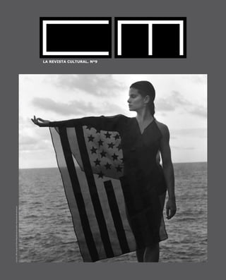
  • 1. LA REVISTA CULTURAL. Nº9 LisaLyon,1982copyright©RobertMapplethorpeFoundation.Reproducedwithpermission
  • 2. Acceso gratuito al centro y a las exposiciones Plaza de Weyler, 3 · Tel. 971 178 500 · www.laCaixa.es/ObraSocial Hasta el 10 de mayo
  • 3. M A R Ç 2 0 0 9 C U L T U R A M A L L O R C A 3 CM - Cultura Mallorca Fotografía: Tom Solo (portada), Patrick Parenteau, Brigitte Lucke, Victor Castells Avinyó Traducción: Judith Glueck Supervisión: Santiago Fabré de Balanzo, Christiane Nolte Colaboración: Aina Riera, Marga Melià, Josef Kiffmeyer, Teresa Ruiz de Apodaca, Michael Mittau, Santiago Stonelli Reservados todos los derechos, prohibida la reproducción total o parcial de los artículos, fotografías, ilustraciones y demas contenidos, sin permiso previo del editor. CM no se hace responsable de las opiniones de sus colaboradores ni se identifica con las mismas. Impressum: Dr. Brigitte Lucke – Editor Arquitecte Benassar 67 07004 Palma de Mallorca Tel. +34 971 20 60 47 • +637 516 492 info@culturamallorca.com www.culturamallorca.com Marketing Mallorca: Aina Riera 610 643463 Marketing Barcelona: Marga Melià Rigo 606091629 Webdesign: Michael Mittau Tel. +49 211 1588310 www.tech-nomades.de Diseño y maquetación: Anibal Guirado / Ramón Giner Tel. + 34 971 711559 / + 34 971 723172 ramon@gdos.net Impresión: BIG. Bahía Indústria Gràfica Deposito Legal: PM-2696-2006 METAPAISAJES Texto: Pau Waelder. Fotos: Fundación Pilar i Joan Miró a Mallorca BOTERO: UNA MIRADA DIFERENTE MARIO ELEFANTHELIADIS: EL PECADO SALVA BERNAT SANSÓ: OBRAS 1997-2007-09-11 Texto y fotos: Solleric ART AL CARRER: MANOLO VALDÈS A PALMA Texto: CAIXA-FORUM. Fotos: Patrick Parenteau …Y AL FINAL FUE MERZ Texto: Pilar Ribal / Foto: Patrick Parenteau DESPUÉS DE ERROR ENTREVISTA CON AMPARO SARD Texto: Aina Riera. Fotos: red. NACHO FRISUELOS: DE LA PINTURA COMO PAISAJE INFINITO Texto: Pilar Ribal. Fotos: Tom Solo LA DESCONSTRUCCIÓN DE LO COTIDIANO Texto: Marga Melia AGENDA LOCAL ARTISTA INVITADO: NACHO FRISUELOS / Foto: Tom Solo CUANDO LAS OBRAS SALEN DEL ESTUDIO SIENTO SU PERDIDA BIEL AMER EN CONVERSACIÓN CON PEP LLAMBIAS Fotos: red. SIN PIE DE PAGINA PINTORA Y GALERISA: MIQUELA NICOLAU Texto: red. Fotos: Victor Castells Avinyó CA N’ALLUNY: LA CASA DE ROBERT GRAVES Texto: Ca n’Alluny. Fotos: Patrick Parenteau STRUKTUR VISIONEN 07 SCHÜNO Texto: Red. Foto: Schüno AGENDA NACIONAL AGENDA INTERNACIONAL UN VERANO EN EL CINE Texto y fotos: Marga Melia EL ARTESANO DE LA NUEVA GASTRONOMÍA VICENTE FORTEA Texto: Teresa Ruiz de Apodaca RUTES SENDERISTES A MALLORCA: REFUGIS DE LA MUNTANYA Text i fotos: Jona Ramon Bosch Cerd LA ÚLTIMA PÁGINA: FOTOGRAFO INVITADO: PATRICK PARENTEAU (Vancouver) 6 10 12 14 16 18 21 22 24 26 28 30 32 35 36 38 40 42 44 47
  • 5. M A R Ç 2 0 0 9 C U L T U R A M A L L O R C A 5 CM , una revista independiente y trilingüe, se presenta desde hace más de tres años en España y Alemania, Suiza, Inglaterra, Irlanda, Estados Unidos, Canadá, Nueva Ze- landa y Hong Kong como un referente en la divulgación de la cultura contemporánea, con el objetivo de conectar con las vibraciones culturales más emergentes e intere- santes como de crear un vinculo entre los procesos creativos de múltiples artistas con nuestros lectores. En una amplia distribución en galerías, museos, fundaciones y ferias internacionales de arte contemporáneo, CM trabaja desde la aparente sencillez del blanco y negro para hacerte llegar las últimas reflexiones del panorama cultural. Con nombres como Mapplethorpe, Miroslav Tichy o Takashi Murakami os presenta- mos en este nuevo número las últimas exposiciones con críticas de arte, reflexiones y artículos que estamos seguros de que serán de vuestro interés. Así como los artistas invitados en esta nueva edición son los mallorquines Rafel Morey y Mónica Fuster. CM quisiera tener un feedback positivo con todos vosotros, para ir creciendo en base a vuestras críticas constructivas, por ese motivo, CM cuenta con un forum especializado en cultura accesible a través de nuestra pagina web: www.culturamallorca.com Quisiéramos aprovechar la ocasión para comentar nuestra grata sorpresa al en- terarnos de que CM tiene grandes seguidores que coleccionan los números an- teriores, que, o ya tienen la colección entera de la revista o nos van pidiendo algunos números para irla completando. Por último quisiéramos agradecer a todos nuestros lectores que desde un principio han compartido este nuevo reto editorial, el seguimiento que han hecho de la revista como las demostraciones de apoyo. Gracias por creer en la única revista especializada en arte contemporáneo de Baleares, que poco a poco irá rompiendo más y más barreras. Brigitte Lucke CM - Cultura Mallorca La revista cultural para Mallorca
  • 6. 6 C U L T U R A M A L L O R C A M A R Ç 2 0 0 9 Cristina Ros Salvà All works copyright © Robert Mapplethorpe Foundation. Qüestió de distànciesA question of distances
  • 7. M A R Ç 2 0 0 9 C U L T U R A M A L L O R C A 7 A Robert Mapplethorpe el miram amb els ulls de l’actualitat. Observar avui cadascuna de les seves fotografies, tot i conèixer la trajectòria vital i artística de qui ha restat com a mite de la revolució homosexual dels anys setanta i vuitanta als Estats Units, tot i que el sapiguem transgressor, provocador, amb un interès manifest per la celebritat, visionari pel que fa a l’art però també al mercat i, fins i tot, encara que el reconeguem en l’afirmació, realitzada per ell mateix, que era part de la cultura americana que li va ser contemporània, amb tot i això, les seves fotografies s’observen avui des de la distància que imposa el present. Els artistes i les obres són importants pel que significaren a la seva època, però també, tant o més, per la seva capacitat de suportar el pas de l’època, de les dècades, i fins i tot el pas de l’artista i de les seves revolucions. Les fotografies de Mapplethorpe, quan es compleixen dues dècades de la mort de l’artista, aguanten amb la mateixa força l’observació de l’actualitat. La distància que marca la caducitat dels calendaris no les ha engroguides. Més encara, una vegada que ha quedat enrere l’enrenou que produïren, quan ja no és possible interpretar-les com a crides d’atenció o com a camins marginals i escandalosos que havien de redundar en notorietat per a l’artista, els nus masculins, les escenes de sexe, els retrats o les llargues sèries de flors es defensen amb excel·lència per si mateixos. Salvada la distància entre l’actualitat i l’ahir de les obres, Mapplethorpe mateix en va marcar moltes altres, de distàncies, algunes més notòries que no d’altres. Millor dit, algunes han quedat escrites a la seva biografia i d’altres es poden llegir amb força claredat a les seves fotografies. No és el propòsit d’aquest article breu aprofundir en la biografia de l’artista, ni tan sols fer-ne una crònica de passada, tot i que fos per esmentar la distància establerta entre el camí emprès i l’educació tradicional i catòlica rebuda o, fins i tot, la distància, i més que distància, el trencament amb tants de prejudicis que respecte del sexe, la raça, el gènere o la religió mateixa hi havia tan sols fa trenta o quaranta anys. Cal destacar, això sí, la tasca de qui fou un esteta, un artista amb una enorme preocupació estètica, un home amb l’objectiu ferm d’anar a la recerca de la bellesa que emana o que es pot descobrir en els cossos animats i inanimats. Així que la distància és obligada si es persegueix la perfecció, per molt que l’artista s’apropàs als models, convisqués amb bona part d’ells o hi tengués relacions íntimes. El control de la imatge fins a l’obsessió per la perfecció tècnica i/o la de qualsevol dels elements i detalls que intervenen a l’obra l’obliga a allunyar-se de l’objecte, sia aquest un tros de pa, sia un gerro amb una flor, sia un penis, un tors, un home o una dona. No es tracta d’una distància física, sinó d’una distància psicològica, una manera de mirar des de fora, per poder analitzar, calcular i controlar. Robert Mapplethorpe ho deia i ho repetia, que ell no deixava res a l’atzar. El fotògraf, eminentment fotògraf d’estudi, semblava trobar-se bé sobretot a l’espai i amb les persones i els objectes que ell podia dominar des del principi a la fi. També amb els processos, tot i la investigació. Controlava al mil·límetre les composicions, les proporcions, els equilibris, els enfocaments, el blanc i negre, les ombres i la llum, les postures dels cossos, les actituds, les textures de les pells, el color quan el va fer servir, tot allò que havia d’entrar en We view Robert Mapplethorpe through the eyes of the present. Even though one is aware of the biography and art of a mythical figure in the gay revolution of the 1970s and 80s in the US, even though one knows him to have been transgressive, provocative, markedly interested in celebrity, a visionary with respect to art but also with respect to the market, and even though one recognises him in the statement he made about himself - that he was a part of his own contemporary American culture – still, his photographs are viewed today from the distance imposed by the present. Artists and works are important for what they mean in their day, but also, as much or more so, by their capacity to bear the passing of that day, of decades and even of the artist and his revolutions. Two decades after Mapplethorpe’s death, his photographs can still bear today’s gaze with the same forcefulness. The distance that marks the lapsing of calen- dars has not aged them. What’s more, the noise they produced has all been left behind, now that it is no longer possible to interpret his works as attention-seeking or marginal and scandalous pathways intended to make the artist notorious; the male nudes, the sex scenes, the portraits or long series of flowers are defences in themselves par excellence. Aside from the distance between the yesterday and today of his works, Mapplethorpe him- self marked many other distances, some more famous than others. Some have remained
  • 8. 8 C U L T U R A M A L L O R C A M A R Ç 2 0 0 9 la fotografia i tot el que hi havia de quedar a fora. Perseguia la perfecció fins a l’eliminació dels defectes. I tot aquest control és fruit d’una distància que l’artista s’havia d’imposar respecte de la pròpia obra. Més enllà del sexe, de la raça i del gènere, el cos humà es torna, d’aquesta manera, pura forma, una forma eminentment bella quan passa per l’ull de Mapplethorpe, que a més tenia ull per triar cossos extraordinaris. El mateix passa amb les orquídies, els lliris xinesos o les tulipes, que es retorcen, es tanquen o s’obren insinuants, com si fossin cossos, formes belles i, per tant, igualment desbordants d’erotisme. Figures animades que es converteixen en figures inanimades del tot sotmeses a l’artista. Es converteixen en escultures, molt més suggerents per la forma que no perquè l’artista intenti extreure el foc de cap ànima que hi pogués habitar a dintre. Contràriament, quan fotografia estàtues, en una reconeguda sèrie, sembla perseguir-ne l’expressió, com si volgués animar aquelles figures clàssiques de marbre o bronze i convertir-les en éssers dotats de a part of his written biography and others can be very clearly read in his photographs. This brief article does not intend to delve into the artist’s biography, not even to suc- cinctly chronicle it, although it must men- tion the distance between the path he took and the traditional, Catholic education he received and even the distance - or rupture rather than distance - from the many preju- dices about sex, race, gender and religion itself that existed only thirty or forty years ago. Yet, it does indeed propose to highlight the work of a man who was an aesthete, an artist with an enormous aesthetic sense, a man with an unyielding goal: to seek the beauty that emanates or can be discovered in animate and inanimate bodies. So distance is obligatory when one pur- sues perfection and this is true no mat- ter how close the artist gets to his mod- els, no matter whether he lives with or maintains intimate relations with a good many of them. Controlling an image to the point of obsessing over technical per- fection and/or any element or detail that intervenes in a work forces an artist to distance himself from the object, be it a chunk of bread, a vase with a flower, a penis, a torso, a man or a woman. This is not a physical, but rather a psycho- logical distance, a way of looking at the object from the outside so as to be able to analyse, calculate and control it. Rob- ert Mapplethorpe said it on many occa- sions: he left nothing to chance. An emi- nently studio photographer, he seemed to be comfortable in a space and with people and objects he could dominate from start to finish; beyond the research he conducted, the same thing was true of his processes. He controlled down to the millimetre his compositions, propor- tions, balances, approaches, blacks and whites, lights and shadows, positions of bodies, focuses, skin textures, colour when he used it - everything that was al- lowed to come into the photograph and everything that remained outside. He pursued perfection until all flaws were removed. And all this control was the fruit of a distance from the work itself that the artist was forced to impose upon himself. After passing through Mapplethorpe’s eye, which was also adept at choosing extraor- dinary bodies, the human body thus became pure, an eminently beautiful shape beyond sex, race or gender. The same thing can be said about the orchids, Chinese lilies and tulips that twist, close or open insinuatingly, as if they were bodies, beautiful shapes that are therefore equally overflowing with eroticism. Animated figures that become inanimate and absolutely submissive to the artist’s will. They become sculp- tures, much more suggestive because of their shapes than because of the artist’s attempts to extract the fire of a soul that may dwell within. To the contrary, when he was photographing statues in an acclaimed series, Mapplethorpe seemed to pursue their expression, as if he wanted to animate those classic marble and bronze figures
  • 9. M A R Ç 2 0 0 9 C U L T U R A M A L L O R C A 9 vida i sentiments, tots aquells sentiments que, moltes vegades, no trobam a les fotografies realitzades als seus amics, amigues i amants. Fotògraf de temes clàssics i a la recerca de la perfecció, revolucionari en el context sociopolític que li va tocar viure, Mapplethorpe, per la seva manera de mirar i d’interpretar les formes i, entre altres aspectes, també per fer a través del conjunt de la seva obra una mena de diari de les pròpies vivències i reivindicacions, és un dels grans precursors de la fotografia artística que domina la proposta contemporània. Vist des de la distància que ofereix el pas de dues dècades després de la seva mort, el 9 de març de 1989, l’obra de Robert Mapplethorpe esdevé encara més forta. and turn them living, feeling beings, endowed with all the feelings that are lacking on many occasions in the photographs taken of his friends and lovers. Photographer of classic themes in search of perfection, revolutionary within the socio- political context of his day, Mapplethorpe’s way of viewing and interpreting shapes and making a kind of diary of his own experiences and demands through his oeuvre made him one of the great precursors of the contemporary art photography scene. Viewed from the distance offered by the passing of two decades after his death on March 9, 1989, Robert Mapplethorpe’s work is now even stronger.
  • 10. 10 C U L T U R A M A L L O R C A M A R Ç 2 0 0 9 An exhibition with works by Anselm Kiefer always poses a very special challenge to the observer, the curator and naturally, the collector as well. The artist’s works display such a wide variety in terms of the interpretation of the world and the depiction of the inconceivable, of the paradox, replete with illustrative metaphors and allegorical worldly landscapes, that approaching and contemplating them must be understood as a provocation to knowledge itself and one’s own capacity for perception - all this within a context with an impressive dimension and an aesthetic indelibly stamped on the ob- server’s view through a symbiosis between materiality and painting. Thus, Kiefer’s work is an on-going challenge to the senses and the spirit. Yes, we recognise everything we see, yet does that mean we have already grasped it? When collector Hans Grothe became familiar with Anselm Kiefer’s works in the mid- 1980s, he could not resist them and began to devote himself to them with the cor- responding consequences. He has compiled a considerable collection of twenty-five works from the score of years that stretch from 1989 to today. At first, the collector Una exposició amb obres d’Anselm Kiefer sempre és un desafiament molt especial, per a l’observador, el curador i naturalment també per al col·leccionista. Les obres de l’artista presenten tanta varietat quant a la interpretació del món i la plasmació de l’inconcebible, de la paradoxa, ple de metàfores il·lustratives i paisatges al·legòrics del món, que s’ha de comprendre l’aproximació i contemplació de l’obra com a provocació del propi saber i de la pròpia capacitat de percepció. Tot això dins el context d’una dimensió impressionant i una estètica, que es grava de forma inoblidable dins la visió de l’observador, mitjançant una simbiosi entre materialitat i pintura. L’obra de Kiefer és d’aquesta manera el continu desafiament dels sentits i de l’esperit. Sí que reconeixem tot allò que veiem, però vol dir que per això ja ho comprenem?  El col·leccionista Hans Grothe no s’hi va poder resistir, quan a mitjans dels anys 80 va conèixer les obres d’Anselm Kiefer i va començar a dedicar-se a elles, amb les conseqüències corresponents. Es va reunir una col·lecció considerable d’unes 25 obres dels vint anys que van de 1989 a avui. El col·leccionista al primer intent no va comprendre Anselm Kiefer Walter Smerling. President de la Fundació per a l’Art i la Cultura Fotos: Es Baluard
  • 11. M A R Ç 2 0 0 9 C U L T U R A M A L L O R C A 11 did not understand the early paintings, the origin of the Grothe collection, Lilith and The Big Freight. Yet, his fascination was so great that he wished to comprehend them and finally acquired them. This phenomenon has accompanied Grothe until today: “I identify what I see, although I do not understand it, and interpret it in a direction dif- ferent from the one Kiefer insinuates.” This, together with his fascination for Kiefer’s painting, as opposed to Keifer’s oeuvre as a whole, has captivated Grothe and is the only explanation behind the collector’s motives for separating himself from a large part of his complete and considerable collection of German contemporary art, with exception of Anselm Kiefer’s work, in mid-2005. Unlike the widely-held opinion that Kiefer is first a German painter who devotes himself primarily to German history, the Grothe Collection provides a different view. Grothe began to collect Kiefer when the latter was taking his leave of Germany, significantly through the work Census in the Magiciens de les terres exhibition. Sixty million peas, strung up and incrusted in lead strips and placed in an ordinary, everyday container oc- cupied by the monster Leviathan, which symbolised an entire nation’s political stance - paradoxical, disquieting and alarming all at the same time. This confrontation would be decisive in the German collector from Duisburg’s subsequent actions. Upon observing the selection in Es Baluard, it can be seen that overcoming Germany’s past, although exhibited in a particular form, does not represent the centre of Kiefer’s attention. Le voyage au bout de la nuit, Schwarze Flocken [Black Flakes], Die Grosse Fracht [The Big Freight], Shevirat HaKelim [The Breaking of the Vessels] and the stel- lar paintings For Robert Fludd: the Secret Life of Plants are testimonies to the poetic and philosophical culture of the work by this German artist who has settled in France. The twenty works on display at Es Baluard were largely produced outside of Germany, concretely in the southern French town of Barjac and in Paris. Perhaps that is why the works convey a new view of the complexity of artistic thought and action. Moreover, the pathos in Kiefer’s work, described on numerous occasions, appears strangely truncated, withdrawn and neutralised. The collection makes an impression without overpowering the spectators and invites them to an analytical reflection. To a large degree, Kiefer’s work reflects that which is extraordinarily important to the artistic and intellectual debate in Europe and many other parts of the world. els primers quadres, l’origen de la col·lecció Grothe, Lilith i Gran carregament. Això no obstant, va quedar tan fascinat que els volia comprendre i finalment els va comprar. Es tracta d’un fenomen que acompanya el col·leccionista fins avui: “Identific allò que veig, encara que no ho comprenc i que ho interpret en una altra direcció que la insinuada per Kiefer.” Aquest fet, juntament amb la fascinació per la pintura de Kiefer, captiven Grothe de cara a la obra global de Kiefer. És l’única explicació de perquè el col·leccionista a mitjans de l’any 2005 es va separar de gran part de la seva col·lecció completa i considerable d’art contemporani alemany, a excepció de les obres d’Anselm Kiefer. A diferència de l’opinió habitual de què Kiefer sigui en primer lloc un pintor alemany que es dedica principalment a la història alemanya, la col·lecció Grothe proporciona una visió diferent. Grothe va començar la col·lecció Kiefer, quan aquest s’estava acomiadant d’Alemanya, de forma significativa mitjançant l’obra Cens nacional a l’exposició Magieciens de les terres. 60 milions de pèsols, enfilats i incrustats dins tires de plom, ficades dins un contenidor normal i corrent, ocupat pel monstre Leviatan, simbolitzant la postura política de tota una nació. Va ser paradoxal, inquietant i alarmant a la vegada. Per al col·leccionista alemany de Duisburg, aquesta confrontació seria decisiva per a la seva actuació posterior. A l’hora d’observar la seva selecció a Es Baluard, es pot contemplar que per a Kiefer la superació del passat alemany, encara que exposat de forma característica, no representa el centre de la seva atenció. Dominen més bé els temes del cristianisme jueu, temes mitològics i polítics. Le voyage au bout de la nuit,  Flocs negres, Gran carregament, She berat Hakelim i els quadres estel·lars Secret life of plants for Robert Fludd, són testimonis de la cultura poètica i filosòfica dins l’obra de l’artista alemany establert a França. Les 20 obres mostrades a Es Baluard són en gran part produïdes fora d’Alemanya, concretament al poble del sud de França Barjac i a París. Tal vegada per aquest motiu les obres transmeten una nova visió de la complexitat de l’acció i el pensament artístic. A més, el pathos dins les obres de Kiefer, descrit en nombroses ocasions, apareix estranyament trencat, replegat i neutralitzat. La col·lecció impressiona sense apoderar-se de l’observador i convida a una reflexió analítica. Les obres de Kiefer reflecteixen en gran mesura allò que per a la discussió artística i intel·lectual, a Europa i a moltes altres parts del món, té una importància extraordinària
  • 12. 12 C U L T U R A M A L L O R C A M A R Ç 2 0 0 9 Las palabras de un rebelde e inconformista quien ha sido confrontado con una fama repentina a la edad de 79 años, cuando su trabajo fue exhibido por primera vez en “Kusthaus Zürich” en el 2005 y celebrado en el Centro Jorge Pompidou en una gran retrospectiva en el 2008; una fama que nunca buscó y que no le importa para nada. La biografía de Miroslaw Tichy esta en la línea de la carrera de muchos artistas en países pertenecientes al Pacto de Varsovia. Nacido en Checoslovaquia en 1926, cuando era niño demostró un inmenso interés por el dibujo y se convirtió en estudiante de la Academia de las Artes en Praga. Pasó años en prisión y en hospitales mentales y durante décadas vivió retraído y aislado en su pueblo natal de Kyiov. Allí encontró su nicho, viviendo como un paria, como alguien que no pertenece a ningún lugar, permitiéndole una cierta libertad y una vida autodeterminada. Él observó el mundo que le rodeaba a través de las lentes de sus cámaras caseras; un mundo, que él cree ser sólo una idea, que sólo existe tan allá como lo percibimos. Durante cuatro décadas caminaba por las mismas calles y alrededor de los mismos lugares, equipado con su cámara, que casi siempre escondía bajo su jersey. Tomó cientos de fotos cada día, revelándolas más tarde en su humilde estudio y colgando los negativos a secar en su patio trasero. La mayoría de sus fotos son imágenes de mujeres un tanto fuera de foco. Son muy atractivas y a primera vista parecen ser del siglo 19; no del siglo 20. Y es este sentido atemporal y esta falta de perfección que hacen que las imágenes parezcan poéticas y bastante místicas. Son como el largo diario de una persona que siempre se mantuvo al borde de la escena; sin nunca interactuar. A veces podemos ver una mirada, o una sonrisa o hasta un adiós con la mano; la mayoría de sus imágenes son tomadas desde una posición de observación, desde un lugar escondido. La característica esencial de su obra no es la perfección o documentación, sino su respeto y profundo amor por las mujeres como seres humanos preciosos; aunque él mismo lo rechazaría. Tal vez, dentro de esta actitud de escepticismo convencido, este impulso lo mantuvo vivo. The words of a rebel and non-conformist who has been confronted with sudden fame at the age of 79 when his work was shown for the first time in “Kusthaus Zürich” in 2005 and celebrated at the George Pompidou Centre in a large retro- spective in 2008; a fame he was never looking for and doesn’t care about at all. Miroslaw Tichy’s biography reads like many artists’ careers in countries belong- ing to the former Warsaw Pact. Born in Czechoslovakia in 1926 he showed an immense interest in drawing as a child and became a student at the Academy of Arts, in Prague. He spent years in prison and mental hospitals and lived for decades withdrawn and isolated in his hometown of Kyiov. There he found his niche living as an outcast, as someone who belongs to no- where, allowing him a certain kind of freedom and a self-determined life. He observed the world that surrounded him through the lenses of his homemade cameras; a world, that he believes to be only an idea, that only exists so far as we perceive it. For four decades he was walking the same streets and around the same places, equipped with his camera, which he mostly hid under his jersey. He took hun- dreds of photos each day, developed them later at his modest studio and hung the negatives in his backyard to dry. Most of his photos are slightly out of focus images of women. They are very ap- pealing and at first glance look to be from the 19th; not the 20th century. And it is this timelessness and lack of perfection that makes the images appear poetic and rather mystical. They read like the long diary of a person who always kept on the border of the scene; without ever interacting. Sometimes we can see an eye contact, a smile or even a wave; most of his images are taken out of an observing position, from a hidden place. The essential characteristic of his work is not in perfection or documentation, but his respect and deep love of women as beautiful human beings; even if he himself would reject this. Maybe, within this attitude of convinced scepticism, this impulse kept him alive. Miroslav Tichy “Si quieres ser famoso, tienes que ser el peor en algo que nadie más en el mundo” Miroslav Tichy “If you want to be famous, you have to be worse at something than everyone else in the world” Miroslav Tichy ??????????????????? Cortesia: Roman Buxbaum 2006, Mirislav Tichy , Tazan Retired. Film by Roman Buxbaum
  • 13. M A R Ç 2 0 0 9 C U L T U R A M A L L O R C A 13
  • 14. 14 C U L T U R A M A L L O R C A M A R Ç 2 0 0 9 “Soy un abservador. “ “I am an observer.” “Todo cuanto existe es el mundo! Y cuando una parte de ella se volvió reco- nocible lo imprimí.” “Everything that exists is the world! And if some of it be- came recognizable, I printed it.” “Reconocemos únicamente aquello que podemos, y queremos reconocer.” “We recognize only which we can and want to recognize.” “De todas formas, el mundo no es más que una aparencia, una illusion.” “The world is anyway nothing but an appearance, an illusion.” “Todo lo decide la tierra, que está girando.” “Everything is decided by the earth which is turning.” “Las imperfecciónes forman parte de ella. Esa es la poesía.” “The flaws arte part of it.That’s the poetry.” “La fotografía es percepción. Los ojos – aquello que ves. Y ocurre tan de prisa. !I que a lo major no ves absolutamente nada!” “Photography is perception. The eyes, you see with. And it happens so fast that you may not see anything at all.”
  • 15. M A R Ç 2 0 0 9 C U L T U R A M A L L O R C A 15 “La fotografía significa pintar con la luz.” “Photography means painting with light.” “Nunca he hecho más que dejar que el tiempo pase. Voy al pueblo y debo hacer algo más que solo dar un paseo. Así simplemente apretaba el botón.” “I have never done anything beyond letting time pass by. I go to town and must do something, rather than just talk a walk. So I was simply pressing the release.” “La fotografía es una cosa concreta.” “Photography is something concrete.” Yo no seleccioné nada. Examiné el material bajo la ampliadora. Y todo lo que me parecía en algo al mundo, lo imprimí.” “I did not select anything. I looked at the stuff under the enlarger, and whatever seem to bear resemblance of the word, I printed.”
  • 16. 16 C U L T U R A M A L L O R C A M A R Ç 2 0 0 9 SOLLERIC
  • 17. M A R Ç 2 0 0 9 C U L T U R A M A L L O R C A 17 Cadàver exquisit (Exquisite corpse) is a display proposal that integrates artists from different generations and very different styles. Exquisite corpse is a technique that allows a group of words or images to be put together as a group; the result is known as an exquisite corpse or cadavre exquis in French. Used by the surrealists around 1925, its inspiration comes from an old table game called “consequences”, in which the players wrote on a sheet of paper in turns, folded it to hide the writing and then they passed it on to the next player, for another collaboration. The name derives from a phrase that came up the first time it was played in French: Le cadavre / exquis / boira / le nouveau / vin (The corpse / exquisite / will drink / the new / wine). The theorists and promoters of this creative strategy (initially Robert Desnos, Paul Eluard, André Bretón and Tristan Tzara) postulated that creation, especially poetic or expressive creation, should be anonymous and collaborative, intuitive, spontaneous, recreational and, if possible, automatic. Eighty years later, cadavre exquis still preserves all its creative potential. For this reason, a creation of a new exquisite cadaver is proposed, with the collaboration of the following artists: Steve Afif, Josep Maria Alaminos, Amador, Rafael Amengual, Mateu Bauzà, Erwin Bechtold, Joan Bennàssar, Pere Bennàssar, Rafel Bestard, Jim Bird, Maria Carbonero, Maria Catalán, Pep Coll, Astrid Colomar, Joan Costa, Cristina Escape, Ñaco Fabré, Marian Femenías Moratinos, Paca Florit, Pep Guerrero, Gilbert Herreyns, Enric Irueste, Ellis Jacobson, Mercedes Laguens, Alícia Llabrés, Antoni Llabrés, Pep Llambías, Eugenio López, Joan March, Teresa Matas, Mariano Mayol, J.M. Menéndez Rojas, Maria Antònia Mir, Pepe Nebot, Ángel Pascual Rodrigo, Ra- fel Perelló, Cris Pink, Alceu Ribeiro, Enric Riera, Dolores Sampol, Lourdes Sampol, Àngel San Martín, Bernat Sansó, Horacio Sapere, Amparo Sard, Tòfol Sastre, Juan Segura, Joan Soler Rebassa, Andreu Terrades, Vicenç Torres, Rafel Tur Costa, Tomeu Ventayol and Amable Villarroel. The Cadàver exquisit exhibition – that has been in Ses Voltes from January 8 to Fe- bruary 8– is a coproduction that is part of the Projecte Llevant, thanks to which it has been possible for exhibitions of great quality to be carried out, and be presented in different exhibition halls in Majorca, Menorca and Ibiza. All the productions in this project have also been presented in Barcelona, and some of them in Bremen and Lüberg (Germany), in Moscow (Russia) and in Saragossa, amongst others. The Go- vernment of the Balearic Islands, the Consell de Mallorca, the Ajuntament de Palma and “Sa Nostra” Caixa de Balears have contributed to the now travelling exhibit. 53 artists for an “exquisite corpse” ?????????????????? Cadàver exquisit (Exquisite corpse) is a display proposal that integrates artists from diffe- rent generations and very different styles. Exquisite corpse is a technique that allows a group of words or images to be put together as a group; the result is known as an exquisite corpse or cadavre exquis in French. Used by the surrealists around 1925, its inspiration comes from an old table game called “consequences”, in which the players wrote on a sheet of paper in turns, folded it to hide the writing and then they passed it on to the next player, for another collaboration. The name derives from a phrase that came up the first time it was played in French: Le cadavre / exquis / boira / le nouveau / vin (The corpse / exquisite / will drink / the new / wine). The theorists and promoters of this creative strategy (initially Robert Desnos, Paul Eluard, André Bretón and Tristan Tzara) postulated that creation, especially poetic or expressi- ve creation, should be anonymous and collaborative, intuitive, spontaneous, recreational and, if possible, automatic. Eighty years later, cadavre exquis still preserves all its creative potential. For this reason, a creation of a new exquisite cadaver is proposed, with the collaboration of the following artists: Steve Afif, Josep Maria Alaminos, Amador, Rafael Amengual, Mateu Bauzà, Erwin Bechtold, Joan Bennàssar, Pere Bennàssar, Rafel Bestard, Jim Bird, Maria Carbonero, Maria Catalán, Pep Coll, Astrid Colomar, Joan Costa, Cristina Escape, Ñaco Fabré, Marian Femenías Moratinos, Paca Florit, Pep Guerrero, Gilbert Herreyns, Enric Irueste, Ellis Ja- cobson, Mercedes Laguens, Alícia Llabrés, Antoni Llabrés, Pep Llambías, Eugenio López, Joan March, Teresa Matas, Mariano Mayol, J.M. Menéndez Rojas, Maria Antònia Mir, Pepe Nebot, Ángel Pascual Rodrigo, Rafel Perelló, Cris Pink, Alceu Ribeiro, Enric Rie- ra, Dolores Sampol, Lourdes Sampol, Àngel San Martín, Bernat Sansó, Horacio Sapere, Amparo Sard, Tòfol Sastre, Juan Segura, Joan Soler Rebassa, Andreu Terrades, Vicenç Torres, Rafel Tur Costa, Tomeu Ventayol and Amable Villarroel. The Cadàver exquisit exhibition – that has been in Ses Voltes from January 8 to February 8– is a coproduction that is part of the Projecte Llevant, thanks to which it has been possi- ble for exhibitions of great quality to be carried out, and be presented in different exhibition halls in Majorca, Menorca and Ibiza. All the productions in this project have also been presented in Barcelona, and some of them in Bremen and Lüberg (Germany), in Moscow (Russia) and in Saragossa, amongst others. The Government of the Balearic Islands, the Consell de Mallorca, the Ajuntament de Palma and “Sa Nostra” Caixa de Balears have contributed to the now travelling exhibit. Part of the exhibition “Exquisite corpse”, with works by Astrid Colomar, Cris Pink, Alícia LLabrés, Joan March, Joan Ben- nàssar, Cristina Escape, Pep Guerrero and Amparo Sard. >>>>> (See photo second series corpse.jpg)
  • 18. 18 C U L T U R A M A L L O R C A M A R Ç 2 0 0 9 La present exposició, amb caràcter retrospectiu i que romandrà en exhibició en la Planta Noble del Casal Solleric fins a finals de març, proposa una exhaustiva aproximació al treball de qui és considerant un dels noms essencials dins l’àmbit de l’escultura contemporània a les Illes Balears, i s’articula a partir de quatre nuclis te- màtics que inclouen obres de la seva etapa inicial, així com de les sèries Ferro-testes, Animals en acció i Homenatge a l’arquitectura, que en el seu conjunt permeten conèixer la seva evolució estilística. De formació autodidacta, Antoni Ferragut (Cartagena, Múrcia, 1946, i resident a Mallorca des del 1948) col·laborà en els seus inicis amb el Centre d’Investigacions i Activitats Artístiques de Xavier Corberó a Esplugues (Barcelona). Bona part de la seva producció pot ubicar-se dins l’àmbit de l’abstracció, encara que sovint s’hi de- tecten referències figuratives, algunes de caràcter zoomòrfic. El ferro s’ha configurat com un dels seus materials predilectes, i ha treballat també l’acer, el metacrilat, la fusta, el marbre i el bronze, entre d’altres. Són característiques les seves formes estilitzades i contundents, plenes de dinamisme, amb les quals aconsegueix acotar de manera sensual l’espai i el buit, presents sempre en el rere- fons conceptual de tota la seva obra. Ha realitzat obres en col·laboració amb importants arquitectes, alhora que cal des- tacar també la presència de les seves escultures monumentals a diferents indrets públics i privats de l’illa. El Casal Solleric revisa l’obra d’Antoni Ferragut ?????????????????? The present exhibition, with a retrospective character, that will be on display in the Planta Noble of the Casal Solleric until the end of March, proposes a thorough approximation to the work of who is considered one of the principal names in the field of contemporary sculpture in the Balearic Islands, and it focuses around four main themes, that include works from the first stages, as well as from the series Ferro-testes, Animals en acció i Homenatge a l’arquitectura, that as a whole show the evolution in his style. As a self-taught person, Antoni Ferragut (Cartagena, Murcia, 1946, and a re- sident in Mallorca since 1948) collaborated, in his first stages, with the Centre d’Investigacions i Activitats Artístiques de Xavier Corberó in Esplugues (Barcelona). Most of his work can be categorized under the area of abstraction, though often, figurative references can be detected, some of a zoomorphic character. Iron has become one of his favourite materials, and he has also worked with steel, methacrylate, wood, marble and bronze, amongst others. His stylized and blunt shapes, full of dynamism, through which he manages to delimit space and empti- ness, always present in the conceptual background of his work are typical. He has worked alongside important architects, and we must also point out the presence of his monumental sculptures in different public and private places on the island. Antoni Ferragut. Llevant, 1984 Ferro 50 x 45 x 35 cm (Fotografia Joan-Miquel Ferrà)
  • 19. M A R Ç 2 0 0 9 C U L T U R A M A L L O R C A 19 Germán Gómez (Gijón, 1972), guardonat amb el Premi Revela- ció PhotoEspaña’08 –dotat amb 10.000 euros i que reconeix el tre- ball d’un fotògraf espanyol, menor de 35 anys–, presenta fins el pròxim 5 d’abril la instal·lació titulada Con- denados a l’Espai Quatre del Casal Solleric. La crítica ha coincidit a destacar el treball de Germán Gó- mez com el d’un artista que extreu de la memòria individual les refe- rències que li permeten interpretar les seves incerteses, enyorances i contradiccions. La sèrie d’obres que sota el títol de Condenados presenta ara a Palma resumeix el marcat caràcter autobiogràfic de la seva obra. La seva trajectòria ha consolidat l’obra d’un creador obs- tinat a comunicar quelcom distint cada vegada sense deixar de ser recognoscible sempre. En conjunt, el projecte que ara pre- senta l’Espai Quatre del Casal So- lleric, Condenados, neix de l’estada del seu autor a la capital d’Itàlia, becat per l’Acadèmia d’Espanya a Roma, on es va proposar traslladar al discurs contemporani els personatges de l’Infern de la Capella Sixtina. De fet, l’ar- tista de Gijón va partir de la figura de Miquel Àngel per elaborar una paràbola entorn de determinades “ferides històriques” derivades de la identitat i les seves contradic- cions. Per a això “va aïllar” algunes de les figures dels frescs de la Capella Sixtina i posteriorment va fotografiar, amb les mateixes poses, persones que sofreixen en vida el rebuig social per ser “diferents”: ja sigui per la seva raça, orientació sexual, pensa- ment, malaltia, minusvalidesa... En paraules de Germán Gómez, aquesta mostra “vol ser un humil homenatge a tots els que neixen condemnats”. Des d’aquesta perspectiva, l’autor assumeix que la seva obra fotogràfica es nodreix de contradiccions i mitjançant aquesta sèrie –i altres com Fichados-Tatuados, Gale- ria Fernando Pradilla, Madrid, 2008– construeix un gran al·legat artístic, una aguda reflexió entorn del “rebuig” al llarg de la història, al mateix temps que continua amb el relat del seu treball, en gran mesura autobiogràfic, exhibint-lo en una sala sota terra –l’Espai Quatre–, la qual cosa converteix el muntatge en un nou i metafòric descens als inferns, on es posen de manifest postures inquietants en aquests rostres i figures que s’entrecreuen lluitant, debatent-se entre el cel i la terra, formant un gran bloc mai perfecte i sempre ferit, marcat, compost, dibuixat... La comissària de l’Espai Quatre, Neus Cortés, ha avançat els noms dels artistes que realitzaran instal·lacions en el petit soterrani del Casal Solleric aquest any, entre els cuals destaca el nom de Esther Ferrer, guardonada amb el Premi Nacio- nal d’Arts Plàstiques 2008. José Maldonado, José Ramón Amondarain i Sáncherz Castillo són els altres artistes seleccionats per a intervenir en el Espai Quatre al llarg d’aquest any. Germán Gómez, guardonat amb el Premi Revelació PhotoEspaña’08, exposa a l’Espai Quatre del Casal Solleric ?????????????????? Germán Gómez (Gijón, 1972), awarded the Revelation Prize in PhotoEspaña’08 - a prize of 10,000 euros and recognizing the work of a Spanish photographer less than 35 years of age - presents until next April 5th at Casal Solleric’s Espacio Cuatro an installation titled Condenados (Condemned). Critics have coincided in praising Germán Gómez’s work as that of an artist who can extract from an individual memory, the references that allow him to interpret his uncertainties, yearnings, and contradictions. The series of works presented now in Palma under the title, Condenados, summarizes the marked, autobio- graphical character of his work. His trajectory has consolidated the work of a creator tenaciously attempting to communicate something differ- ent each time while always remain- ing recognizable. As a collection, the project he now presents at Casal Solleric’s Espacio Cuatro, Condenados, is born out of the author’s stay in the capital of Italy, sponsored by the Spanish Academy in Rome, where he proposed translating the contemporary discourse of hell’s characters in the Sistine Chapel. In fact, the artist from Gijón stems from Michael An- gelo’s figure to elaborate a parable around certain “historical wounds” derived from the identity and its contradictions. For this he “isolated” some of the figures from the frescos in the Sistine Chapel and later photographed, with the same poses, people who suffer in their lives from social rejection for being “different”: be it for their race, sexual orientation, thoughts, illness, handicap… In the words of Germán Gómez, this show “wants to be a humble homage to all those who are born condemned”. From this perspective, the author assumes that his photographic work is nurtured by contradictions and through this series - and others like Fichados-Tatuados (Caught-Tat- tooed), Fernando Pradilla Gallery, Madrid, 2008 - he constructs a great artistic allegory, an acute reflection as to “rejection” throughout history, at the same time continuing his work’s story, in large part autobiographical, exhibiting it in an underground hall - Espa- cio Cuatro -, which turns his work into a new montage and a metaphorical descent into hell, where worrying postures in these faces and figures that are interlaced fighting are manifested, debating themselves between heaven and earth, forming a great block, never perfect and always wounded, marked, complex, drawn… Espacio Cuatro’s commissioner, Neus Cortés, has advanced some of the names of the artists that will be presenting their installations in the small basement of the Casal Solleric this year, of which the name of Esther Ferrer, awarded the National Visual Arts Prize 2008, stands out. José Maldonado, José Ramón Amondarain and Sáncherz Castillo are some of the other artists selected to take part in Espacio Cuatro throughout this year. Germán Gómez. CONDENADO RETRATO IX, 2008. Fotografia de color i fil, 100 x 100 cm, peça única.
  • 20. 20 C U L T U R A M A L L O R C A M A R Ç 2 0 0 9 John Ulbricht, one of the most gifted painters in acquired culture in the world to- day, shows the head almost human in his portraits, but only the head, as the only home for homogeneousness, in order to evidence the Face of Time embodied and already personified. For Ulbricht, the technique of imagining Time in a significant manner, as a step and character of the Face, consists of identifying white Space’s material, barely clayey, with the material almost golden, desolate, from the characteristics that make up the mysterious biology of character. More specifically: a zone within the Space has concentrated and accumulated enough cosmic energy so that, from the comprehension and internalization of the material, the Face’s definitive John Ulbricht, uno de los pintores más dotados de cultura adquirida, que hoy existen en el mundo, en los retratos presenta la cabeza llegada a humana, pero sólo la cabeza, como único hogar de la hominización, para hacer evidente el Rostro del Tiempo encarnado y ya personal. La técnica para dar una significativa figuración del Tiempo, como paso y carácter del Rostro, consiste para Ulbricht en identificar la materia del Espacio blanco, ar- cilloso con lejanía, con la materia casi dorada, asolada, de los rasgos que arman el misterio biológico del carácter. Más concretamente: una zona del Espacio ha concentrado y acumulado suficiente energía cósmica para que, de la compren- sión e interiorización de la materia, naciera el Instante definitivo del Rostro, que JOHN ULBRICHT Extract from a Blai Bonet text
  • 21. M A R Ç 2 0 0 9 C U L T U R A M A L L O R C A 21 Instant could arise, reflecting and mirroring the warm colour of the lands of the Earth. The popular expression “the face of the earth” deeply defines the being in Ulbricht’s unrepeatable portraits. In some of those “facies” of Space, Picasso’s for example, they not only portray the head’s roundness and warmness, but the painting expresses the agitated biology and biography of temporality’s Face and life’s moons instilled in Picasso. In the continuation of that act of drawing cracks in the universe’s skin, which is the portrait of total Space and of personal Time, Ulbricht, in the last portraits and paintings of 1973, has found new elements to achieve the birthing of the Face of Space: in the portrait of the American author, friend to the poet Dylan Thomas, Ruthven Todd, the presentation of the biography and the character’s biography is carried out by two proper elements of individuality’s intra history portrayed, but that the author, in his eagerness to turn each frame into a unique work, makes present in the form of expressions external to the Face of Time: the darkening of the existential material of the individuality is thrown at Space’s whiteness, which is left greenish, blackened, earthy and muddied hominy. And the face was left this way, translucent, oxygen coloured, the hair portrayed in its reality of flaps of smoke with fog… And, instead of the Look, the glasses’ objectivity presented as dead nature, an optical still life about the Face which says “always tomorrow, and never do we morrow.” The portrait of an intellectual girl with our time’s fury at the ready, is the investitu- re of an arrested whirlwind, dark, greenish with brown areas, very visible stirring lines from the brush’s bristles, where the Space and the concentration of its matter in the head’s Time are a proper dark green fiery treatment. The darkened tongue and groove, not dark, of Space and of Time are here a compactness and almost union, only broken deliberately by the hanging threads, employed as a plastic part of the canvas, which threatened with bad weather, with storm… As in Ruthven Todd’s portrait, the strong accent was, is, in the still life of the glasses over the still living nature within the pale eyes, the deep portrait the girl is in the supreme find, delicate, tragic, of the pale, cyclamen coloured lips, which, within a few centimetres of high paint, synthesize and portray the small splendour, or minimized, of Time’s spring spectacles. Ulbricht’s incredible capacity to portray, to attract the visual reality of beings is, nevertheless, in the spacious painting, which is the musical theme’s Portrait, a great rectangular canvas, probing the whitest Space, one of the highest level whites I’ve seen in paint, being crossed by a counter position of intensities of cyclamen and amaranth coloured blooms, and of different situations of green in the leaves and of its different situations of green in the leaves and of its reverbe- rations, fugitives, like splinters over the whiteness, that express only pictorially what, in the musical theme, is the impressionist vibration of the concrete sound of each note. The impressive find, also impressionist in the mental sense of Manet, Mallar- mé, Debussy, is in that the Portrait of the musical theme has the Space in two versions, the Space over the space; the strict white, which vibrates above and below the monumental canvas, and the space of different times, attentions, me- lodies, twilights, of green, which, in regards to the cyclamen coloured densities of the musical theme, are the spatial orchestration, the orquestral colour, and the Colour that specializes in each instrument. The multiple collections of green, the vicinity of the situations of the sun’s greenishness, don’t retain any natural perspective in regards to the spectator. It is the perspective of the visual sounds of green, orquestrated over the base of the original whiteness. And this pictorial reason of which, neither on the whitened surfaces of the cloth’s superior and inferior parts, nor in the movement of green’s escapes and densities, is there any reverberation of the musical theme’s amaranth colour, which is Time’s portrait; the mentally whitened whiteness and the orquestration of the green are the Space of the perennial leaf and that always remains, like the sky and the earth. Like the unrepeatable Art Ulbricht man within the human species. refleja y espejea el cálido color de las tierras de la Tierra. La expresión popular “la faz de la tierra” define con hondura el ser de los retratos irrepetibles de Ulbricht. En alguna de esas “facies” del Espacio, la de Picasso, por ejemplo, además de retratar la rotundidad y el templaderal de la cabeza, el cuadro expresa la biología y la biografía agitadas del Rostro de la temporalidad y de las lunas de la vida instalada en Picasso. En la continuación de ese acto de hacer calas en la piel del universo, que es el retrato del Espacio total y del Tiempo personal, Ulbricht, en los últimos retratos y pintados en 1973, ha encontrado nuevos elementos para lograr la parición del Rostro del Espacio: en el retrato del escritor americano, amigo del poeta Dhylan Thomas, Ruthven Todd, la presentación de la biografía y de la biografía del per- sonaje está realizada por dos elementos propios de la intrahistoria de la indivi- dualidad retratada, pero que el pintor, en su ahínco de convertir cada cuadro en una obra única, hace presentes en forma de expresionaduras externas al Rostro del Tiempo: el oscurecimiento de la materia existencial de la individualidad es echada al blancor del Espacio, que queda verduzco, ennegrecido, terroso y limos de homonía. Y el rostro quedó así, traslúcido, de color de oxígeno, la cabellera retratada en su realidad de colgajos de humo con niebla… Y, en vez de la Mirada, la objetividad de las gafas presentadas como una naturaleza muerta, un bodegón de óptica sobre el Rostro que dice “siempre mañana, y nunca mañanamos”. El retrato de una muchacha intelectual con el furor en ristre de nuestra época, es la embestida de un torbellino arrestado, pardo, verduzco con amarronamientos, muy visibles los surcos en revolera de las cerdas de la brocha, donde el Espacio y la concentración de su materia en el Tiempo de la cabeza son una misma lum- brada de tramado verdinegro. El machihembrado oscurecido, no oscuro, del Es- pacio y del Tiempo son aquí una compacidad y una casi unicidad, sólo quebrada por las hilachas deliberadamente, empleadas como factor plástico del lienzo, que amenaza con mal Tiempo, con temporal… Como en el retrato de Ruthven Todd el acento fuerte estaba, está, en el bodegón de las gafas sobre la naturaleza viva aún de los ojos mortecinos, el ahondado retrato la muchacha está en el hallazgo supremo, delicado, trágico, de los pálidos labios de color ciclámen, que, en unos pocos centímetros de pintura alta, sintetizan y retratan el esplendor pequeño, o empequeñecido, de los espectáculos primaverales del Tiempo. La increíble capacidad de Ulbricht para retratar, atraer la visualidad real de los seres está, sin embargo, en la espaciosa pintura, que es el Retrato del tema musical, un gran lienzo rectangular, sonde el Espacio blanquísimo, unos de los blancolores más altos que he visto en la pintura, está siendo cruzado por una contraposición de intensidades de floraciones de color ciclamen, amaranto, y de diferentes situaciones del verdor en las hojas y de sus diferentes situaciones del verdor en las hojas y de sus reverberaciones, fugitivas, como esquirlas sobre la blancura, que expresan solo pictóricamente lo que, en el tema musical, es la vibración impresionista del sonido concreto de cada nota. El hallazgo impresionante, también impresionista en el sentido mental de Manet, Mallarmé, Debussy, está en que el Retraro del tema musical tiene el Espacio en dos versiones, el Espacio sobre el espacio; el blanco estricto, que vibra arriba y abajo del lienzo monumental, y el espacio de diferentes tiempos, vigilias, mediodías, crepús- culos, del verde, que , respecto al tema musical de las densidades de color ciclamen, son la orquestación espacial, el colorido orquestal y el Color que se especializa en cada instrumento. Los múltiples conjuntos de verde, la vecindad de los grupos de si- tuaciones del verdor del sol, no guardan ninguna perspectiva natural con respecto al espectador. Es la perspectiva de los sonidos visuales del verde, orquestado sobre la base del blancor originario. Y esta razón pictórica de que, ni en las superficies enlu- cidas de la parte superior e inferior de la tela, ni en el movimiento de las densidades y fugas del verde, haya ninguna reverberación del color amaranto del tema musical, que es el retrato del Tiempo; el blancor mentalemente enlucido y la orquestación del verde son el Espacio de hoja perenne y que siempre queda, como el cielo y la tierra. Como el irrepetible hombre del Arte Ulbricht entre las especies humanas…
  • 22. 22 C U L T U R A M A L L O R C A M A R Ç 2 0 0 9 In an event-filled World that makes us perceive all variations of grey through to the darkest shade of black, the breath of fresh air that opening a window represents is something to be grateful for, even if it does not occur at the most opportune of times. Leaving insipid shades of grey behind and revelling in the brightness of colour is synonymous with one name: Pep Coll. Despite manuals’ dogmatic theories, providing that it represents an escape from every day routine, Coll seems to have an innate gift for combining innumerable colours when unites all the colours that a palette full of experiences and memories can offer. His daring cannot be denied. The most glaringly bright, often disturbing of co- lours are combined with gentle, relaxing shades, moving from the brush to the canvas or paper with skill and harmony. Half-moon-shaped elements, shapes that take us back to childhood playgrounds or the wall of a convent, primitive-shaped little houses, tangled up worms, zigzags that erotically scribble out a triangle, squares with climbing criss-crossing lines, En un mundo lleno de incidencias, que nos obligan a percibir el gris en todas sus tonalidades, hasta el negro más oscuro, se agradece el aire fresco que comporta abrir una ventana aún siendo a destiempo. El dejar atrás el gris insípido para saborear la vivacidad del color, en el arte con- temporáneo isleño, tiene nombre y apellido: Pep Coll. La combinación de innumerables colores parece innata, a pesar de las teorías de los manuales, cuando Coll abraza todos los colores que le pueda ofrecer una paleta llena de vivencias y recuerdos, siempre que comporte huir de nuestro día a día. Su atrevimiento es incuestionable. Los colores más llamativos y a menudo inquie- tantes conviven con colores suaves y relajantes, pasando del pincel a la tela o al papel con acierto y armonía. Elementos como la media luna, formas que nos transportan a los patios de nues- tra infancia o a la pared de algún convento, casas que atienden a formas pri- mitivas, gusanos retorcidos, zigzags que desdibujan eróticamente el triángulo, cuadrados sometidos por líneas cruzadas, círculos, flechas que siempre te guían Abreme una ventana… Biel Font. Fotos: Brigitte Lucke
  • 23. M A R Ç 2 0 0 9 C U L T U R A M A L L O R C A 23 circles, and arrows that always point upwards create a balance, always governed by colour, seeking relief so as to leave no room for oppressive anguish. For some time, this world has found its limbo in a round format evocative of a portho- le, because the Pep Coll, who is most prone to fantasizing has perhaps exchanged having both feet on the ground for a long sea voyage in order to maintain his freedom of expression, because the world that emerges from his imagination is free. hacia arriba…entonan el equilibrio, siempre regidos por el color, buscando dis- persarse sin dejar sitio para la angustia opresora. Desde hace un tiempo este universo ha encontrado su limbo en el formato circu- lar, evocando el ojo de buey…porqué quizás el Pep Coll más fantasioso ha cam- biado los pies en tierra firme por un periplo por mar para conservar su libertad expresiva; porque libre es el universo que surge de su creatividad.
  • 24. 24 C U L T U R A M A L L O R C A M A R Ç 2 0 0 9 Everything has a reason, everything is everything that happens, whatever happens, everything that happens has a reason. (Gilles Deleuze) Mercedes Laguens rescues these words from Deleuze, which are themselves a fold or loop, for the exhibit inaugurating on the 30th at the Aba Art Gallery in Palma. Since Skin of Paint, the exhibit she did at Casal Solleric in 2004, one could not have been able to see one of her individual exhibits in Palma. Those that follow her work were able to see her exhibit, Lies grow like Pinocchio’s nose, at Son Tugores, Alaró in 2006. This time, she presents us with a group of pieces whose conducting thread is the concept of the fold, a paradoxical proposal since the entire exhibit is the spread of a single work. The paintings on large and small canvas, the drawings on paper, and the ceramic objects, of which we were able to see an example at Palma City and at Son Tugores, will allow us to intuit and deduct the trails left by the author, about the reflexion in regards to the fold and to the passing of time. The painter, who also writes, leaves us clues to decipher what’s presented. The fold is the painting and also the experience. The painting itself doesn’t exist because, as it is artificial, it’s pure experience and folds with it. Todo tiene una razón, todo es todo lo que suceda, suceda lo que suceda, todo lo que sucede tiene una razón. (Gilles Deleuze) Mercedes Laguens rescata estas palabras de Deleuze, que son en sí mismas un pliegue o un bucle, para la exposición que el día 30 inaugurará en la galería Aba Art de Palma. Desde Piel de Pintura, la exposición que hizo en el Casal Solleric en el 2004, no se había podido ver en Palma una muestra individual suya, los que la si- guen pudieron ver en Son Tugores, Alaró, en el 2006 su exposición Crecen mentiras como nariz de Pinocho. Esta vez nos presenta un conjunto de obras cuyo hilo conductor es el concepto de pliegue, propuesta paradójica ya que toda exposición es el despliegue de un traba- jo. Las pinturas sobre tela de gran y pequeño formato, los dibujos sobre papel y los ob- jetos cerámicos, de los cuales ya pudimos ver algún ejemplo en un Ciutat de Palma y en Son Tugores, nos permitirán intuir, deducir los rastros que la reflexión en torno al pliegue y al paso del tiempo deja la autora. La pintora, que también escribe, nos deja pistas para descifrar lo presentado. El pliegue es la pintura y también la vivencia. La pintura por sí sola no existe porque, siendo artificio, es pura experiencia y se pliega con ella. PLIEGUE: TIEMPO VESTIDO ?????????????????????????
  • 25. M A R Ç 2 0 0 9 C U L T U R A M A L L O R C A 25 Mercedes Laguens talks to us about painting, her history, the folds and drapes, the white ruffs over black background in baroque portraits, the “origami-headscarf” on the head of Young Woman with a Water Pitcher by Vermeer, an artist that is ever present for M. Laguens for his luminous space, for the colour. She also reminds us that the painting is time and space that evokes continued creation and, of course, also evokes the fold. And it folds her name in its initial, the M, and by doing so it paints itself in the folded plain. And spreading it challenges us: what we see isn’t an image; it’s a look; since it’s the look that gives it the tone, the criteria with which it is looked at. And like all folds, what begins returns to the end. Therefore, another quote, this time by the painter herself: Wrapping, packaging, opening, spreading, unfolding; time is an elastic mass of cooked folds of shortcrust pastry. Mercedes Laguens nos habla de la pintura, de su historia, de los pliegues y drapea- dos, de la gorguera blanca sobre fondo negro de los retratos barrocos, del “pañuelo- origami” en la cabeza de La mujer joven con jarro de agua de Vermeer, artista que siempre tiene presente M. Laguens por su espacio luminoso, por el color. También nos recuerda que la pintura es tiempo y espacio que evoca el hacer continuado y, cómo no, también evoca el pliegue. Y pliega su nombre en su inicial, la eme, y al hacerlo se pinta en plano plegado. Y desplegando nos lanza un reto: lo que vemos no es imagen, es mirada; ya que es la mirada lo que da el tono, el criterio con el que se mira. Y como todo pliegue, lo que empieza vuelve en el final. Por tanto otra cita, esta vez de la propia pintora: Envolver, empaquetar, abrir, desplegar, desdoblar; el tiempo es una masa elástica de pliegues cocidos de pasta brisa.
  • 26. Mònica Fuster “Among Them”, 2007 Dibujo mural (tríptico), 2 x 4 m Lápiz, carbón y bolígrafo sobre papel
  • 27.
  • 28. 28 C U L T U R A M A L L O R C A M A R Ç 2 0 0 9 Cause : Consequence Body : Shadow Memory : Desire Desire : End-of-desire Conception : Execution Rehearsal : Performance Myth: Insight Archetype : Prototype Past : Present Dream : Remembrance Call : Answer Echo : Echo Answer : Question Future : Present Desire : Pain Pain: Hope Hope : Action Action : Regret Non-action : Regret Life : Regret Life : Death Life : Art (A) Cause : Consequence “One fine morning, I awoke to discover that, during the night, I had learned to understand the language of birds. I have listened to them ever since. They say: ‘Look at me!’ or: ‘Get out of here!’ or: ‘Let’s fuck!’ or: ‘Help!’ or: ‘Hurrah!’ or: ‘I found a worm!’ and that’s all they say. And that, when you boil it down, is about all we say. (B) (Which of those things am I saying now?)”
  • 29. M A R Ç 2 0 0 9 C U L T U R A M A L L O R C A 29 (A)-Fragmentos del texto “From cause to consequence (and back again)”, 2008 por George Stolz, texto escrito para el Catàlogo Fábula fabulae, de Mònica Fuster. (B)-Cita: Hollis Frampton, “Pentagrama para conjurar la narrativa” Causa : Consecuencia Cuerpo : Sombra Memoria : Deseo Deseo : Fin de deseo Concepción : Ejecución Ensayo : Actuación Mito : Perspicacia Arquetipo : Prototipo Pasado : Presente Sueño : Recordación Llamada : Respuesta Eco : Eco Respuesta : Pregunta Futuro : Presente Deseo : Dolor Dolor : Esperanza Esperanza : Acción Acción : Arrepentimiento No-acción : Arrepentimiento Vida : Arrepentimiento Vida : Muerte Vida : Arte (A) Causa : Consecuencia “Una hermosa mañana desperté para descubrir que, durante la noche, había aprendido a entender el lenguaje de los pájaros. Desde entonces siempre les he escuchado. Dicen: “¡Mírame!”, o “¡Fuera de aquí”, o: “¡ A follar!”, o “¡Socorro!”, o “¡Hurra!” o “¡He encontrado un gusano!”, y eso es todo lo que dicen. Nosotros si lo pensamos no decimos mucho más. (B) (¿Cuál de esas cosas estaré diciendo yo ahora?)”
  • 30. 30 C U L T U R A M A L L O R C A M A R Ç 2 0 0 9 Fotografo invitado: Rafal Morey Millers Ten
  • 31. M A R Ç 2 0 0 9 C U L T U R A M A L L O R C A 31
  • 32. 32 C U L T U R A M A L L O R C A M A R Ç 2 0 0 9 According to scientific studies, if the network of neurons that makes up our brain were to be stretched out, the extended distance they would occupy would be equiva- lent to fourteen kilometres, of which apparently we use but a little over a centimetre. In that miniscule portion we develop our cognitive capacities, our perception and comprehension of that which exists. From that reduced potential, we experience our physical and mental condition. It’s a limitation that the newest technological discover- ies are expanding to limits that were unthinkable until now. The synergy between scientific discovery and artistic interests explains that long, spec- ulative tradition which goes from the optical investigations of Dutch paintings and im- pressionism, to experimental photography, to kinetic painting or environmental art. And despite the fact that all artists have wanted to capture that which belongs to their own time, some have been especially fortunate in their desire to follow that magical thread that science places over that thing we call reality. New discoveries, new technological advances, and all that we know or thought we knew could end up altered. Según algunos estudios científicos la extensión que ocuparían las redes neurona- les de nuestro cerebro si fueran desplegadas sería el equivalente a unos catorce kilómetros, de los que al parecer sólo utilizamos algo más de un centímetro. En esa porción minúscula se desarrollan nuestras capacidades cognitivas, la percepción y comprensión de lo existente. Desde esa potencialidad reducida, experimentamos nuestra condición física y mental. Una limitación que los nuevos descubrimientos tecnológicos se ocupan de ampliar hasta límites por ahora impensables. La armonización de las búsquedas científicas con el interés artístico explica esa larga tradición especulativa en la caben desde las investigaciones ópticas de la pintura holandesa y el impresionismo, hasta la fotografía experimental, la pintura cinética o el arte ambiental. Y a pesar de que todos los artistas han querido plasmar lo que es propio de su tiempo, algunos han resultado especialmente afortunados en su deseo de seguir ese hilo mágico que la ciencia tiende sobre eso que llamamos realidad. Nuevos descubrimientos, nuevos avances técnicos y todo aquello que sabemos o creíamos saber puede quedar trastocado. ANN VERONICA JANSSENS “CUANDO EL PENSAMIENTO Y LA EXPERIENCIA SE HACEN POESÍA” Espai d’Art Contemporani de Castelló y Galería Toni Tàpies de Barcelona Pilar Ribal
  • 33. M A R Ç 2 0 0 9 C U L T U R A M A L L O R C A 33 This meant, for example, that until Marey froze their image in the air, painters er- roneously represented the horses’ gallop, and it wasn’t until the introduction of the railroad that a painter named Turner was able to paint those vaporous atmospheres resulting from the combination of rain, wind and speed. Photography, the filmmaker, the digital image… the arch that encompasses the sensory, visual and intellectual continues to be treated to an infinity presently impossible to calculate. To take human perception to a limit and manipulate our physical and mental ex- periences to the point of confusing and altering them is the challenge undertaken by the work of Ann Veronica Janssens, an artist with an extensive and recognized trajectory that has, for more than thirty years, turned the time-space-form-light equation into a consistent process of plastic investigation. Breaking the Kantian premise that only that which exists in time and space can be perceived, Janssens realized lumi- nous installations that break convention and certainty, blurring the boundaries of that which is tangible and intangible and making us perceive phenomena as invis- ible as the movement of a planet or the explosion of light radiating off a light bulb. Her sculptural proposals are as consistent as they are ethereal, able to constitute the luminous materialization of colour or cap- turing the volume of air with a transparent gel. Time’s elasticity, one of the philosophi- cal topics best depicted in her work, is one of the aspects questioned in some of her best-known installations, like the pavilion she realized for her exhibit at the Berlin National Gallery. A replica of that installation currently occupies the public space in front of Castellon’s Espai d’Art Contemporani in order to expose the visitor to the perturbing experience of finding oneself lost in the middle of a thick, coloured mist. This exhibit, titled by Janssens, Are you experienced?, and commissioned by Joël Benzakin and Michèle Lachowsky, is the first she’s institutionally produced in Spain and is without a doubt one of the most interesting proposals in the national circuit. Four specific projects: the editing of an artist’s book with all the visual ar- chives of the artist, a sound installation (a terrifying roar of unknown origin), sev- eral luminous projections where we find ourselves in the dominion of immaterial painting, and the previously mentioned pavilion, integrate this ambitious initiative which lets us discover the most subtle registers of a work with such conceptual and plastic potency. Coinciding with this institutional presentation, Janssens individual exhibit is at the Toni Tàpies Gallery in Barcelona, at which we find such beautiful pieces as Cocktail Sculpture or Tropical Moonlight. These sculptural works, metaphorically and literally exploring the reflection of light and the optical illusion of a moving space, are com- plemented by a series of recent audiovisual installations: registers of the workings of lunar and solar observatories and light metering exercises. Thought through scientifically, designed to the millimetre, plastically impeccable… it’s easy to be taken by the suggestive capacity of Ann Veronica Janssens’ pieces. Her formal universe is like a complex network of constellations whose philosophical breath and sensorial qualities take us to that neighbouring sphere where thought and experience become poetry. Así, por ejemplo, hasta que Marey no congeló su imagen en el aire, los pintores representaban erróneamente el trote de los caballos, y no fue hasta la introducción del ferrocarril que un pintor llamado Turner supo pintar esas atmósferas vaporosas resultado de la combinación de la lluvia, el viento y la velocidad. La fotografía, el cinematógrafo, la imagen digital... el arco de lo visual, intelectual y sensorial sigue tensándose hasta un infinito por ahora imposible de calcular. Llevar la percepción humana a un límite y manipular nuestras experiencias físicas y mentales hasta confundirlas y alterarlas es el reto que asume el trabajo de Ann Veronica Janssens, una artista de extensa y reconocida trayectoria que lleva más de treinta años haciendo de la ecuación tiempo-espacio-forma-luz un consistente proceso de investigación plástica. Rompiendo la premisa kantiana acerca de que sólo aquello que existe en el tiempo y el espacio puede ser percibido, Janssens lleva a cabo instalaciones lumínicas que rompen con las convenciones y las cer- tidumbres, desdibujando las barreras de lo tangible y lo intangible y haciéndonos percibir fenómenos tan invisibles como el movimiento de un planeta o el estallido de luz de una bombilla. Sus propuestas escul- tóricas son tan consistentes como etéreas, puediendo consistir en la materialización luminosa del color o la captación del volu- men del aire con gel transparente. La elas- ticidad del tiempo, una de las cuestiones filosóficas de más calado en su trabajo, es uno de los aspectos puestos en cuestión en algunas de sus instalaciones más co- nocidas, como ese pabellón que realizara para su exposición en la Galería Nacional de Berlín cuya réplica ocupa actualmente el espacio público frente al Espai d’Art Contemporani de Castelló para exponer al visitante a la perturbadora experiencia de hallarse perdido en medio de una espesa bruma coloreada. Esta exposición comisariada por Joël Benzakin y Michèle Lachowsky que Janssens ha titulado Are you experienced?, es la primera que realiza institucionalmente en España, sin duda una de las propuestas más interesantes del circuito nacional. Cuatro proyec- tos específicos: la edición de un libro de artista con todos los archivos visuales de la artista, una instalación sonora (un estruendo pavoroso de origen desconocido), varias proyecciones lumínicas en las que nos hallamos en el dominio de la pintura inmaterial, y el ya mencionado pabellón, integran esta ambiciosa iniciativa que nos descubre los más sutiles registros de un trabajo tan conceptual y plásticamente potente. Coincide con esta presentación institucional la exposición individual de Janssens en la Galería Toni Tàpies de Barcelona, en la que encontramos piezas tan hermosas como Cocktail Sculpture o Tropical Moonlight. Estos trabajos escultóricos que explo- ran metafórica y literalmente la reflexión de la luz y la ilusión óptica de un espacio en movimiento, se complementan con una serie de instalaciones de audiovisuales recientes: registros del funcionamiento de observatorios lunares y solares y ejercicios de medición de la luz. Científicamente pensadas, milimétricamente diseñadas, plásticamente impecables... es fácil dejarse llevar por la capacidad de sugestión de las obras de Ann Veronica Janssens. Su universo formal es como una compleja red de constelaciones cuyo aliento filosófico y cualidades sensoriales nos llevan a ese ámbito limítrofe donde el pensamiento y la experiencia se hacen poesía.
  • 34. 34 C U L T U R A M A L L O R C A M A R Ç 2 0 0 9 8 To read a manga it’s important to start at the end. This is due to the fact that the Japa- nese read from right to left, something that aficionados are used to, but that since the first years of the Nipponese comic books’ incursion in the US and Europe has caused some editors to invert the pages in order to adapt them to the western reader. This type of “standardization” exemplifies the ethnocentric vision that is typical of our culture, a translation that, in the case of Murakami, leads to a false understanding of his work, assimilated as a Japanese version of Pop Art or a simple and shameless commercial operation. In order to understand Murakami, it’s important to read it from the oriental and not the western: put simply, inverting the order of the pages. 7 The Warhol reference seems obligatory when confronted with Murakami’s work, but said comparison, if clearly plausible, tends to limit the comprehension of the Japa- nese’s piece. The search for a contemporary Japanese identity in a world globalized by the West is one of Murakami’s principal preoccupations, transcending in this way the Pop Art artisan’s discourse. Use of the comic book, advertising and consumer products by American artists didn’t have the critical intention nor the depth of ap- proach that is behind the recovery of the otaku culture, the use of manga and anime 8 Para leer un manga es preciso empezar por el final. Esto se debe a los japoneses leen de derecha a izquierda, un hecho al que los aficionados se han acostumbrado ya, pero que desde los primeros años de incursión del comic nipón en EE.UU. y Europa ha llevado a algunos editores a invertir las páginas para acomodarlas al lector occidental. Este tipo de “normalización” ejemplifica la visión etnocentrista propia de nuestra cultura, una traducción que, en el caso de Murakami, conduce a una falsa comprensión de su obra, asimilada como una versión japonesa del Pop Art o una simple y descarada operación comercial. Para entender a Murakami es preciso leerlo desde oriente y no desde occidente: en cierto modo, invertir el orden de la lectura. 7 La referencia a Warhol parece obligada cuando se afronta la obra de Murakami, pero dicha comparación, si bien plausible, tiende a limitar la comprensión de la obra del japonés. La búsqueda de una identidad japonesa contemporánea en un mundo globa- lizado desde occidente es una de las preocupaciones principales de Murakami, quien trasciende de esta manera el discurso de los artífices del Pop Art. El uso del cómic, la publicidad y los productos de consumo que hicieron los artistas americanos no tenía la intención crítica ni la profundidad del planteamiento que se halla tras la recuperación Murakami Takashi (léase de atrás hacia adelante) Pau Waelder Fotos: Guggeheim Bilbao
  • 35. M A R Ç 2 0 0 9 C U L T U R A M A L L O R C A 35 elements or the perverse turn of the complacent, kawaii aesthetic. For this reason, reading Murakami from Warhol can drive to error: even though popular culture, the merchandise, the serial fabrication, and the exploitation of icons are points in com- mon, the intentions are different. 6 If Superflat means not making a distinction between art and merchandising, Murakami plays in an ambiguous terrain that supposes, in part, marking a clear difference be- tween works of art and merchandising objects, and on the other hand permitting a fu- sion between both. This is what happens with the bags he’s designed for Louis Vuitton since 2003. The luxury brand’s product logo is inserted into Murakami’s work as much as the Nipponese artist’s work becomes a part of the Vuitton collection. The (con)fu- sion is such, that in some of Murakami’s exhibits (not the one in Bilbao’s Guggenheim), a Vuitton store is included where you can acquire said products. The insertion of the commercial in the artist’s work is patented in the eloquent © which precedes his name in the exhibit’s title and in the functionality of his company, Kaikai Kiki Co. Ltd., in charge of developing the art pieces as well as the commercial products of the Muraka- mi brand. It’s a studio that isn’t simply a “factory”, but a fully functioning company. 5 After his first experiences in the United States’ art market, Murakami develops the theory he calls Superflat: “Superflatness is an original concept of the Japanese, who have been completely westernized,” the artist affirms.1 . Behind this concept is the revendication of the absence of perspective in Japanese traditional painting, the hori- zontal distribution of Nipponese culture, that doesn’t distinguish between high and low culture nor between art and handicraft, the flat forms produced by certain vector drawing applications and finally, the reduction of Hiroshima and Nagasaki into a des- olate, flat land.2 Paradoxically, this complex, conceptual base is expressed through infantile figures, with bright colours and defined forms that, in their simplicity, seduce the spectator and bring them face to face with unexpected contents. As stated by Dick Hebdige: “Superflat functions like the ancient Trojan Horse”3 de la cultura del otaku, el uso de elementos de manga y anime o el perverso giro de la complaciente estética kawaii. Por eso, leer a Murakami desde Warhol puede conducir a equívoco: aunque la cultura popular, la mercancía, la fabricación en serie y la explo- tación de los iconos sean puntos en común, las intenciones son distintas. 6 Si bien Superflat significa no hacer distinción entre arte y mercadería, Murakami juega en un terreno ambiguo que supone, por una parte, marcar una clara diferencia entre obras de arte y objetos de merchandising, y por otra parte permitir una fusión de ambas. Así ocurre con los bolsos que diseña para Louis Vuitton a partir de 2003. El logo de la marca de productos de lujo se inserta en la obra de Murakami tanto como la obra del artista nipón pasa a formar para de la colección Vuitton. La (con)fusión es tal, que en algunas de las exposiciones de Murakami (no en el Guggenheim de Bilbao) se incluye una tienda Vuitton en la que se pueden adquirir dichos productos. La inserción de lo comercial en la obra del artista se hace patente en el elocuente © que precede a su nombre en el título de la exposición y en el funcionamiento de su empresa Kaikai Kiki Co. Ltd., encargada de ela- borar tanto las obras de arte como los productos comerciales de la marca Murakami. Un estudio que no es simplemente una “factory”, sino una empresa de pleno rendimiento. 5 Tras sus primeras experiencias con el mercado del arte estadounidense, Murakami desarrolla la teoría que denomina Superflat: “Lo superplano es un concepto original de los japoneses, que han sido totalmente occidentalizados”, afirma el artista1 . Tras este concepto se halla la reivindicación de la ausencia de perspectiva en la pintura tradicional japonesa, la distribución horizontal de la cultura nipona, que no distingue entre alta y baja cultura ni entre arte y artesanía, las formas planas que producen ciertos programas de dibujo vectorial y finalmente la reducción de Hiroshima y Naga- saki a una tierra desolada, plana2 . Paradójicamente, esta compleja base conceptual se expresa por medio de figuras infantiles, de colores vivos y formas definidas que, en su simplicidad, seducen al espectador y le enfrentan a contenidos inesperados. Como afirma Dick Hebdige: “Superflat funciona como el antiguo caballo de Troya”3 .
  • 36. 36 C U L T U R A M A L L O R C A M A R Ç 2 0 0 9 4 Murakami’s principal source of inspiration is Japanese culture, but not in its tradi- tional form, but in the subculture of the otaku, young people fascinated by the prod- ucts of a consumerist society that has assimilated Western concepts in its own way. The otaku and the culture that surrounds it, looked down upon by Japanese society, are revendicated by Murakami as the essence of the country’s contemporary, cul- tural identity. The characters in manga (comic) and anime (cartoons) become icons of a globalized art and simultaneously remain typically Japanese. The sculptures, Hiropon (1997) and My Lonesome Cowboy (1998), are erected as the koré and the kouros of Murakami’s art: two figures of naked youth with big eyes and an impossible hairstyle that project their internal fluidity in beautiful and imaginative forms. These figures exemplify another of contemporary Japan’s concepts of identity, the kawaii, the cuteness of those characters that decorate any type of sign, signal or message in the Nipponese culture. Murakami gives his characters this kawaii aura, while at the same time giving them deliberately perverse attitudes. The reading is, well, more complex than it seems. 3 Mr DOB, the star character in Murakami’s production and in a way, his alter ego, is created little after the artist’s first trip to the United States. It’s born of a phrase as absurd as it is untranslatable (“dobozite, dobozite oshamanbe”) and acquires a familiar form, inspired in equal part by the cosmic cat, Doraemon and the Sega brand, videogame mascot, Sonic. To the eyes of a westerner, it looks like Mickey Mouse’s distant cousin, but in difference to the happy mouse created by Walt Disney, Mr. DOB is a character with a perverse side and in constant mutation. Closer to its creator, it’s the only figure in the Murakami universe that is displayed in all of its facets, from the most happy and innocent to the most aggressive, monstrous, and excessive. Mickey will never be like this. 2 “I felt I had to understand the relationship between Japan and the U.S.”, affirms Mu- rakami.4 This relationship is explored in his first pieces, fruit of the influence of confer- ences given by artists like Christo, Mario Merz or Joseph Beuys at the school at which he studied traditional Japanese painting. But he didn’t like the elitism he perceived in contemporary western art, something that, on the one hand, he attempts to eliminate through the Superflat theory, and on the other, praises through his alliance between art and commercial luxury product. Plyrythm (1991), made with plastic soldiers from the Second World War, or Randoseru Project (1991), a series of school backpacks, similar to those worn by Nipponese soldiers, realized with the skins of endangered animals, contain a fascination for the western and their values mixed with a sense, both ironic and tragic from which not even his happiest figures can escape. 1 Murakami’s mother lived in the city of Kokura, principal target for the launching of the atomic bomb known as Fat Man, the 9th of August 1945. That day, the cloud cover prevented the mission from achieving its objective, so the United States’ bomber, Bockscar, opted for dropping its devastating cargo over the city of Nagasaki. The memory of the nuclear explosions has for decades haunted the thoughts of Japan’s people, and in particular, Takashi Murakami had to listen to his mother numerous times, reminding him that his existence owes a lot to the clouds that covered Kokura that day. A nuclear mushroom in the shape of a skull, which he took from an animat- ed series, has become a recurring element in his work, a symbol of the difficult as- similation of western culture, which has brought Japan the most horrible devastation and also the model of perfection and happiness, an assimilation that, in Murakami, has become precise and ironic, and that he has been able to irradiate towards the West, returning to it its own symbols but with in an inverted reading. 1 “Superflatness is an original concept of the Japanese, who have been completely Westernized” Quote by Dick Hebdige, “Flat Boy vs. Skinny: Takashi Murakami and the Battle for »Japan»” en ©Mu- rakami. New York: Rizzoli International Publications, 2008, pg. 18 2 As indicated by Dick Hebdige, op quote, pg. 20 3 “Superflat functions like the ancient Trojan Horse” Dick Hebdige, op quote. pg. 24. 4 “I felt I had to understand the relationship between Japan and the US”. Quote by Paul Schimmel, “Making Murakami”, in ©Murakami. Op quote, pg. 60. 4 La fuente de inspiración principal de Murakami será la cultura japonesa, pero no en su faceta tradicional, sino en la subcultura de los otaku, jóvenes fascinados por los productos de una sociedad de consumo que ha asimilado a su manera los modelos occidentales. El otaku y la cultura que lo rodea, menospreciados por la sociedad japonesa, son reivindicados por Murakami como la esencia de la identidad cultu- ral contemporánea de su país. Los personajes de manga (cómic) y anime (dibujos animados) se convierten en iconos de un arte globalizado y a la vez típicamente japonés. Las esculturas Hiropon (1997) y My Lonesome Cowboy (1998) se erigen como la koré y el kouros del arte de Murakami: dos figuras de jóvenes desnudos de grandes ojos y peinado imposible que proyectan sus fluidos internos en bellas y fantasiosas formas. Estas figuras ejemplifican otro de los conceptos identitarios del japón actual, kawaii, el carácter adorable* de los personajes que adornan cualquier tipo de cartel, señalización o mensaje en la cultura nipona. Murakami dota a sus personajes de esta aura kawaii, a la vez que les otorga actitudes deliberadamente perversas. La lectura es, pues, más compleja de lo que parece. 3 Mr. DOB, el personaje estrella de la producción de Murakami y en cierto modo su alter ego, es creado poco antes del primer viaje del artista a Estados Unidos. Nace de una frase un tanto absurda e intraducible (“dobozite, dobozite oshamanbe”) y adquiere una forma familiar, inspirada a partes iguales en el gato cósmico Doraemon y en Sonic, la mascota de la marca de videjuegos Sega. A ojos de un occidental parece un primo lejano de Mickey Mouse, pero a diferencia del jovial ratón creado por Walt Disney, Mr. DOB es un personaje con un lado perverso y en constante mutación. Más cercano a su creador, es la única figura del universo Murakami que se muestra en todas sus facetas, desde la más alegre e inocente a la más agresiva, monstruosa y excesiva. Mickey nunca será así. 2 “Sentí que debía entender la relación entre Japón y los Estados Unidos”, afirma Mu- rakami4 . Esta relación es explorada en sus primeras obras, fruto de la influencia de las conferencias que artistas como Christo, Mario Merz o Joseph Beuys dieron en la escuela en la que estudió pintura tradicional japonesa. Pero no le gustó el elitismo que percibía en el arte contemporáneo occidental, algo que, por una parte, pretende eliminar por medio de la teoría Superflat y, por otra, ensalza en su alianza entre arte y producto comercial de lujo. Polyrythm (1991) hecha con soldados de plástico de la Se- gunda Guerra Mundial, o Randoseru Project (1991), una serie de mochilas escolares, similares a las de los soldados nipones, realizadas con pieles de animales en vías de extinción, contienen una fascinación por lo occidental y sus valores mezclada con un sentido irónico y trágico al que no escapan ni siquiera sus figuras más alegres. 1 La madre de Murakami vivía en la ciudad de Kokura, objetivo principal del lanzami- ento de la bomba atómica Fat Man, el 9 de agosto de 1945. Ese día, la nubosidad impidió realizar la misión, de manera que el bombardero estadounidense Bockscar optó por soltar la devastadora carga sobre la ciudad de Nagasaki. La memoria de las explosiones nucleares ha acechado durante décadas el pensamiento del pueblo japonés, y en particular Takashi Murakami tuvo que escuchar muchas veces a su madre recordándole que su existencia debe mucho a las nubes que cubrían Kokura aquel día. Un hongo nuclear con forma de calavera, que tomó de una serie de ani- mación, se ha convertido en un elemento recurrente de su obra. Un símbolo de la difícil asimilación de la cultura occidental, que ha traído a Japón la más horrible de- vastación y a la vez el modelo de la perfección y la felicidad. Una asimilación que, en Murakami, se vuelve precisa e irónica, y que ha conseguido irradiar hacia occidente, devolviéndole sus propios símbolos pero con una lectura inversa. 1 “Superflatness is an original concept of the Japanese, who have been completely Westernized” Citado por Dick Hebdige, “Flat Boy vs. Skinny: Takashi Murakami and the Battle for »Japan»” en ©Murakami. New York: Rizzoli International Publications, 2008, p. 18 2 Según indica Dick Hebdige, op cit, p. 20 3 “Superflat functions like the ancient Trojan Horse” Dick Hebdige, op cit. p.24 4 “I felt I had to understand the relationship between Japan and the US”. Citado por Paul Schimmel, “Making Murakami”, en ©Murakami. Op cit, p. 60
  • 37. M A R Ç 2 0 0 9 C U L T U R A M A L L O R C A 37
  • 38. 38 C U L T U R A M A L L O R C A M A R Ç 2 0 0 9 Rafa Cortés doesn’t like the verb to be when referring to people. He believes that the line “know yourself” exists for little more than selling perfumes. He loves his Island and firmly believes in the potential of the Majorcan people. Deeply rooted in the land that saw him grow up, he’s been able to sincerely capture a local history in me (yo), his first film. With it, captured on location at Estellencs, he’s been able to achieve a universality that has allowed it to move people all over the world. Despite being expelled from a number of schools during his rebellious youth, he has finally figured out, like the protagonist of me, how to find his place in the world. Rafa Cortés has been able to give another twist to the current cinematographic narrative and bet on a new way to view cinema, in which the spectator becomes an active part of the crea- tive process. He’s won numerous awards (the FIPRESCI Revelation of the Year Award at Cannes among them) and has enamoured public and critics alike. After recently releasing me on DVD, he’s currently in New York preparing his next feature, Dakota, but remains hopeful that one day he’ll be able to once again film in Majorca.  A Rafa Cortés no le gusta utilizar el verbo ser para hablar de las personas. Cree que la máxima “conócete a ti mismo” sólo sirve para vender perfumes. Ama su Isla y cree firmemente en el potencial de los mallorquines. Arraigado a la tierra que lo vio crecer, ha sabido retratar con sinceridad una historia local en yo, su primera película, rodada en Estellencs, y con ello ha logrado que su cine se convierta en universal, llegando a emocionar a gente de todo el mundo. A pesar de que en su juventud rebelde fue expulsado de varias escuelas, finalmente ha sabido, como el protagonista de yo, en- contrar su lugar en el mundo. Rafa Cortés ha sido capaz de dar otra vuelta de tuerca a la narrativa cinematográfica actual y apostar por una nueva forma de ver el cine, en la que el espectador forma parte activa del proceso creativo. Ha ganado numerosos premios (entre ellos el premio a la Película Revelación del Año en Cannes) y ha ena- morado al público y a la crítica. Después de haber sacado recientemente al mercado el dvd de yo, actualmente está preparando en Nueva York su próxima película, Dako- ta, pero espera con ilusión el día que pueda volver a rodar en Mallorca. RAFA CORTÉS: DE LO LOCAL A LO UNIVERSAL Marga Melià en conversación con Rafa Cortés