Descargado 46 veces

![https://twitter.com/jordisan/status/756431013191020544
22 jul. 2016
Diseño de la Interfaz de Usuario. [T.Granollers - UTP Panamá, Agosto 2017] 2/88](https://image.slidesharecdn.com/3-170824014235/85/Diseno-de-la-interfaz-de-usuario-2-320.jpg)
![Source:
https://www.interaction-design.org/quote/show/steve-job-6
Diseño de la Interfaz de Usuario. [T.Granollers - UTP Panamá, Agosto 2017] 3/88](https://image.slidesharecdn.com/3-170824014235/85/Diseno-de-la-interfaz-de-usuario-3-320.jpg)
![Índice
• Parte 1: Características Principales de una IU
– Elementos interactivos y simbología
– Consistencia
– Elementos de ubicación
– Navegación
– Identidad
• Parte 2: Elementos importantes en una UI
– Espacio de interacción
– Color
– Tipografía
– Iconos
– Menús
– Tono del mensaje
– Formularios
Diseño de la Interfaz de Usuario. [T.Granollers - UTP Panamá, Agosto 2017] 4/88](https://image.slidesharecdn.com/3-170824014235/85/Diseno-de-la-interfaz-de-usuario-4-320.jpg)
![Características Principales de una interfaz
• Elementos interactivos y simbología
• Consistencia
• Elementos de ubicación
• Navegación
• Identidad
Diseño de la Interfaz de Usuario. [T. Granollers - UTP Panamá, Agosto 2017] 5/88](https://image.slidesharecdn.com/3-170824014235/85/Diseno-de-la-interfaz-de-usuario-5-320.jpg)
![Características Principales de una interfaz
Elementos interactivos y simbología
• capacidad de ejecución de las diferentes
tareas que el sistema ofrece al usuario
– Links
– Texto interactivo (clicable)
– Botones
– Imágenes y gráficos interactivos (clicables)
Diseño de la Interfaz de Usuario. [T. Granollers - UTP Panamá, Agosto 2017] 6/88](https://image.slidesharecdn.com/3-170824014235/85/Diseno-de-la-interfaz-de-usuario-6-320.jpg)
![Diseño de la Interfaz de Usuario. [T.Granollers - UTP Panamá, Agosto 2017] 7/88](https://image.slidesharecdn.com/3-170824014235/85/Diseno-de-la-interfaz-de-usuario-7-320.jpg)
![Diseño de la Interfaz de Usuario. [T.Granollers - UTP Panamá, Agosto 2017] 8/88](https://image.slidesharecdn.com/3-170824014235/85/Diseno-de-la-interfaz-de-usuario-8-320.jpg)
![Características Principales de una interfaz
Elementos interactivos y simbología
• Consistencia
• Elementos de ubicación
• Navegación
• Identidad
Diseño de la Interfaz de Usuario. [T.Granollers - UTP Panamá, Agosto 2017] 9/88](https://image.slidesharecdn.com/3-170824014235/85/Diseno-de-la-interfaz-de-usuario-9-320.jpg)
![Consistencia
• se refiere a si los diferentes estados por los
que pasa la interfaz son coherentes y si se
respeta la jerarquía de información
establecida
The consistent approach: the same content offering is replicated across devices, with some
adjustments to accommodate each device’s character
Diseño de la Interfaz de Usuario. [T.Granollers - UTP Panamá, Agosto 2017] 10/88](https://image.slidesharecdn.com/3-170824014235/85/Diseno-de-la-interfaz-de-usuario-10-320.jpg)
![Consistencia
• These adjustments address differences between
devices in facets like form factor, screen size,
interaction model (touch, keys, voice), and
sensors (GPS, accelerometer, gyroscope, and
others).
• They can be visual —adapting screen layouts,
grids, and user interface (UI) element size— but
they can also involve other experience layers,
like information architecture (IA).
Diseño de la Interfaz de Usuario. [T.Granollers - UTP Panamá, Agosto 2017] 11/88](https://image.slidesharecdn.com/3-170824014235/85/Diseno-de-la-interfaz-de-usuario-11-320.jpg)
![Consistencia
• Mashable’s responsive web design for desktop, tablet, and smartphone.
– The three-column tiled layout on the desktop changes into two columns on the tablet, and is
then condensed into a single list column on the smartphone.
– Also, while on the bigger screens the main navigation bar is placed horizontally at the top
across the entire desktop site, on the smartphone it is hidden behind a “hamburger” icon at
the top-left.
The design
adjustments
between devices
highlight an
important principle
of the consistent
approach:
consistent doesn’t
mean identical.
Diseño de la Interfaz de Usuario. [T.Granollers - UTP Panamá, Agosto 2017] 12/88](https://image.slidesharecdn.com/3-170824014235/85/Diseno-de-la-interfaz-de-usuario-12-320.jpg)
![Consistencia
• Google Search results screen for
“Abraham Lincoln” on
desktop/web (top), tablet
(bottom left), and smartphone
(bottom right).
• The page content and design
elements are consistent—yet
not identical—across devices:
– as the available screen real
estate gets smaller, fewer
details are surfaced by default
in the summary cards
Diseño de la Interfaz de Usuario. [T.Granollers - UTP Panamá, Agosto 2017] 13/88](https://image.slidesharecdn.com/3-170824014235/85/Diseno-de-la-interfaz-de-usuario-13-320.jpg)
![Consistencia
Source: https://www.interaction-design.org/literature/book/the-encyclopedia-of-human-
computer-interaction-2nd-ed/user-interface-design-adaptation
Diseño de la Interfaz de Usuario. [T.Granollers - UTP Panamá, Agosto 2017] 14/88](https://image.slidesharecdn.com/3-170824014235/85/Diseno-de-la-interfaz-de-usuario-14-320.jpg)
![Principle of Consistency and Standards in
User Interface Design
Two Key Reasons for
Consistency and
Standards
1. Reduce Learning
2. Eliminate Confusion
Five Ways to Achieve Consistency
1. Your Choice of Language
2. Apply UI Elements asThey are
Originally Defined
3. ConsiderVariousWell-
established ConventionsWhen
Deciding on Layout
4. Design for your User’s
Expectations
5. Create ConsistentVisual
Elements throughoutYour Site
SOURCE: https://www.interaction-design.org/literature/article/principle-of-consistency-and-standards-in-user-interface-
design?utm_source=facebook&utm_medium=sm&utm_content=two_key_reasons_for_consistency_and_standards_in_us
er_interface_design
Diseño de la Interfaz de Usuario. [T.Granollers - UTP Panamá, Agosto 2017] 15/88](https://image.slidesharecdn.com/3-170824014235/85/Diseno-de-la-interfaz-de-usuario-15-320.jpg)
![Características Principales de una interfaz
Elementos interactivos y simbología
Consistencia
• Elementos de ubicación
• Navegación
• Identidad
Diseño de la Interfaz de Usuario. [T.Granollers - UTP Panamá, Agosto 2017] 16/88](https://image.slidesharecdn.com/3-170824014235/85/Diseno-de-la-interfaz-de-usuario-16-320.jpg)
![Elementos de ubicación
valoración de aquellos elementos de la
interfaz que informan al usuario acerca de
la ubicación dentro de la arquitectura de la
información:
• Users should always know which site
or app they’re in, even if they bypass
the front door and enter through a
search engine or a link to a subsidiary
page.
• Extending the organization’s name,
logo, and graphic identity throughout
is a fairly obvious way to accomplish
this goal.
You Are
Here
The “You Are Here”
indicator can be the
difference between
knowing where you
stand and feeling
completely lost.
Diseño de la Interfaz de Usuario. [T.Granollers - UTP Panamá, Agosto 2017] 17/88](https://image.slidesharecdn.com/3-170824014235/85/Diseno-de-la-interfaz-de-usuario-17-320.jpg)
![UI design.
YOU ARE HERE !!
• Users Don’tAlways Use the Front Door
• TypicalYou-Are-Here Mechanisms
– Logo and branding
– Navigation change
– Headings
– Window (page) title
– URL
– Breadcrumbs
– Contextual cues
– Visual design changes
– Steps
https://www.nngroup.com/articles/navigation-you-are-here
Diseño de la Interfaz de Usuario. [T.Granollers - UTP Panamá, Agosto 2017] 18/88](https://image.slidesharecdn.com/3-170824014235/85/Diseno-de-la-interfaz-de-usuario-18-320.jpg)
![BBC News indicates
where you are with
(1) logo and
branding,
(2) navigation-bar
change,
(3) headings, and
(4) contextual cues.
The page title and
URL include the
article's title and
website's name.
Diseño de la Interfaz de Usuario. [T.Granollers - UTP Panamá, Agosto 2017] 19/88](https://image.slidesharecdn.com/3-170824014235/85/Diseno-de-la-interfaz-de-usuario-19-320.jpg)
![MIT’s
OpenCourseWare
website has great
location
indicators:
(1) branding,
(2) navigation bar
changes,
(3) breadcrumbs,
(4) headings, page
title, and URL, but
it misses the
important, visible,
time context.
Diseño de la Interfaz de Usuario. [T.Granollers - UTP Panamá, Agosto 2017] 20/88](https://image.slidesharecdn.com/3-170824014235/85/Diseno-de-la-interfaz-de-usuario-20-320.jpg)
![Diseño de la Interfaz de Usuario. [T.Granollers - UTP Panamá, Agosto 2017] 21/88](https://image.slidesharecdn.com/3-170824014235/85/Diseno-de-la-interfaz-de-usuario-21-320.jpg)
![Diseño de la Interfaz de Usuario. [T.Granollers - UTP Panamá, Agosto 2017] 22/88](https://image.slidesharecdn.com/3-170824014235/85/Diseno-de-la-interfaz-de-usuario-22-320.jpg)
![Características Principales de una interfaz
Elementos interactivos y simbología
Consistencia
Elementos de ubicación
• Navegación
• Identidad
Diseño de la Interfaz de Usuario. [T.Granollers - UTP Panamá, Agosto 2017] 23/88](https://image.slidesharecdn.com/3-170824014235/85/Diseno-de-la-interfaz-de-usuario-23-320.jpg)
![Navegación
• Navegación y “navegabilidad”, se refiere a si
los diferentes estados por los que pasa la
interfaz son coherentes con la Arquitectura de
la Información y si se respeta la jerarquía de
información establecida
Diseño de la Interfaz de Usuario. [T.Granollers - UTP Panamá, Agosto 2017] 24/88](https://image.slidesharecdn.com/3-170824014235/85/Diseno-de-la-interfaz-de-usuario-24-320.jpg)
![https://www.sitepoint.com/design-ux
Diseño de la Interfaz de Usuario. [T.Granollers - UTP Panamá, Agosto 2017] 25/88](https://image.slidesharecdn.com/3-170824014235/85/Diseno-de-la-interfaz-de-usuario-25-320.jpg)
![Diseño de la Interfaz de Usuario. [T.Granollers - UTP Panamá, Agosto 2017] 26/88](https://image.slidesharecdn.com/3-170824014235/85/Diseno-de-la-interfaz-de-usuario-26-320.jpg)
![Identidad
• Todo sistema (aplicación debe tener elementos que permitan al usuario
conocer la identidad del mismo (un nombre, un logo, … algo que acerque
al usuario a saber qué hace y para que sirve el sistema)
Diseño de la Interfaz de Usuario. [T.Granollers - UTP Panamá, Agosto 2017] 27/88](https://image.slidesharecdn.com/3-170824014235/85/Diseno-de-la-interfaz-de-usuario-27-320.jpg)
![Índice
Parte 1: Características Principales de una IU
Elementos interactivos y simbología
Consistencia
Elementos de ubicación
Navegación
Identidad
• Parte 2: Elementos importantes en una UI
– Espacio de interacción
– Color
– Tipografía
– Iconos
– Menús
– Tono del mensaje
– Formularios
Diseño de la Interfaz de Usuario. [T. Granollers - UTP Panamá, Agosto 2017] 28/88](https://image.slidesharecdn.com/3-170824014235/85/Diseno-de-la-interfaz-de-usuario-28-320.jpg)
![Elementos importantes en
una UI
• Espacio de interacción
• Color
• Tipografía
• Iconos
• Menús
• Tono del mensaje
• Formularios
Todo está relacionado
• Elementos interactivos y
simbología
• Coherencia jerárquica
• Elementos de ubicación
• Navegación
• Identidad
• Relación con los Factores
Humanos
Diseño de la Interfaz de Usuario. [T. Granollers - UTP Panamá, Agosto 2017] 29/88](https://image.slidesharecdn.com/3-170824014235/85/Diseno-de-la-interfaz-de-usuario-29-320.jpg)
![Diseño de la Interfaz de Usuario. [T.Granollers - UTP Panamá, Agosto 2017] 30/88](https://image.slidesharecdn.com/3-170824014235/85/Diseno-de-la-interfaz-de-usuario-30-320.jpg)
![https://yalantis.com/blog/designer-seminar-gridalicious-magicDiseño de la Interfaz de Usuario. [T.Granollers - UTP Panamá, Agosto 2017] 31/88](https://image.slidesharecdn.com/3-170824014235/85/Diseno-de-la-interfaz-de-usuario-31-320.jpg)
![http://modulargrid.org/#app
Diseño de la Interfaz de Usuario. [T.Granollers - UTP Panamá, Agosto 2017] 32/88](https://image.slidesharecdn.com/3-170824014235/85/Diseno-de-la-interfaz-de-usuario-32-320.jpg)
![https://material.google.com/layout
Diseño de la Interfaz de Usuario. [T.Granollers - UTP Panamá, Agosto 2017] 33/88](https://image.slidesharecdn.com/3-170824014235/85/Diseno-de-la-interfaz-de-usuario-33-320.jpg)
![Diseño de la Interfaz de Usuario. [T.Granollers - UTP Panamá, Agosto 2017] 34/88](https://image.slidesharecdn.com/3-170824014235/85/Diseno-de-la-interfaz-de-usuario-34-320.jpg)
![http://sneakpeekit.com
Free standard multi-purpose grid for your
projects
- Browser
- Pad
- Mobile
- wireframes
Diseño de la Interfaz de Usuario. [T.Granollers - UTP Panamá, Agosto 2017] 35/88](https://image.slidesharecdn.com/3-170824014235/85/Diseno-de-la-interfaz-de-usuario-35-320.jpg)
![Adaptive vs Responsive design
• https://www.interaction-
design.org/literature/article/adaptive-vs-
responsive-design
Diseño de la Interfaz de Usuario. [T.Granollers - UTP Panamá, Agosto 2017] 37/88](https://image.slidesharecdn.com/3-170824014235/85/Diseno-de-la-interfaz-de-usuario-37-320.jpg)
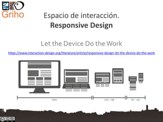
![Responsive design is …
• a way of developing web properties so that
the device they are used on determines the
way that the site will be displayed.
• It’s normally done using the principle “mobile
first”
– i.e. the experience is defined on mobile platforms
such as smartphones and tablets and then scaled
up to larger screens
Diseño de la Interfaz de Usuario. [T.Granollers - UTP Panamá, Agosto 2017] 38/88](https://image.slidesharecdn.com/3-170824014235/85/Diseno-de-la-interfaz-de-usuario-38-320.jpg)
![Author/Copyright holder: Stéphanie Walter. Copyright terms and licence: CC BY-SA 3.0Diseño de la Interfaz de Usuario. [T.Granollers - UTP Panamá, Agosto 2017] 39/88](https://image.slidesharecdn.com/3-170824014235/85/Diseno-de-la-interfaz-de-usuario-39-320.jpg)
![Ejemplo de un sitio web con un diseño
bastante bueno pero no es responsive:
http://www.rutespirineus.cat
Diseño de la Interfaz de Usuario. [T.Granollers - UTP Panamá, Agosto 2017] 40/88](https://image.slidesharecdn.com/3-170824014235/85/Diseno-de-la-interfaz-de-usuario-40-320.jpg)
![The Three Major
Principles of Responsive Design
• Fluid Grid Systems
• Fluid Image Use
• Media Queries
Diseño de la Interfaz de Usuario. [T.Granollers - UTP Panamá, Agosto 2017] 41/88](https://image.slidesharecdn.com/3-170824014235/85/Diseno-de-la-interfaz-de-usuario-41-320.jpg)
![Principles of Responsive Design.
Fluid Grid Systems
• For the responsive design the absolute size
doesn’t work, we use the idea of relative sizes
rather than absolute ones using this formula:
– Target size / context = relative size
• that is implemented using CSS
Diseño de la Interfaz de Usuario. [T.Granollers - UTP Panamá, Agosto 2017] 42/88](https://image.slidesharecdn.com/3-170824014235/85/Diseno-de-la-interfaz-de-usuario-42-320.jpg)
![Principles of Responsive Design.
Fluid Image Use
• The easiest way to handle fluid images (images
that scale to fit their container) is using the CSS
command:
img {max-width: 100%;}
• This tells the browser that the image should be a
maximum 100% of its pixel value and that it
should scale according to its container
Diseño de la Interfaz de Usuario. [T.Granollers - UTP Panamá, Agosto 2017] 43/88](https://image.slidesharecdn.com/3-170824014235/85/Diseno-de-la-interfaz-de-usuario-43-320.jpg)
![Principles of Responsive Design.
Fluid Image Use
Responsive Images Community Group: http://responsiveimages.org
Diseño de la Interfaz de Usuario. [T.Granollers - UTP Panamá, Agosto 2017] 44/88](https://image.slidesharecdn.com/3-170824014235/85/Diseno-de-la-interfaz-de-usuario-44-320.jpg)
![Principles of Responsive Design.
Media Queries
• Media queries are designed to
alter the layout of the site
when certain conditions are
met.
• The CSS might look like this:
@media screen and (min-
width: 480px) { /*
..larger screen sizes
here.. */ }
Diseño de la Interfaz de Usuario. [T.Granollers - UTP Panamá, Agosto 2017] 45/88](https://image.slidesharecdn.com/3-170824014235/85/Diseno-de-la-interfaz-de-usuario-45-320.jpg)
![Espacio de interacción.
UI design
• Optimize Screen Space
• Maximize Efficiency
• Preserve expected navigation behaviour
A good UX is NOT about
technology
Diseño de la Interfaz de Usuario. [T.Granollers - UTP Panamá, Agosto 2017] 46/88](https://image.slidesharecdn.com/3-170824014235/85/Diseno-de-la-interfaz-de-usuario-46-320.jpg)
![UI design.
Optimize Screen Space
• Not everything users need to see can or should
be shown at once
• Navigating is time-consuming and uses are often
unsure of their choices
• Scrolling is not always appropriate
• Cath: users need to navigate to get more
information, but they don’t yet know what they
want more information about
– Solution: popup images and details
Diseño de la Interfaz de Usuario. [T.Granollers - UTP Panamá, Agosto 2017] 47/88](https://image.slidesharecdn.com/3-170824014235/85/Diseno-de-la-interfaz-de-usuario-47-320.jpg)
![http://www.milliondollarhomepage.com
NO
Diseño de la Interfaz de Usuario. [T.Granollers - UTP Panamá, Agosto 2017] 48/88](https://image.slidesharecdn.com/3-170824014235/85/Diseno-de-la-interfaz-de-usuario-48-320.jpg)
![Popup information …
what happens on touch screens ?
Diseño de la Interfaz de Usuario. [T.Granollers - UTP Panamá, Agosto 2017] 49/88](https://image.slidesharecdn.com/3-170824014235/85/Diseno-de-la-interfaz-de-usuario-49-320.jpg)
![Popup information …
what happens on touch screens ?
Diseño de la Interfaz de Usuario. [T.Granollers - UTP Panamá, Agosto 2017] 50/88](https://image.slidesharecdn.com/3-170824014235/85/Diseno-de-la-interfaz-de-usuario-50-320.jpg)
![UI design. Maximize Efficiency
• Allow users to do more with less effort
– Popups reduce navigation
– Automated suggestions and history reduce
typing
– Appropriate widgets reduce interaction steps
(calendar popups for example)
– Scripted forms can eliminate opportunities for
errors (by adjusting choices)
Diseño de la Interfaz de Usuario. [T.Granollers - UTP Panamá, Agosto 2017] 51/88](https://image.slidesharecdn.com/3-170824014235/85/Diseno-de-la-interfaz-de-usuario-51-320.jpg)
![Compra billete de avión
el día 21-julio-2016
No puedo escoger una
fecha de IDA anterior al
día actual
Diseño de la Interfaz de Usuario. [T.Granollers - UTP Panamá, Agosto 2017] 52/88](https://image.slidesharecdn.com/3-170824014235/85/Diseno-de-la-interfaz-de-usuario-52-320.jpg)
![Compra billete de avión
el día 21-julio-2016
No puedo escoger una
fecha de REGRESO
anterior al día de la ida
(05/08/2016)
Diseño de la Interfaz de Usuario. [T.Granollers - UTP Panamá, Agosto 2017] 53/88](https://image.slidesharecdn.com/3-170824014235/85/Diseno-de-la-interfaz-de-usuario-53-320.jpg)
![Reserva aparcamiento
en el aeropuerto de BCN
el día 15-marzo-2017
Puedo escoger una
fecha de SALIDA anterior
a la de entrada
Diseño de la Interfaz de Usuario. [T.Granollers - UTP Panamá, Agosto 2017] 54/88](https://image.slidesharecdn.com/3-170824014235/85/Diseno-de-la-interfaz-de-usuario-54-320.jpg)
![UI design. Preserve expected navigation
behaviour
• Ensure that browser back and forward
buttons still do what users expect
– AJAX: most AJAX libraries allow control over
browser history (use it wisely)
Diseño de la Interfaz de Usuario. [T.Granollers - UTP Panamá, Agosto 2017] 55/88](https://image.slidesharecdn.com/3-170824014235/85/Diseno-de-la-interfaz-de-usuario-55-320.jpg)
![Even the user can see that more
information on the bottom of the
page, it was no possible to
continue without clicking on the
button
Diseño de la Interfaz de Usuario. [T.Granollers - UTP Panamá, Agosto 2017] 56/88](https://image.slidesharecdn.com/3-170824014235/85/Diseno-de-la-interfaz-de-usuario-56-320.jpg)
![Elementos importantes en
una UI
Espacio de interacción
• Color
• Tipografía
• Iconos
• Menús
• Tono del mensaje
• Formularios
Diseño de la Interfaz de Usuario. [T.Granollers - UTP Panamá, Agosto 2017] 57/88](https://image.slidesharecdn.com/3-170824014235/85/Diseno-de-la-interfaz-de-usuario-57-320.jpg)
![Color Theory for Designers
• The meaning of color
– https://www.smashingmagazine.com/2010/01/color-theory-for-
designers-part-1-the-meaning-of-color
• Understanding Concepts AndTerminology
– https://www.smashingmagazine.com/2010/02/color-theory-
for-designers-part-2-understanding-concepts-and-terminology
• ColorTheory For Designers: CreatingYour Own Color
Palettes
– https://www.smashingmagazine.com/2010/02/color-theory-
for-designer-part-3-creating-your-own-color-palettes
• Color Matters. http://www.colormatters.com
Diseño de la Interfaz de Usuario. [T.Granollers - UTP Panamá, Agosto 2017] 58/88](https://image.slidesharecdn.com/3-170824014235/85/Diseno-de-la-interfaz-de-usuario-58-320.jpg)
![Developer’s Guide To Color
• Choosing A Base Color
• CreatingA Cohesive
Color Palette
• FindingYour Accent
• Adding the Gray
• Creating Harmonious
Grays
https://www.smashingmagazine.com/2016/04/web-developer-guide-color
bit.ly/2kbLiI9
Diseño de la Interfaz de Usuario. [T.Granollers - UTP Panamá, Agosto 2017] 59/88](https://image.slidesharecdn.com/3-170824014235/85/Diseno-de-la-interfaz-de-usuario-59-320.jpg)
![El sistema visual. Recomendations
(guidelines). Example
NO
Bad color
combination
(text against
background)
worsened by
the size of
text.
SI
Diseño de la Interfaz de Usuario. [T.Granollers - UTP Panamá, Agosto 2017] 60/88](https://image.slidesharecdn.com/3-170824014235/85/Diseno-de-la-interfaz-de-usuario-60-320.jpg)
![El sistema visual. Recomendations
(guidelines). BAD Example
Diseño de la Interfaz de Usuario. [T.Granollers - UTP Panamá, Agosto 2017] 61/88](https://image.slidesharecdn.com/3-170824014235/85/Diseno-de-la-interfaz-de-usuario-61-320.jpg)
![Use “standard understandings”
• Typical feedback colors: success, warning,
error and informational
Diseño de la Interfaz de Usuario. [T.Granollers - UTP Panamá, Agosto 2017] 62/88](https://image.slidesharecdn.com/3-170824014235/85/Diseno-de-la-interfaz-de-usuario-62-320.jpg)
![Elementos importantes en
una UI
Espacio de interacción
Color
• Tipografía
• Iconos
• Menús
• Tono del mensaje
• Formularios
Diseño de la Interfaz de Usuario. [T.Granollers - UTP Panamá, Agosto 2017] 63/88](https://image.slidesharecdn.com/3-170824014235/85/Diseno-de-la-interfaz-de-usuario-63-320.jpg)
![Tipografía
• La buena tipografía
– soporta la estructura visual
– transmite el mensaje con mayor transparencia
– complementa el diseño visual
• La tipografía “habla” a los usuarios
– Visual language and typography, together, play a
play a tremendous role in influencing people’s emotions
people’s emotions
• Una mala elección conlleva problemas
(ver siguiente)
Diseño de la Interfaz de Usuario. [T.Granollers - UTP Panamá, Agosto 2017] 64/88](https://image.slidesharecdn.com/3-170824014235/85/Diseno-de-la-interfaz-de-usuario-64-320.jpg)
![Tipografía, una mala elección conlleva
problemas
Shorter line lengths
slows comprehension as
the eye spends more time
tracking back to the next
line.
Letter-spacing set to -
4px, default and +4px
respectively
Logos, titles, book covers and other
larger texts often employ much tighter
tracking than any body text could
tolerate.
Body text legibility erodes quickly with reduced
tracking.
Font: https://www.sitepoint.com/typography-cheat-sheet
Diseño de la Interfaz de Usuario. [T.Granollers - UTP Panamá, Agosto 2017] 65/88](https://image.slidesharecdn.com/3-170824014235/85/Diseno-de-la-interfaz-de-usuario-65-320.jpg)
![Typography Guidelines for Good Website Usability:
Legibility and Readability
1.Keep the number of fonts
used at a minimum
2.Use sans serif fonts instead
of serif for content
3.Ensure that proper text and
text size is used
4.Content must make use of
mixed capitalisation
5.Use standard fonts for web
site fonts
6.Character spacing should
not be minimised
7. Limit the use of different
colours for fonts
8. Do not use blue for content
9.Avoid colouring text in red or
green
10.Do not use the same or
similar colours for text and
background
11.Numbers having 5 digits or
more should have a thousand
separator
12.Do not use moving or
blinking text
Font: http://usabilitygeek.com/12-typography-guidelines-for-good-website-usability
Diseño de la Interfaz de Usuario. [T.Granollers - UTP Panamá, Agosto 2017] 66/88](https://image.slidesharecdn.com/3-170824014235/85/Diseno-de-la-interfaz-de-usuario-66-320.jpg)
![Tipografía
• Web Fonts are Critical to the Online User
Experience - Don’t HurtYour Reader’s Eyes
• https://www.smashingmagazine.com/tag/typ
ography
• The UX of typography explained
– http://www.creativebloq.com/web-design/ux-
typography-explained-21619368
Diseño de la Interfaz de Usuario. [T.Granollers - UTP Panamá, Agosto 2017] 67/88](https://image.slidesharecdn.com/3-170824014235/85/Diseno-de-la-interfaz-de-usuario-67-320.jpg)
![Elementos importantes en
una UI
Espacio de interacción
Color
Tipografía
• Iconos
• Menús
• Tono del mensaje
• Formularios
Diseño de la Interfaz de Usuario. [T.Granollers - UTP Panamá, Agosto 2017] 68/88](https://image.slidesharecdn.com/3-170824014235/85/Diseno-de-la-interfaz-de-usuario-68-320.jpg)
![Tips for Designing with Icons
• Familiarize yourself with
– icons used by your competitors
&
– with icons commonly used
• For new icons:
– Keep the design simple and schematic
– Use the 5-second rule: if it takes you more than 5 seconds to think of an
appropriate icon for something, it is unlikely that an icon can effectively
communicate that meaning
– Test the icons for
• recognizability: ask people what they expect the icons to stand for.
• memorability: ask a repeat set of users if they can remember the icon’s meaning after
after being told what it represented a couple weeks earlier.
• And remember that:
– “Universal” Icons Are Rare & Icons Need aText Label
https://www.nngroup.com/articles/icon-usability
those will be most recognizable to
your users
Diseño de la Interfaz de Usuario. [T.Granollers - UTP Panamá, Agosto 2017] 69/88](https://image.slidesharecdn.com/3-170824014235/85/Diseno-de-la-interfaz-de-usuario-69-320.jpg)
![Affordance & graphic methafors (icons)
• In the battle of clarity between icons and
labels, labels always win.
http://bokardo.com/archives/labels-always-win
Progressive Reduction:
http://layervault.tumblr.com/post/423615
66927/progressive-reduction
familiarity
Diseño de la Interfaz de Usuario. [T.Granollers - UTP Panamá, Agosto 2017] 70/88](https://image.slidesharecdn.com/3-170824014235/85/Diseno-de-la-interfaz-de-usuario-70-320.jpg)
![Easy Steps To Better Icon Design
• Easy StepsTo Better Icon Design (by Scott
Lewis, May 11th, 2016)
• The Icon Handbook
• (google) Material icons
• Types of icons and their impact on the user
experience
Diseño de la Interfaz de Usuario. [T.Granollers - UTP Panamá, Agosto 2017] 71/88](https://image.slidesharecdn.com/3-170824014235/85/Diseno-de-la-interfaz-de-usuario-71-320.jpg)
![Elementos importantes en
una UI
Espacio de interacción
Color
Tipografía
Iconos
• Menús
• Tono del mensaje
• Formularios
Diseño de la Interfaz de Usuario. [T.Granollers - UTP Panamá, Agosto 2017] 72/88](https://image.slidesharecdn.com/3-170824014235/85/Diseno-de-la-interfaz-de-usuario-72-320.jpg)
![Menu Design. Checklist of 15 UX
Guidelines to Help Users
• Make It Visible
1. Don’t use tiny menus (or menu icons) on large
screens
2. Put menus in familiar locations
3. Make menu links look interactive
4. Ensure that your menus have enough visual
weight
5. Use link text colors that contrast with the
background color
https://www.nngroup.com/articles/menu-design
Diseño de la Interfaz de Usuario. [T. Granollers - UTP Panamá, Agosto 2017] 73/88](https://image.slidesharecdn.com/3-170824014235/85/Diseno-de-la-interfaz-de-usuario-73-320.jpg)
![Menu Design. Checklist of 15 UX
Guidelines to Help Users
• Communicate the Current Location
6. Tell users ‘where’ the currently visible screen
located within the menu options
• Coordinate Menus with User Tasks
7. Use understandable link labels
8. Make link labels easy to scan
9. For large websites, use menus to let users
preview lower-level content
10.Provide local navigation menus for closely
related content
11.Leverage visual communication
Diseño de la Interfaz de Usuario. [T. Granollers - UTP Panamá, Agosto 2017] 74/88](https://image.slidesharecdn.com/3-170824014235/85/Diseno-de-la-interfaz-de-usuario-74-320.jpg)
![Menu Design. Checklist of 15 UX
Guidelines to Help Users
• Make It Easy to Manipulate
12.Make menu links big enough to be
tapped or clicked
13.Ensure that drop-downs are not too
small or too big
14.Consider ‘sticky’ menus for long pages
15.Optimize for easy physical access to
frequently used command
Diseño de la Interfaz de Usuario. [T. Granollers - UTP Panamá, Agosto 2017] 75/88](https://image.slidesharecdn.com/3-170824014235/85/Diseno-de-la-interfaz-de-usuario-75-320.jpg)
![Elementos importantes en
una UI
Espacio de interacción
Color
Tipografía
Iconos
Menús
• Tono del mensaje
• Formularios
Diseño de la Interfaz de Usuario. [T.Granollers - UTP Panamá, Agosto 2017] 76/88](https://image.slidesharecdn.com/3-170824014235/85/Diseno-de-la-interfaz-de-usuario-76-320.jpg)
![Communication design. The Four
Dimensions of Tone of Voice
• A website’s tone of voice communicates how
an organization feels about its message.The
tone of any piece of content can be analyzed
along 4 dimensions: humor, formality,
respectfulness, and enthusiasm
https://www.nngroup.com/articles/tone-of-voice-dimensions
Diseño de la Interfaz de Usuario. [T.Granollers - UTP Panamá, Agosto 2017] 77/88](https://image.slidesharecdn.com/3-170824014235/85/Diseno-de-la-interfaz-de-usuario-77-320.jpg)
![4 primary tone-of-voice dimensions
• Funny vs. serious: Is the writer trying to be humorous? Or is the subject
approached in a serious way? (Note that for our purposes, this
was only the attempt at humor. We didn’t evaluate if the writers
successfully landed their jokes.)
• Formal vs. casual: Is the writing formal? Informal? Casual? (Note that
casual and conversational are not necessarily synonymous, but they
often appear together.)
• Respectful vs. irreverent: Does the writer approach the subject in a
respectful way? Or does she take an irreverent approach? (In practice,
most irreverent tones are irreverent about the subject matter, in an
to set the brand apart from competitors. They are not usually
intentionally irreverent or offensive to the reader.)
• Enthusiastic vs. matter-of-fact: Does the writer seem to be enthusiastic
about the subject? Is the organization excited about the service or
product, or the information it conveys? Or is the writing dry and matter-
of-fact?
Diseño de la Interfaz de Usuario. [T. Granollers - UTP Panamá, Agosto 2017] 78/88](https://image.slidesharecdn.com/3-170824014235/85/Diseno-de-la-interfaz-de-usuario-78-320.jpg)
![One Message, Many Possible Tones
• “We apologize, but we are
experiencing a problem.”
• “We’re sorry, but we’re
experiencing a problem on our end.”
– the message becomes more casual with a few small
changes:
• “We are” becomes “we’re”
• “Apologize” becomes “sorry”
• The addition of the expression “on our end”
a serious, formal,
respectful, and matter-of-
fact error message
the same message a
little more casual
Diseño de la Interfaz de Usuario. [T.Granollers - UTP Panamá, Agosto 2017] 79/88](https://image.slidesharecdn.com/3-170824014235/85/Diseno-de-la-interfaz-de-usuario-79-320.jpg)
![One Message, Many Possible Tones
• “Oops!We’re sorry, but we’re experiencing a
problem on our end.”
• “What did you do!?You broke it! (Just kidding.
We’re experiencing a problem on our end.)”
Let’s add a little more enthusiasm
to the message
And now we’ve taken the error
message’s tone to casual and
enthusiastic.
Diseño de la Interfaz de Usuario. [T.Granollers - UTP Panamá, Agosto 2017] 80/88](https://image.slidesharecdn.com/3-170824014235/85/Diseno-de-la-interfaz-de-usuario-80-320.jpg)
![Elementos importantes en
una UI
Espacio de interacción
Color
Tipografía
Iconos
Menús
Tono del mensaje
• Formularios
Diseño de la Interfaz de Usuario. [T.Granollers - UTP Panamá, Agosto 2017] 81/88](https://image.slidesharecdn.com/3-170824014235/85/Diseno-de-la-interfaz-de-usuario-81-320.jpg)
![Forms Usability
Top 10 Recommendations
1. Keep it short
2. Visually group related labels and fields
3. Present fields in a single column layout
4. Use logical sequencing
5. Avoid placeholder text
6. Match fields to the type and size of the input
7. Distinguish optional and required fields
8. Explain any input or formatting requirements
9. Avoid Reset and Clear buttons
10. Provide highly visible and specific error messages
LECTURA: https://www.nngroup.com/articles/web-form-design
Diseño de la Interfaz de Usuario. [T.Granollers - UTP Panamá, Agosto 2017] 82/88](https://image.slidesharecdn.com/3-170824014235/85/Diseno-de-la-interfaz-de-usuario-82-320.jpg)
![Diseño de la Interfaz de Usuario. [T.Granollers - UTP Panamá, Agosto 2017] 83/88](https://image.slidesharecdn.com/3-170824014235/85/Diseno-de-la-interfaz-de-usuario-83-320.jpg)
![Índice
Parte 1: Características Principales de una IU
Elementos interactivos y simbología
Consistencia
Elementos de ubicación
Navegación
Identidad
Parte 2: Elementos importantes en una UI
Espacio de interacción
Color
Tipografía
Iconos
Menús
Tono del mensaje
Formularios
Diseño de la Interfaz de Usuario. [T. Granollers - UTP Panamá, Agosto 2017] 84/88](https://image.slidesharecdn.com/3-170824014235/85/Diseno-de-la-interfaz-de-usuario-84-320.jpg)
![ADEMÁS,
aprender de la experiencia
• https://www.nngroup.com/articles/top-
intranet-trends
Diseño de la Interfaz de Usuario. [T.Granollers - UTP Panamá, Agosto 2017] 85/88](https://image.slidesharecdn.com/3-170824014235/85/Diseno-de-la-interfaz-de-usuario-85-320.jpg)
![ADEMÁS,
aprender de la experiencia
• https://www.nngroup.com/articles/university-
sites
Diseño de la Interfaz de Usuario. [T.Granollers - UTP Panamá, Agosto 2017] 86/88](https://image.slidesharecdn.com/3-170824014235/85/Diseno-de-la-interfaz-de-usuario-86-320.jpg)
![ADEMÁS,
aprender de la experiencia
• Better Interface Design: Logins, Menus,
Toggles And Other Fancy Modules, by Cosima
Mielke
Diseño de la Interfaz de Usuario. [T.Granollers - UTP Panamá, Agosto 2017] 87/88](https://image.slidesharecdn.com/3-170824014235/85/Diseno-de-la-interfaz-de-usuario-87-320.jpg)
![Gracias por su
atención !!!
Toni Granollers
Escola Politècnica Superior
Universitat de Lleida (UdL)
C/ Jaume II, 69
25001 – Lleida (Catalonia)
(+34) 973 702750
antoni.granollers@udl.cat
@DCU_MPIUA
slideshare.net/DCU_MPIUA
@
Diseño de la Interfaz de Usuario. [T.Granollers - UTP Panamá, Agosto 2017] 88/88](https://image.slidesharecdn.com/3-170824014235/85/Diseno-de-la-interfaz-de-usuario-88-320.jpg)

Este documento presenta recomendaciones básicas para el diseño de interfaces de usuario. Describe características principales como elementos interactivos, consistencia, elementos de ubicación, navegación e identidad. También cubre elementos importantes como el espacio de interacción, color, tipografía, iconos, menús, tono del mensaje y formularios. El documento enfatiza la importancia del diseño responsivo y el uso de cuadrículas fluidas, imágenes fluidas y consultas de medios.


