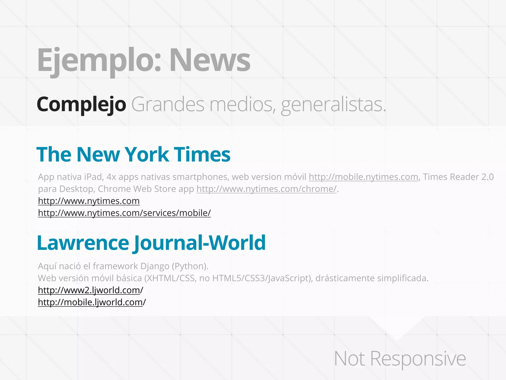
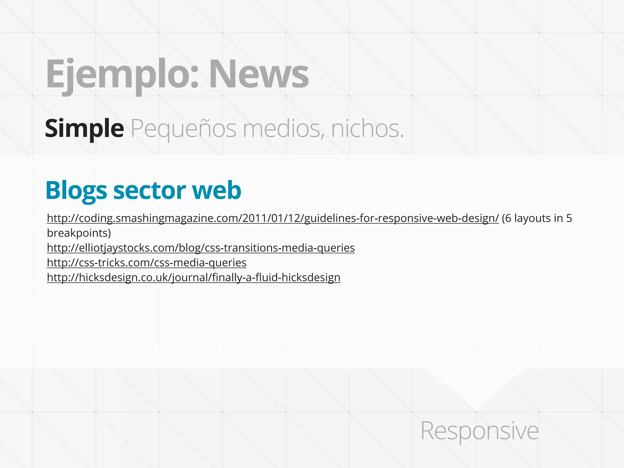
Descargado 21 veces


![VS Mobile sites/apps
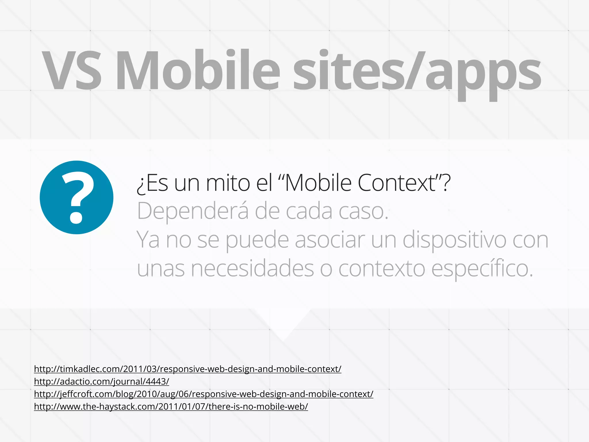
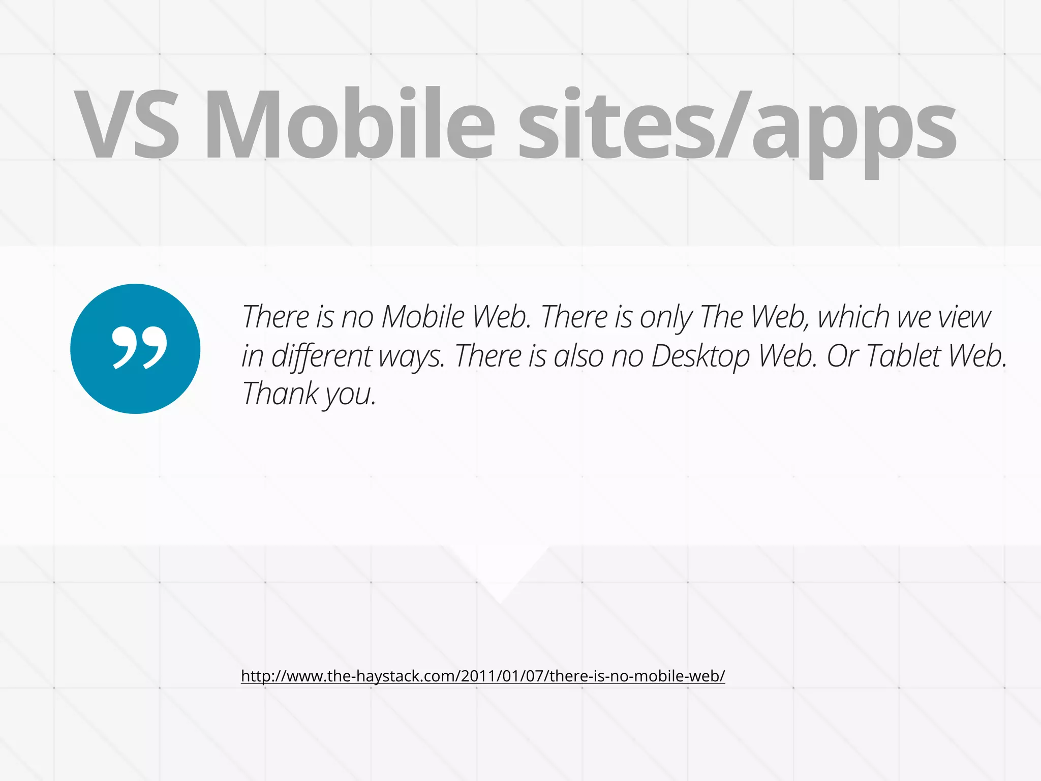
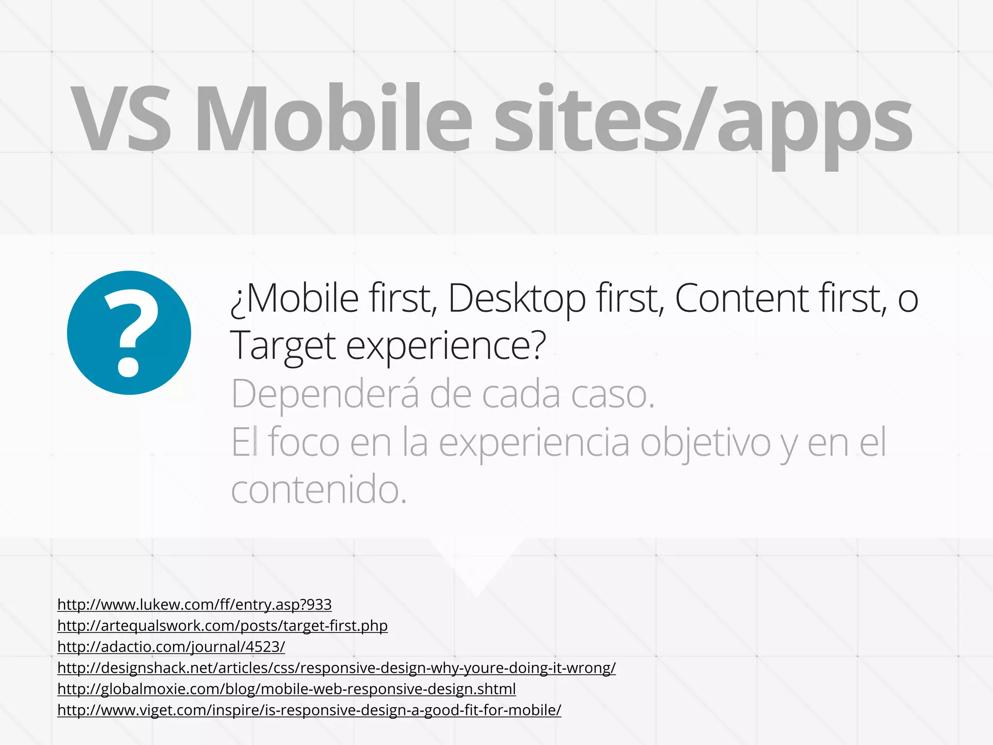
Design for a Target Experience First. “Mobile First” is as
” arbitrary as designing “Desktop First”. [...]
“Target First” design approach sets a target experience to
anchor our decisions of what should be added or subtracted,
diminished or emphasized in each screen context.
http://artequalswork.com/posts/target-first.php](https://image.slidesharecdn.com/responsive-web-design-diseno-sensible-by-janogarcia-120323091958-phpapp02/75/Responsive-web-design-diseno-sensible-20-2048.jpg)
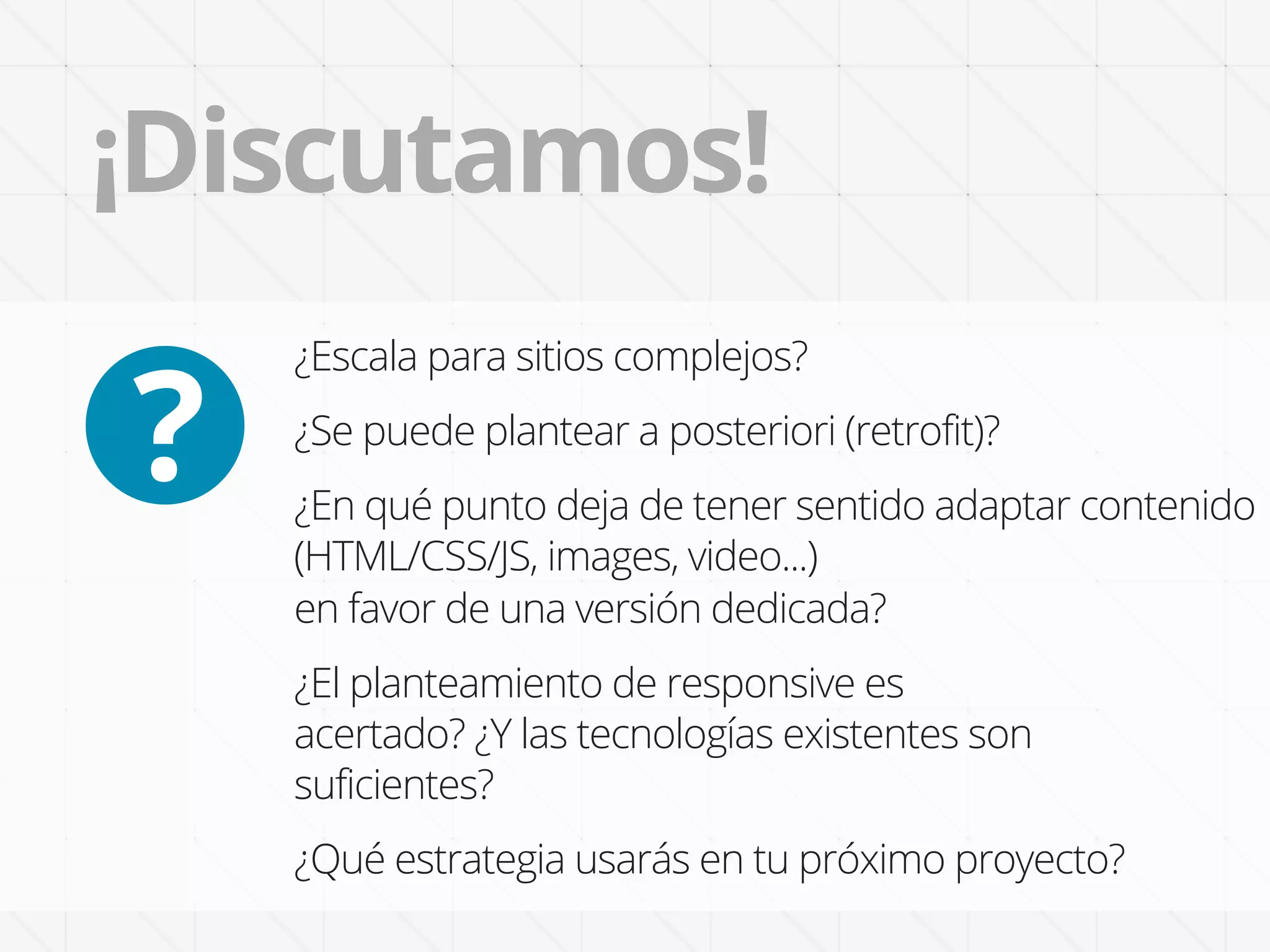


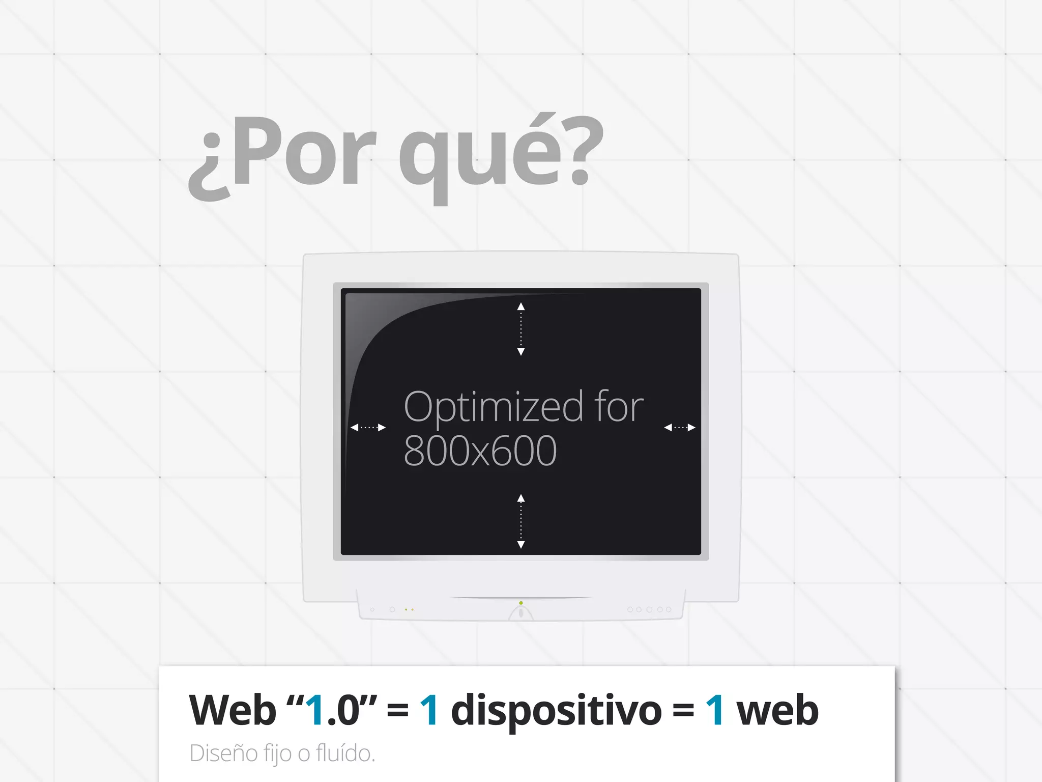
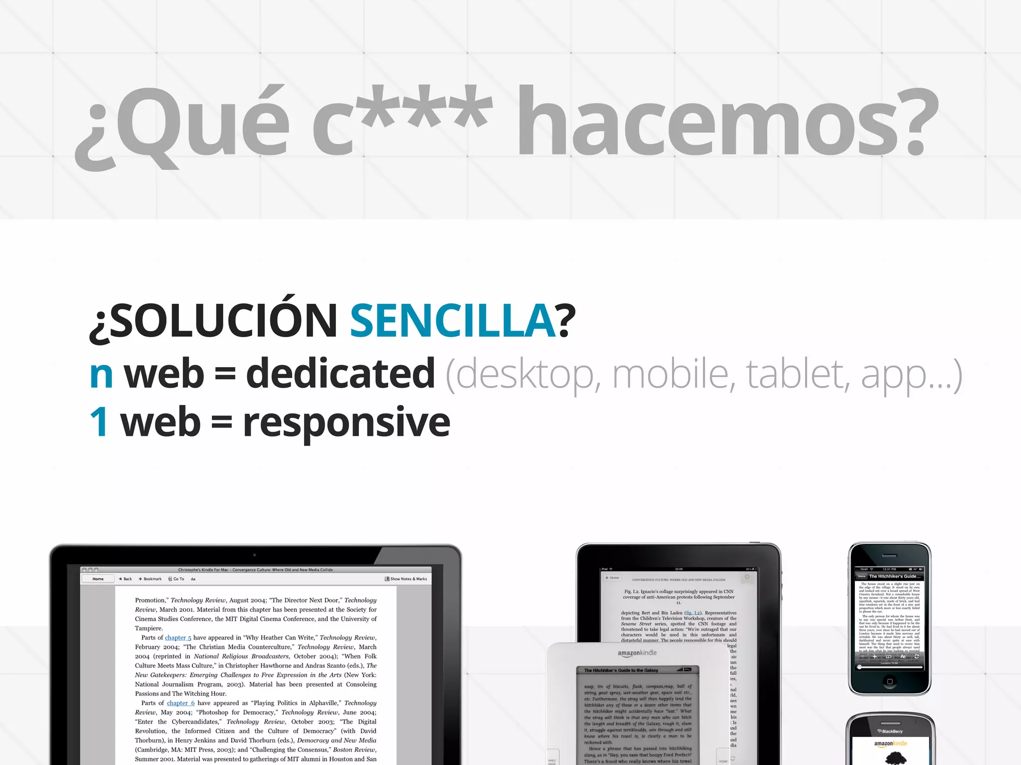
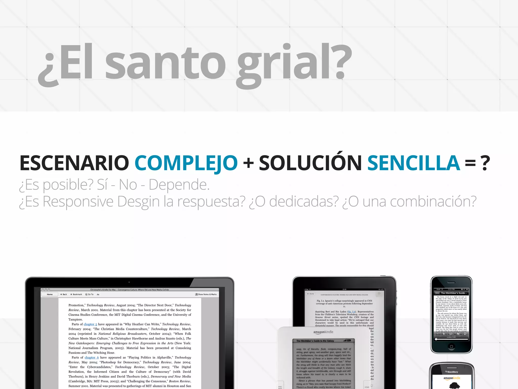
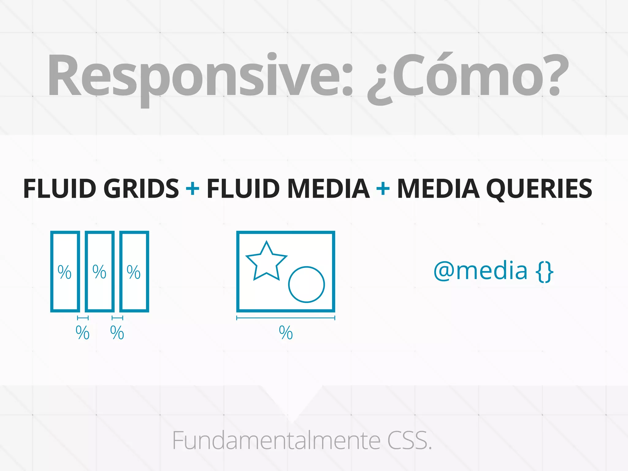
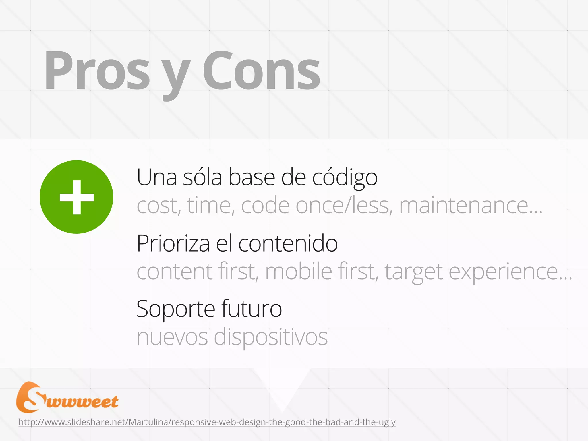
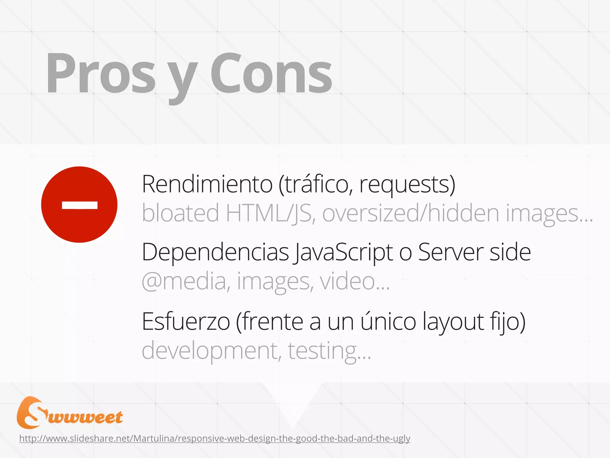
Este documento discute el diseño responsivo y sus principios. El diseño responsivo crea sitios web que se adaptan a diferentes dispositivos mediante el uso de rejillas fluidas, medios fluidos y consultas de medios. Proporciona una única base de código para múltiples dispositivos en lugar de sitios web dedicados. Sin embargo, también puede tener desventajas como el rendimiento y la dependencia de JavaScript. El documento plantea que el enfoque correcto dependerá del proyecto específico y si el contenido puede adaptarse fácilmente o si se


![[090723]Web2.0to Sns](https://cdn.slidesharecdn.com/ss_thumbnails/090723web2-0tosns-090724222505-phpapp01-thumbnail.jpg?width=640&height=640&fit=bounds)


