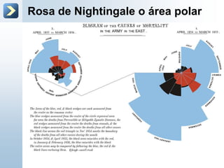
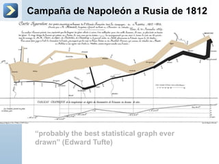
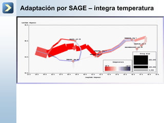
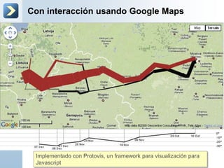
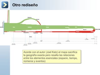
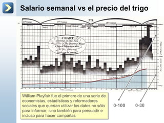
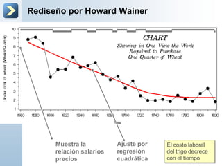
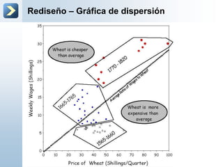
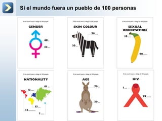
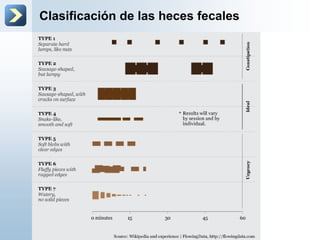
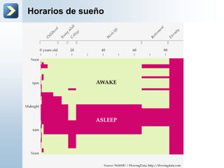
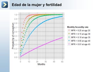
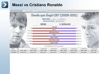
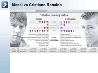
Una introducción a través de
exploración
Visualización de la
Información – Parte
2
Universidad Anahuac
Taller Kolmogorov
David Solís
Las 3 mejores gráficas de
la historia
De acuerdo a The Economist (Dec 22nd 2007)
Rosa de Nightingale o área polar
Campaña de Napoleón a Rusia de 1812
“probably the best statistical graph ever
drawn” (Edward Tufte)
Adaptación por SAGE – integra temperatura
Con interacción usando Google Maps
Implementado con Protovis, un framework para visualización para
Javascript
Otro rediseño
Acorde con el autor (Joel Katz) el mapa sacrifica
la geografía exacta pero resalta las relaciones
entre los elementos esenciales (espacio, tiempo,
números y eventos)
Salario semanal vs el precio del trigo
William Playfair fue el primero de una serie de
economistas, estadísticos y reformadores
sociales que querían utilizar los datos no sólo
para informar, sino también para persuadir e
incluso para hacer campañas
0-100 0-30
Rediseño por Howard Wainer
Muestra la
relación salarios
precios
Ajuste por
regresión
cuadrática
El costo laboral
del trigo decrece
con el tiempo
Rediseño – Gráfica de dispersión
Ejemplos triviales
Con información trivial
Si el mundo fuera un pueblo de 100 personas
Tendencias en búsquedas
Tendencias - Trabajo
Percepción de la importancia del 14 de Feb
Videos más odiados en Youtube
Clasificación de las heces fecales
Horarios de sueño
Edad de la mujer y fertilidad
Messi vs Cristiano Ronaldo
Escenario de la matanza de Denver

Visualización Parte 2

Notas del editor

  • #4 Coxcombhttp://erre-que-erre-paco.blogspot.mx/2010/06/los-datos-de-florence-nightingale.htmlThe chart displays the causes of the deaths of soldiers during the Crimean war, divided into three categories: “Preventible or MitigableZymotic Diseases” (infectious diseases, including cholera and dysentery, coloured in blue), “wounds” (red) and “all other causes” (black). As with today's pie charts, the area of each wedge is proportional to the figure it stands for, but it is the radius of each slice (the distance from the common centre to the outer edge) rather than the angle that is altered to achieve this. Her principal message—that even during periods of heavy fighting, such as November 1854, far more soldiers died from infection than from wounds—can be seen at a glance. She sent the chart to the War Office; and it is a fair assumption that it contributed to the improvements in military hospitals that she brought about.
  • #5 Minard's chart shows six types of information: geography, time, temperature, the course and direction of the army's movement, and the number of troops remaining. The widths of the gold (outward) and black (returning) paths represent the size of the force, one millimetre to 10,000 men. Geographical features and major battles are marked and named, and plummeting temperatures on the return journey are shown along the bottom.The chart tells the dreadful story with painful clarity: in 1812, the Grand Army set out from Poland with a force of 422,000; only 100,000 reached Moscow; and only 10,000 returned. The detail and understatement with which such horrifying loss is represented combine to bring a lump to the throat. As men tried, and mostly failed, to cross the Bérézina river under heavy attack, the width of the black line halves: another 20,000 or so gone. The French now use the expression “C'est la Bérézina” to describe a total disaster.In 1871, the year after Minard died, his obituarist cited particularly his graphical innovations: “For the dry and complicated columns of statistical data, of which the analysis and the discussion always require a great sustained mental effort, he had substituted images mathematically proportioned, that the first glance takes in and knows without fatigue, and which manifest immediately the natural consequences or the comparisons unforeseen.”The chart inspires bitter reflections on the cost to humanity of the madnesses of conquerors and the merciless thirst of military glory
  • #9 This graph plots three parallel time series: prices, wages, and the reigns of British kings and queens. Among the benefits of graphical display, Playfair said, "On inspecting any one of these Charts attentively, a sufficiently distinct impression will be made, to remain unimpaired for a considerable time, and the idea which does remain will be simple and complete, at once including the duration and the amount."